
Hi there,
We’re into a new month, which means it’s bullet journal walkthrough time again! Similarly to February themes, I never feel like March themes come particularly easily to me- a lot of the spreads out there seem to involve green colour palettes and plants, which, while I can appreciate them from afar, don’t really bring me all that much joy (an essential for all of my bullet journal themes- I mean, I look at this thing every day). I definitely found myself feeling uninspired this month, so I turned to my master list of theme ideas (everyone has one of those, right?) and came across an idea I’d had ages ago (i.e. May 2022) to create a setup inspired by Blake Lively’s incredible patina dress from the 2022 Met Gala. I even bought this gorgeous watercolour paint on Etsy, from seller AzuraColour, a duochrome shimmer of rose gold and aqua, to use for it- I mean, the shade is literally called ‘Patina’, perfect, right? However, as I’m sure you can tell from the obvious lack of Met Gala goodness on the above photo, I ran into some problems that led me to change my theme for this month at the last minute.
I tend to gravitate towards more collage-based approaches to my bullet journal decoration- I’m very much a coloured-paper-and-pens kind of girl. I am not a painter- painting has always just felt like a lot of effort for something that is very easy to mess up. In particular, I have very little experience using watercolours, especially those with shimmer pigments. When I was practising with the paint I bought, I genuinely could not achieve the duochrome shimmer the paint promised, only a slightly shimmery copper. Unsurprisingly, the problem was with me and my lack of watercolour skills, not the product itself (spoiler alert: I wasn’t using enough water, then I was using too much water- evidently, the amount of water you use is important… the more you know, huh?). Seeing as the aqua shimmer was rather vital to the Met Gala dress idea, I had to rethink my plans (BUT, I’m hoping to bring the dress inspiration back in the future, when I have had more time to formulate the perfect setup with it).
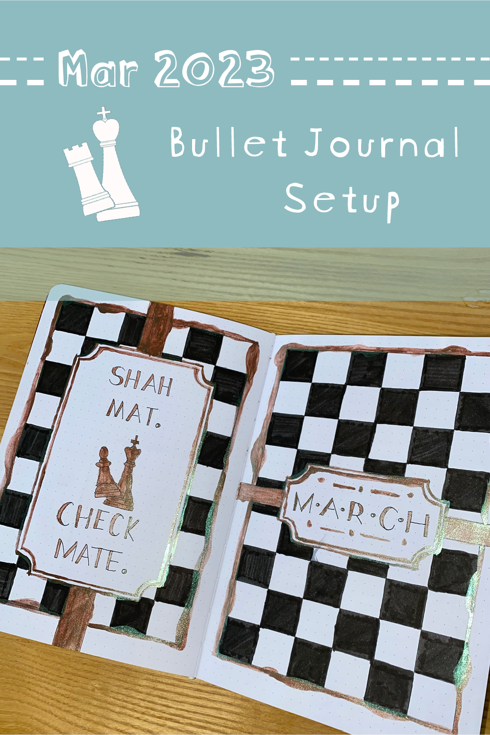
Time was ticking on and, since March was swiftly approaching, I had to make a new plan. I’m a big fan of using high contrast colour palettes in my journal, so I figured I could pretty easily make a black and white setup and use my ill-fated paint as a highlight shade, to bring a bit of brightness to the layout. In February, I read The Last Hours trilogy by Cassandra Clare, in which the game of chess (and its Persian origins) featured prominently. Inspired by this, I decided to go for a chess theme (which, to be perfectly honest, is quite ironic because I am the world’s worst chess player).
Anyway, having finally settled on a more doable theme, I got to sketching out my plans, inking in a multitude of chessboard grids and even drawing little chess pieces as decorations (not my strong suit, some of my pawns are truly atrocious). Then it was time to paint. It was… an experience. On the bright side, I finally figured out how to use the right amount of water so that I could get that patina-esque duochrome shimmer (the irony being I could have used it for my Met Gala dress theme, after all). On the less-than-bright side, I was (naively, admittedly) horrified at how imprecise watercolour is. Looking back, this is obvious- who was I to think I could control water? I ended up having to embrace a lot of imperfections and mistakes, which is not entirely in my nature- I’ll talk more about this later on in the post. Honestly, I have to admit that this isn’t my favourite setup, but sometimes you just have to accept these things and move on. With the patina shimmer, the slightly messy paint application and the theme, it’s ended up as a sort of Shabby Chic Antique Chess spread. A slightly niche theme, I admit, but a fun one nonetheless.
Anyway, let’s get into the setup…
Equipment used:
- Muji 0.38 pen, black
- Tombow ABT dual brush pen, N15 black (I purchased mine in this pack).
- Sakura gelly roll, white
- Black paper
- ML02 Patina watercolour paint
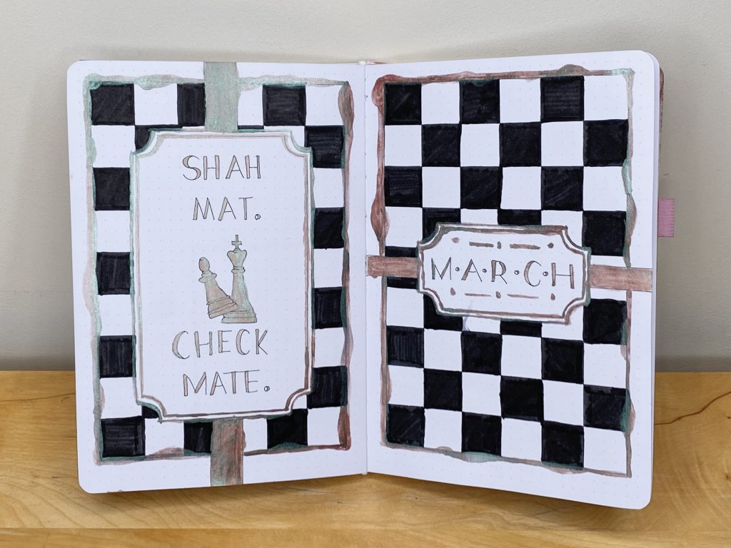
First up, as always, is my cover and quote page. I mean, in this instance, I use ‘quote’ in the loosest sense- it’s more like two phrases. ‘Checkmate’ is, I hope, self-explanatory. Shah Mat is a Persian phrase I came across while reading The Last Hours. According to Clare, it can be translated as ‘The King is Dead’ and is the ancient phrase from which the modern ‘checkmate’ is derived. Cool, right?
Throughout this setup, I aimed to juxtapose the modern minimalism of the black and white chessboard pattern with the more traditional, antique-y shapes and features of the chess pieces and the bevelled edges of the frames, as well as the connotations of the patina paint. I tried to reflect this in my font- the varying stroke weight is common in more traditional fonts, but the lack of serifs gives this particular font a more modern feel. It was at this point in my painting journey that I realised how imprecise watercolour can be, particularly with my (extremely) shaky hands. I tried very hard to embrace that imperfection, emphasising any mistakes instead of trying to cover them up (you can see this most prominently on the painted borders around the chessboard grids). I’m still not entirely comfortable with the end result, but I am proud that I challenged myself to accept the less-than-perfect aspects of this setup.
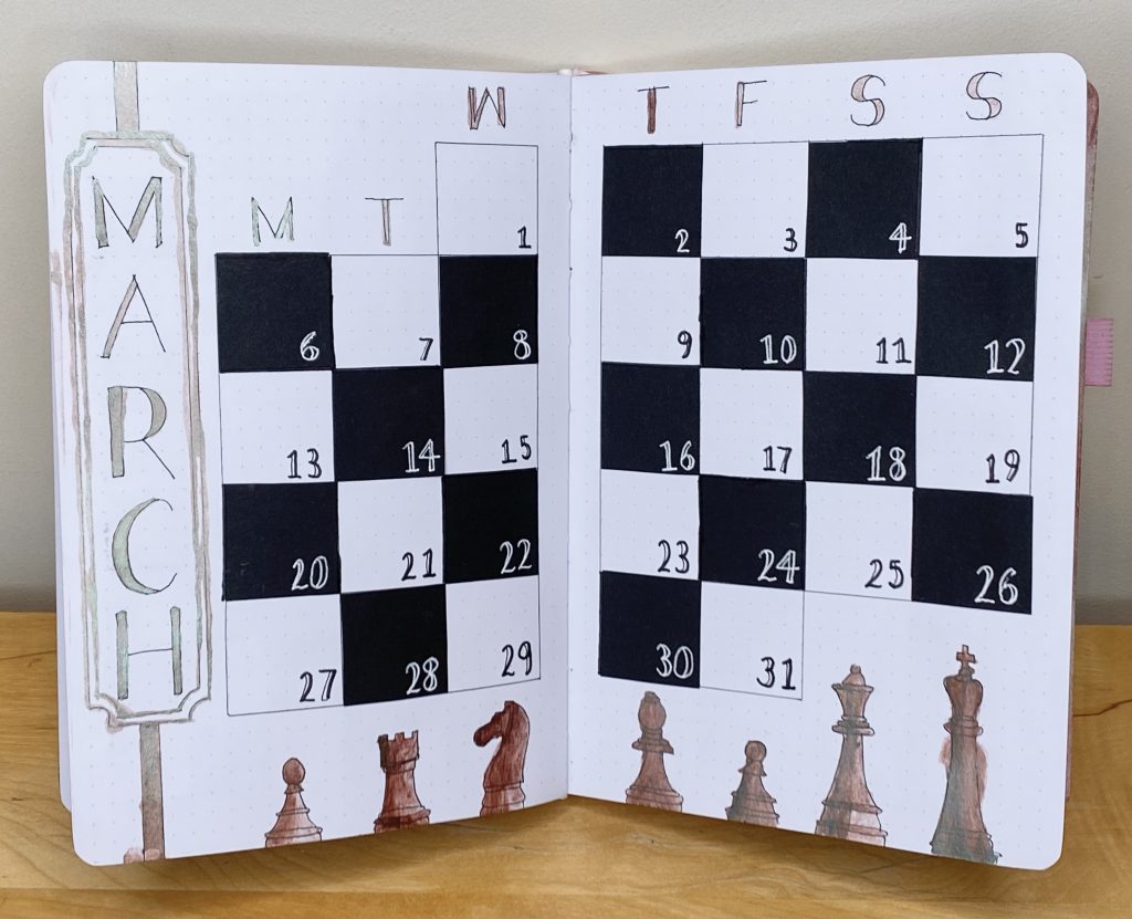
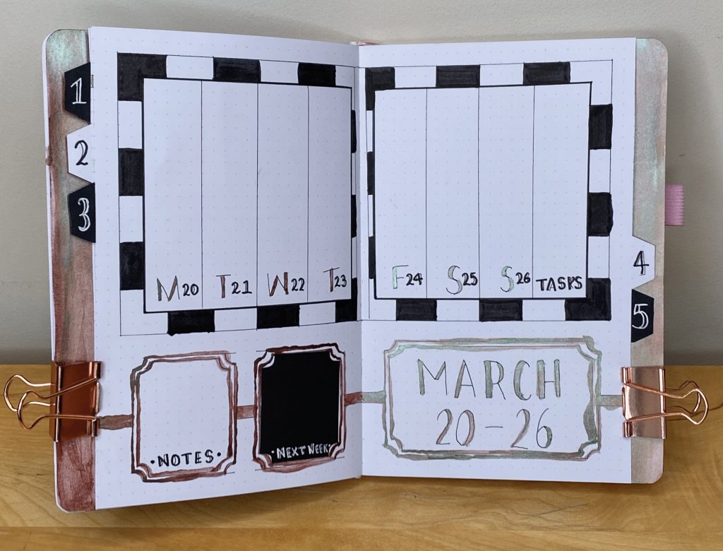
Next up is my monthly calendar. I used squares of black paper to give the calendar itself a chessboard effect. I also decorated the bottom of the spread with some chess pieces, which, although they are not perfect, I am quite proud of. I tried to deepen the colour on the left-hand side of each shape to create shadows and give them a bit more dimension, which I think was quite effective and really added to the antique-y vibe that I was going for.
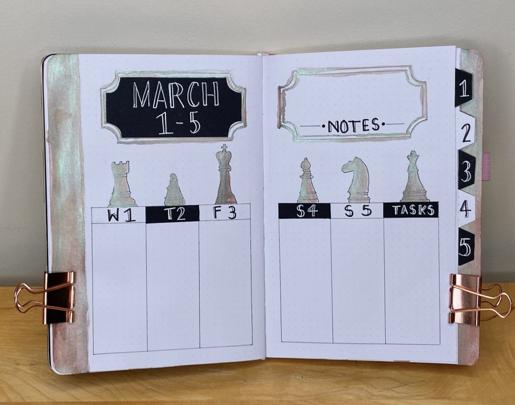
Onto the first weekly spread now, which features a delightful example of just how much I struggled with the watercolour paint. As always, I made use of tabs for my weeklies, and I typically like to create a contrasting strip of colour/pattern both behind and in front of the tabs, to help them stand out wherever you look at them from. I chose to do my tabs in black and white and use the watercolour as the contrast colour, but painting a large section was (a little surprisingly?) a lot trickier than painting the little details. Additionally, despite the fact that I was very careful with the amount of water I used, painting these big sections did cause my paper to wrinkle up a little bit- I don’t think this is necessarily avoidable, but it is something I will definitely keep in mind if I want to use paint in the future.
Throughout my weekly spreads, I kept the same font as my cover/calendar pages, using my white Sakura gelly roll when I needed to write on black paper, and my black Muji pen, along with the finer tip of my black Tombow, when writing directly onto the journal.
For the second weekly, I used squares for my daily task lists, arranged in a chequerboard formation. I did also add a small dot in each corner of the individual boxes, just because it felt like it needed a little something extra.
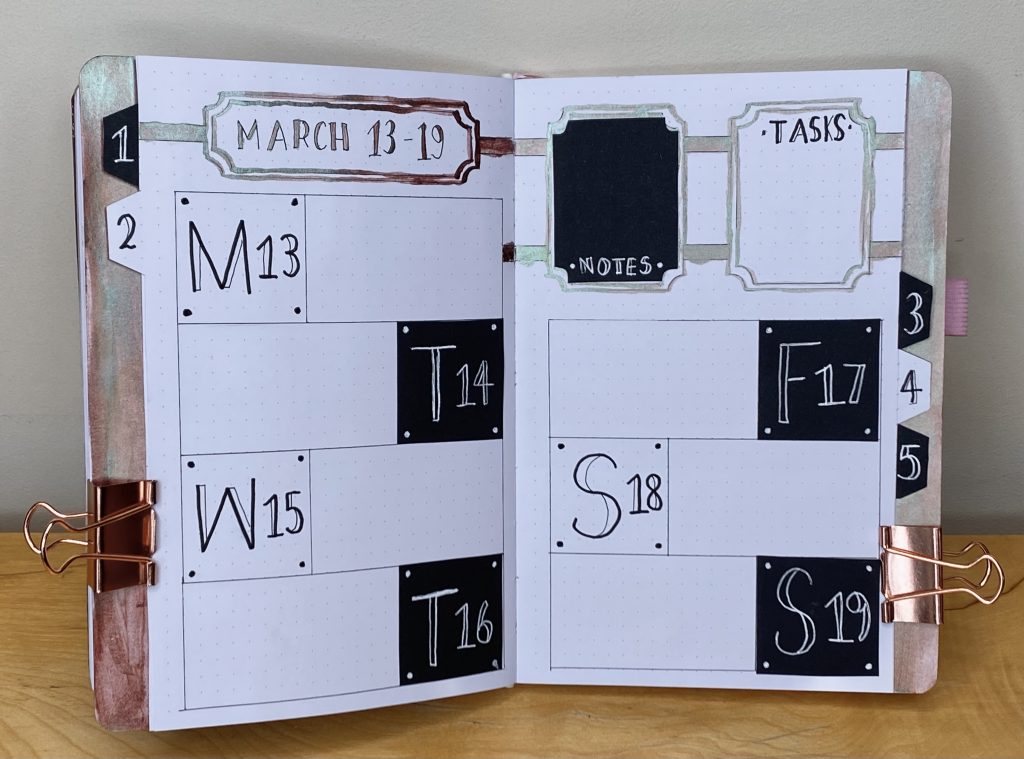
My idea for the third weekly was for the ‘header’ squares to form a chequerboard, while they alternate from left to right in the horizontal daily task lists. I don’t think this was the most successful approach- it would perhaps have been better to make all of the headers black, but I did like that they were so large and eye-catching.
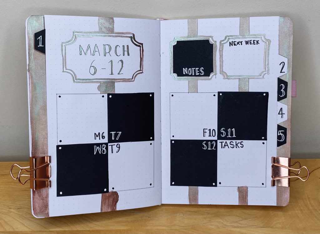
The fourth weekly makes use of vertical daily task lists, which I set within two chequerboard-style ‘frames’.
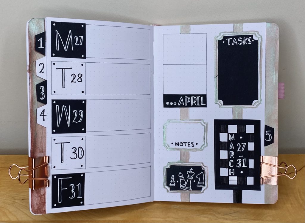
The final weekly spread has the last 5 days of March on the left, in horizontal boxes (with, I think, a more successful attempt at the large chequerboard-style headers than my third weekly). On the right, there are two spaces for the first two days in April (which fall on the Saturday and Sunday of this week), a master task list, a space for notes and a little white-on-black doodle of some more chess pieces.
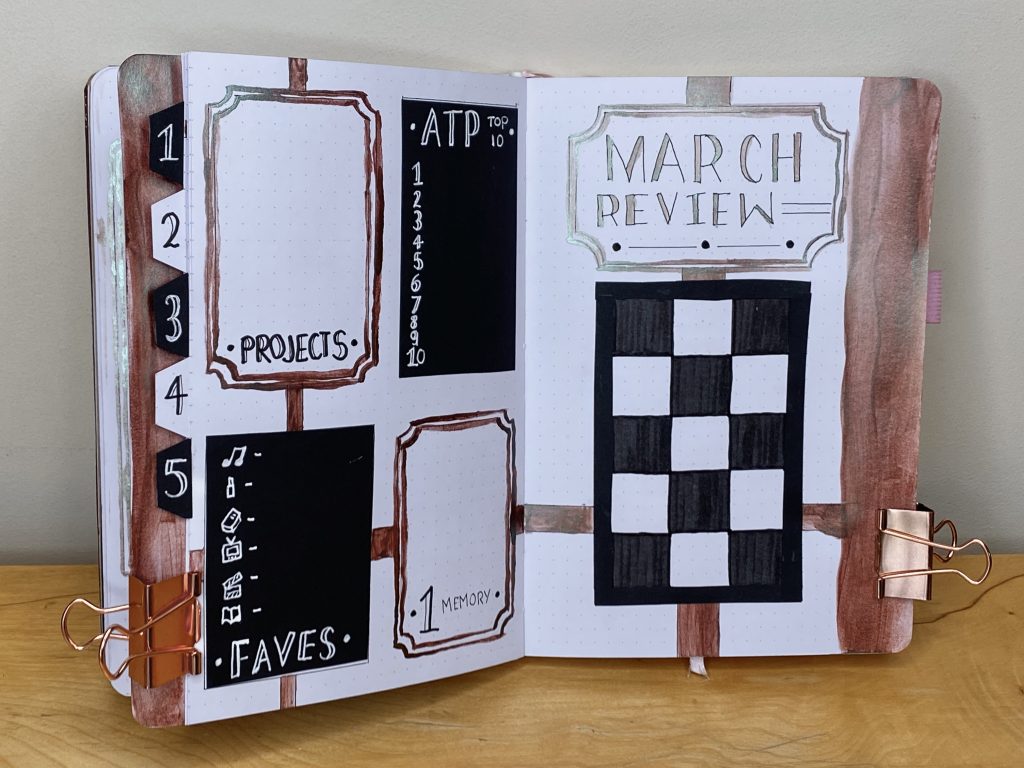
Finally, as always, we have my March Review (and another questionably painted watercolour strip). Another chequerboard frame will house my polaroid of the month on the right-hand page, while all the same sections as my previous monthly setups (projects, ATP Top 10, faves and #1 memory) are on the left page.
So, there we have it, my March 2023 bullet journal setup. As I said, it’s not my favourite- the messy paint application, the questionable pawn (I’m looking at you, Weekly Setup #1), the numerous mistakes and smudges, all, as I said earlier, make me feel a little uncomfortable. However, this was my first time using paint in my journal and it was also my first time drawing chess pieces. Sometimes it is easy to expect yourself to be perfect when you have no reason at all to be perfect- I would never expect someone else to do anything perfectly on their first go, so why should I hold myself to a different standard? I like my bullet journal to look nice, but, in the end, it is only for my personal use. I think this month’s setup has been a good lesson for me- it’s been a lesson in embracing mistakes, in finding the beauty in the parts of a setup, rather than a whole, in being adaptable, in not being afraid of trying new things and in being imperfect.
Hope you like it, or at least, can find some joy in its parts.
Gemma
xxx