Hello again!
The post about my January setup may have been excessively belated, but we’re only a couple of days into February now, meaning this post is only slightly belated. Progress. Anyway, let’s get into it.
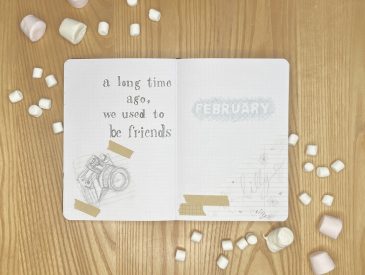
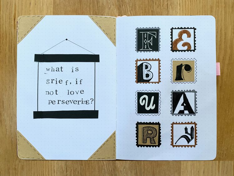
I wasn’t entirely sure what theme to choose for February. Typical February themes revolve around Valentine’s Day: flowers, hearts, pink & red colour schemes- you know the drill. Don’t get me wrong- I’m all for those themes, but usually, when February comes around, I find myself wanting something else for my own bullet journal. I cycled through a couple of different options until, finally, I decided on a (slightly niche) theme: stamps. I stumbled upon this article by Liz Gray (@thegraytergood on Instagram) while I was researching and fell in love with the cover page pictured. Isn’t it beautiful? From there, everything fell into place. I recently lost my grandfather, who was an avid (truly, truly avid) stamp collector. His birthday would have been in February, so it felt like a good time to pay tribute to him through my journal. I also love playing around with different fonts, so the use of multiple styles within the setup felt perfect for me. Even the colour scheme, the dark academia-style combination of brown, black and grey, just felt right. I was sold. My February 2023 theme would be: Stamps and Fonts (Neutral Edition).
So, let’s get into it, shall we?
Equipment used:
- Black paper
- Brown paper
- Muji 0.38 pen, black
- Crayola Supertips, brown
- Tombow ABT dual brush pen, N89, N45 and N15 (I purchased all 3 of these shades in this pack)
- Sakura gelly roll, white
- Alphabet stamps & black ink pad
- Pencil, ruler, scissors, glue stick, craft knife & cutting board
Right then, into the setup…
Cover and Quote Pages
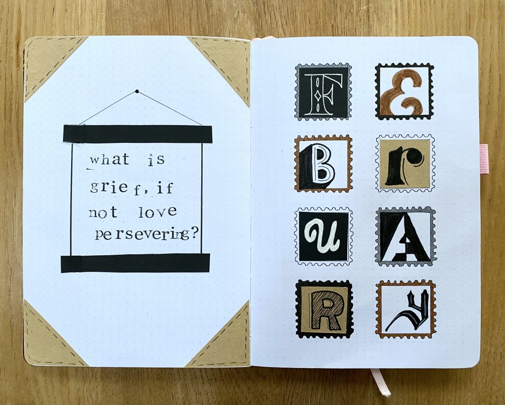
My cover page is pretty much a replica of the one in my inspiration photo. I did make a couple of changes to suit my own needs/capabilities: I substituted a couple of the fonts, I omitted the postmarks and I made each of my stamps slightly smaller than in the original setup- 6×6 squares, as opposed to 8×8. Sometimes it can feel like a bit like cheating to recreate someone else’s set up, but the original spread brought me so much joy that I really wanted to have a version of it in my own journal. I used this spread to influence the rest of the setup (which is my original work, just inspired by the premise/colour scheme of this page!).
It took a while to find a fitting quote to put on my quote page, opposite the cover page. Surprisingly, there aren’t really any motivational or poignant quotes out there about stamps- go figure. In the end, I opted for this one, from the Disney+ series, WandaVision. It felt fitting, given the inspiration for this setup. I placed the quote in a black poster hanger (which I promptly stuck in off centre, so I had to paste in extra length to each of the black bars…), and drew inspiration from the corners of an old-fashioned suitcase to decorate the page itself. For this, I cut right-angled triangles from brown paper, drew faux-stitching on them with the fine tip of my N45 Tombow and stuck one on each corner. I felt this tied in with the sense of ‘travel’ introduced by the stamps, while also maintaining the antique-y, yet minimal, vibe of the setup.
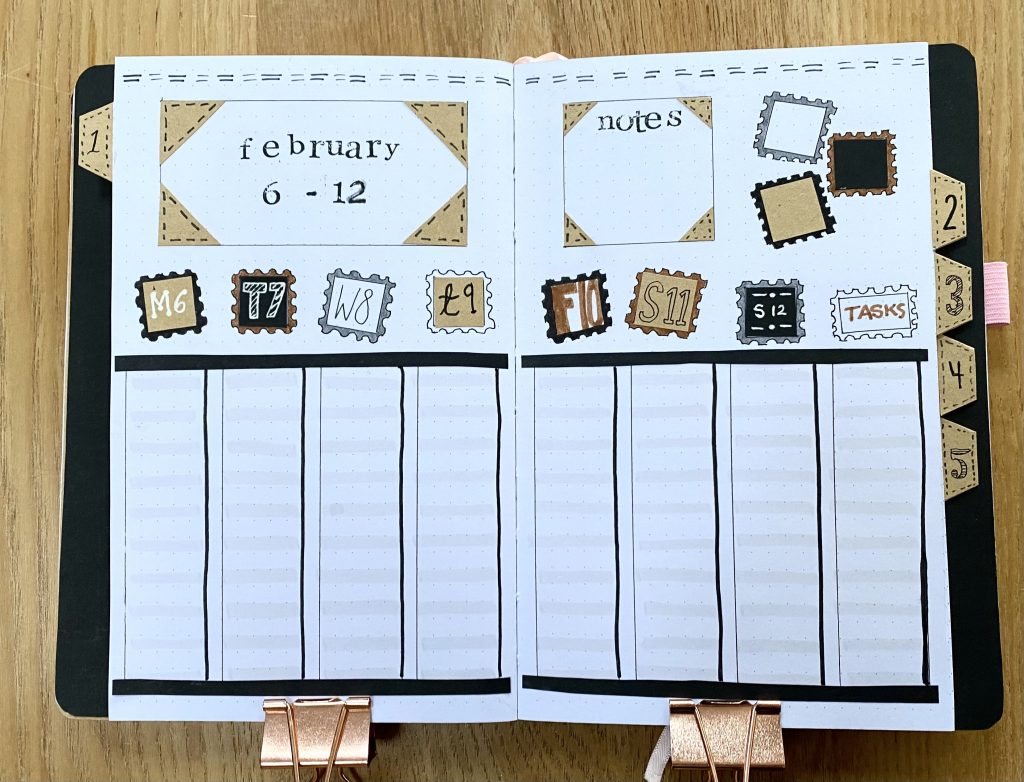
Month at a Glance
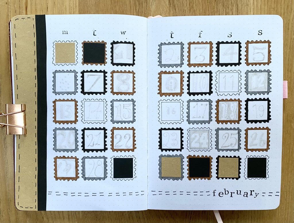
My Month at a Glance spread probably took the longest time of all the spreads in this setup. As I sat, drawing and colouring in each of the borders for the calendar ‘stamps’, I did indeed question all of my life decisions. However, I do think it turned out well! As you can see, each calendar box is one ‘stamp’. I used my N89 Tombow to put the appropriate number in each box, varying my fonts for each one. This pen is light enough that you can easily write over it when using the Muji pen (which is my go-to for filling in my journal), so I was able to use up the whole space to write in the date. I blocked out the stamps that did not correspond to a day in February with little squares of black and brown paper, which I also used to decorate the left-hand side of the setup (again, I added faux-stitching to the brown paper using the N45 pen). Finally, I stamped out the days of the week along the top, and ‘February’ along the bottom. I then added two parallel rows of stitching straight onto the journal, using the same N45 pen, to fill in the blank space a bit more.
Weekly Setups
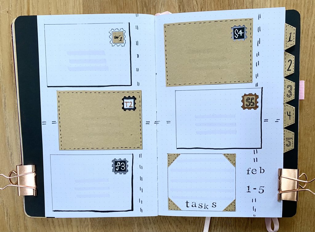
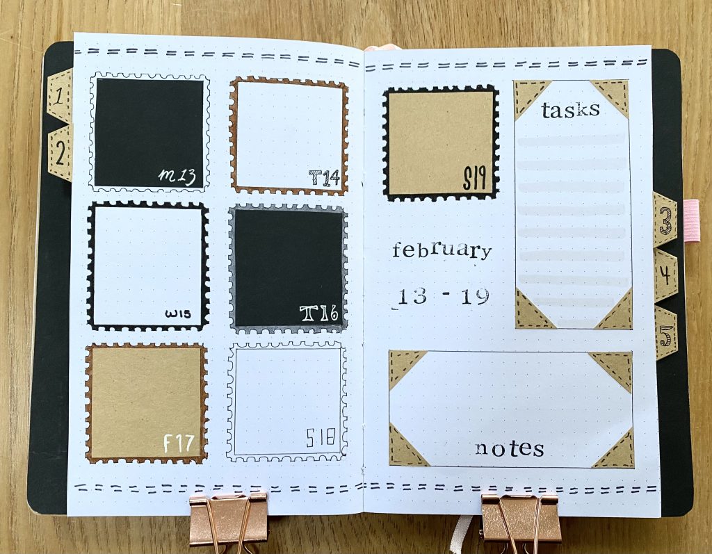
Into the weeklies now. As always, I used tabs for my weekly setups, which I cut out beforehand. To decorate the tabs, I covered each one with brown paper, added some faux-stitching around the edges and numbered them from 1-5, using 5 different fonts, to fit the theme of the spread. I also stuck strips of black paper along the edges of the first and last page in this section (as pictured), so that, no matter where you look at the tabs from, they are against a black background. This year, there are only 5 days in the first week in February, so I had a little more space to play around with on the first weekly. I opted to create 5 ‘envelopes’, alternating between white and brown, to act as the spaces for each of my daily task lists. For the white envelopes, I simply drew the boxes and stamps using my Muji pen and added a black drop shadow using my N15 Tombow. I then coloured in the stamps in the same way as the rest of the setup, adding in the day & date in varying fonts, and used my N89 Tombow to add 3 lines to the centre of the ‘envelopes’, to mimic the address lines. For the brown envelopes, I cut rectangles out of brown paper and used my craft knife to cut out a space with scalloped edges for the stamps, sort of like reverse appliqué, then decorated the stamps in the same way as before. Then I just added a task box, decorated with more ‘suitcase corners’ and stripes made using my N89 Tombow, a stamped title in the bottom right-hand corner, and some more lines of faux-stitching.
For the second weekly, I opted for tall, vertical boxes for my daily and general task lists. Again, I used stamps for the days above said boxes, and ‘suitcase corners’ to frame the title/notes boxes. I also added in some faux-stitching and a few decorative stamps for good measure. I also added a shadow to the right-hand side of each vertical box using my N15 Tombow, and internal horizontal lines using my N89. This setup looked a little bare at this point, so I decided to reintroduce the poster hanger from my quote page by sticking in thin strips of black paper across the top and bottom of my task lists. I like it much better now!
For my third weekly, I decided to fully embrace the stamp motif, and made each daily task list into a stamp in itself, using the same methods that I used to make the smaller stamps on the previous pages. I placed the day & date for each in the bottom right-hand corner, again varying my fonts.
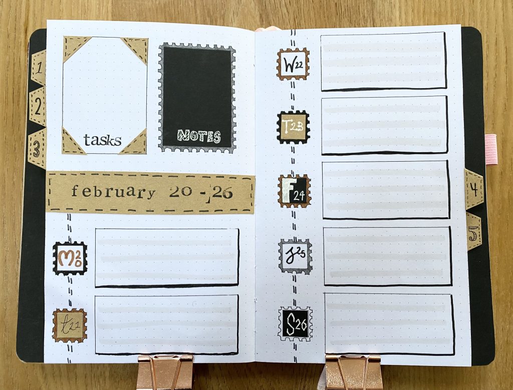
In the fourth weekly spread, I decided to go for horizontal boxes, each with the same horizontal line detailing and black drop shadows. I ran some faux-stitching through the stamp headers on the left-hand side of the boxes, made my notes box into an enlarged, rectangular stamp, and used brown paper to make a central bar for the title.
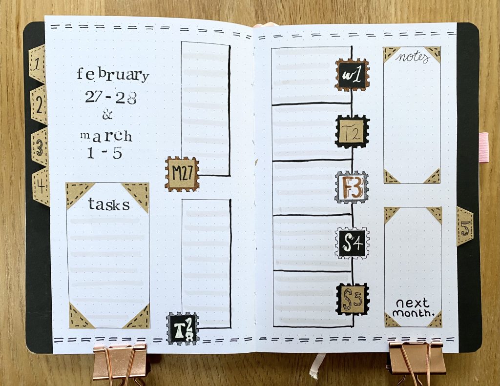
The final weekly spread includes the two remaining days of February as vertical boxes on the left-hand page, but also includes the rest of the week (which bleeds into March) so that I can see my upcoming events at a glance. The boxes for the days in March are smaller, because I won’t be putting any tasks in here (they’ll go in the first weekly of my March setup), just events and reminders.
February Review
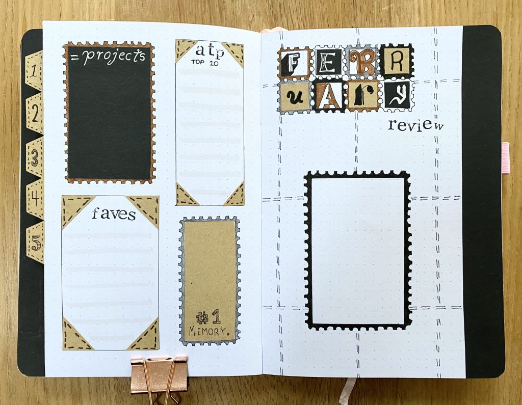
We then come to the final page in this setup, my February Review. Similarly to last month, the header and the space for a photo are on the right-hand page, while I have spaces for my projects, the ATP Top 10, my current favourites and my No.1 memory on the left-hand page. I alternated between stamp-style frames and suitcase-corners to frame each of the boxes. The header is a horizontal, smaller version of the cover page (albeit with a couple of alterations), with ‘review’ stamped out below. I also added more rows of faux-stitching to the right-hand page, to flesh it out and tie it into the rest of the setup even more.
So, there we have it, my February 2023, ‘Stamps and Fonts (Neutral Edition)’ bullet journal setup. This one means a lot to me- I hope you love it as much as I do!
Gemma
xxx