It’s time for another bullet journal setup and my theme for this month is The Eras Tour! I was lucky enough to snag a couple of tickets for one of the June shows, so it really felt like the perfect theme for the month ahead. Despite my long-standing love for Taylor Swift, I’ve never actually seen her live before, so this is kind of a big deal for me! Also a big deal: the whole leaving-the-house, going to a crowded concert thing. I’m nervous, but excited. I’m nervcited.
Let’s get into the setup, shall we?
Table of Contents
- Inspiration
- Equipment
- Cover + Quote Page
- Monthly Calendar
- Eras Tour Memories
- Weekly Spreads
- June Review
- Final Thoughts
Inspiration
For this setup, I was really inspired by The Eras Tour poster (which has recently been updated to include Swift’s new album: The Tortured Poets Department) and the friendship bracelets that are famously swapped between fans at the event.
Each of Swift’s albums (or ‘eras’) tends to be associated with a specific colour, as demonstrated by the poster. Following the poster, the album colours are as follows:
- Taylor Swift – pale green
- Fearless – gold/deep yellow
- Speak Now – lilac
- Red – red (astounding, I know)
- 1989 – pale blue
- Reputation – dark grey
- Lover – pale pink
- Folklore – grey
- Evermore – beige
- Midnights – dark blue
- The Tortured Poets Department – black
For each album, I tried to find both a coloured pencil and coloured paper in the right shade. I was pretty successful with the pencils- less so with the coloured paper. I purchased this pack of origami paper to use so that I would have lots of options, but I still ran into some problems, particularly with the grey shades! I feel my Reputation grey is more of a Folklore grey, and my Folklore grey is more of an Evermore beige, but, alas, what can you do?
Equipment
- Sakura Pigma Micron pens (01, 05, 08, 10 and Graphic 1) (I purchased mine in this set).
- Sakura Gelly Roll 10, Bright White.
- Coloured pencils.
- Coloured origami paper (I used colours from this pack).
- Scissors.
- Ruler.
- Pencil.
- Eraser.
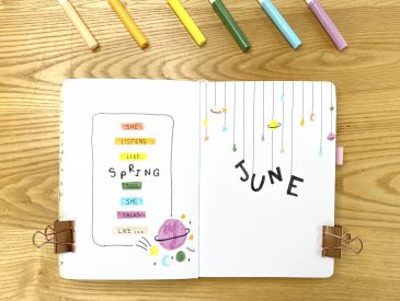
Cover + Quote Page
For my Cover Page, I wanted to recreate the graphic from the poster in a minimal (read: achievable) style. I opted to cut out the colour blocks for each album from origami paper and glue them into my journal, a bit like a hyper-organised collage. To finish off the right-hand page, I wrote ‘June’ below my collage in the iconic font from the poster. To recreate the font (which, if you’re interested, is Pistilli Roman), I sketched it out in pencil first, then drew around the outline of each letter with my 05 Sakura pen, before filled them in with the Graphic 1 pen.
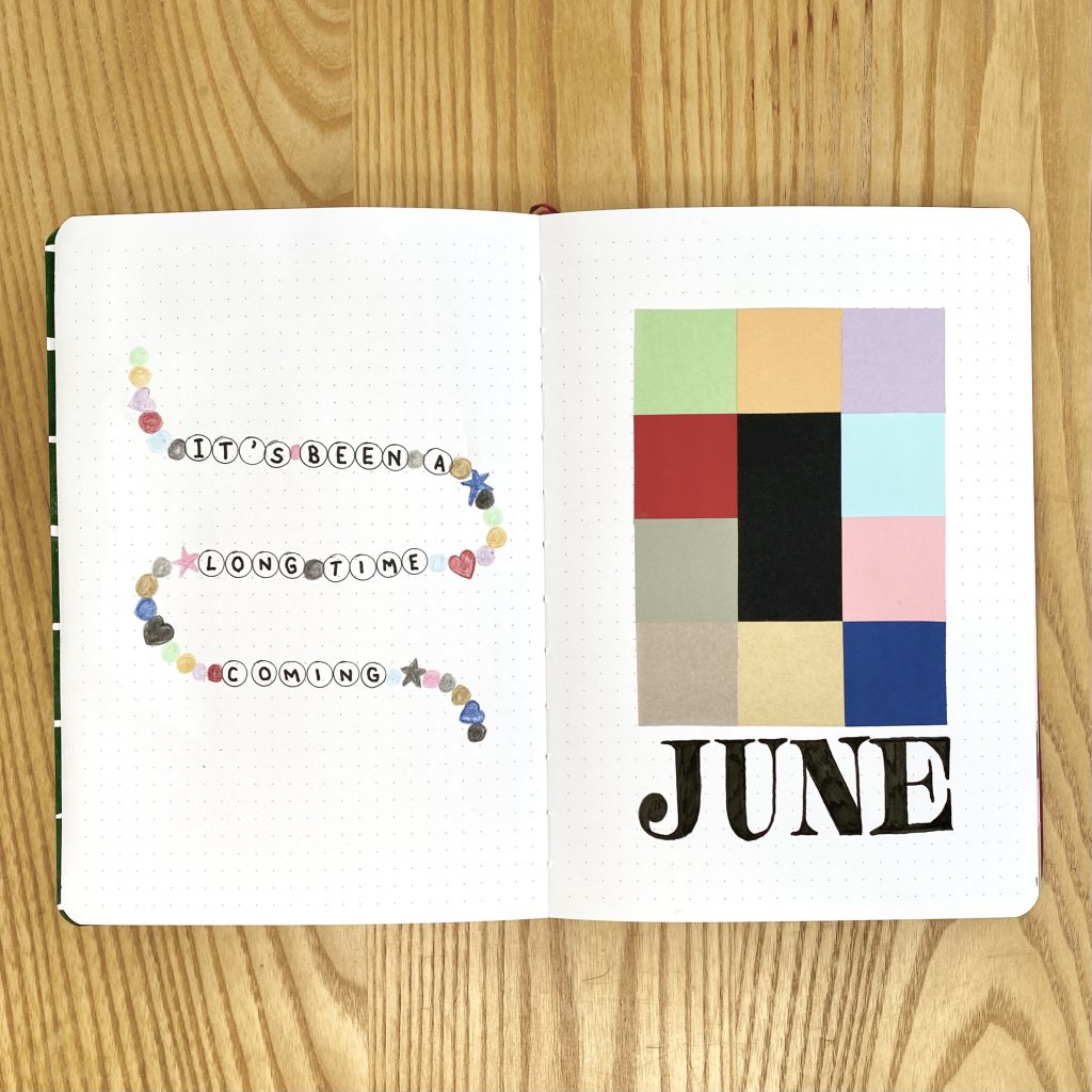
For the Quote Page, I wanted to use the opening line from the introduction to the Eras Tour, which is a lyric from Swift’s song Miss Americana and the Heartbreak Prince. ‘It’s been a long time coming’ just feels very fitting for me! I decided to create a ‘friendship bracelet’ of era-coloured beads, interspersed with alphabet letter beads, on which I wrote the quote. To make this, I sketched a wavy line in pencil, then used my 01 Sakura pen to draw the circles for each alphabet bead. I added an assortment of round, heart and star-shaped beads, using my coloured pencils. Finally, I used my 10 Sakura pen to write in the quote, one letter per bead. I used this friendship bracelet effect throughout the setup, for both quotes and headings (though I didn’t keep the star-shaped beads in my bracelet doodles moving forward, because I just wasn’t… loving them?)!
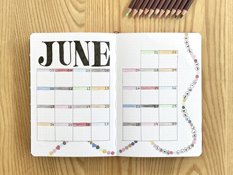
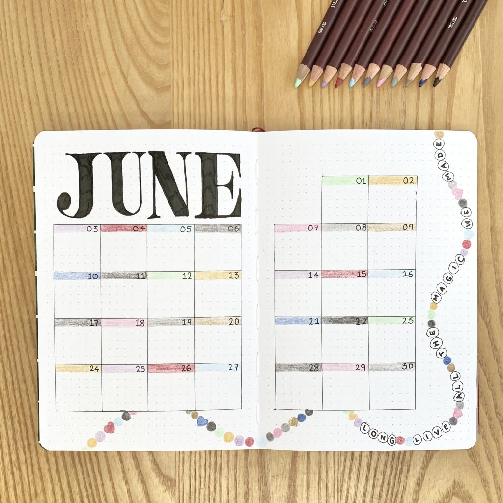
Monthly Calendar
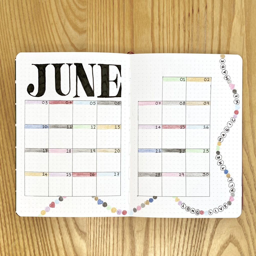
I think my Monthly Calendar spread might just be my favourite spread in the whole setup- I feel like it came together so perfectly! I went for my typical 6×6 grid for the calendar and used the same poster font to write the ‘June’ heading along the top. I used my coloured pencils to make bars of colour at the top of grid box, on top of which I wrote the dates. Finally, I decorated the space along the bottom and right-hand side with one long friendship bracelet (friendship necklace?), with another Taylor Swift lyric (from Long Live, which I LOVE and has, much to my dismay, recently been cut from the tour set list 🙁 …). This lyric one of my other options for the main quote page, so it felt right to give it this cool spot!
Eras Tour Memories
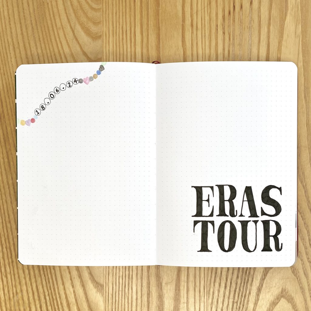
If you’ve been here before, you might have been expecting my Blog Planning/Daily Sunshine spreads around this point, but I’ve gone for something a little different this time around. I have been struggling to keep up with those spreads over the past few months, so I figured that a month off might allow me to reset, so that I can (hopefully!) get back into using them next month!
Instead of those pages, then, I decided to make a spread to fill with all of my memories from my Eras Tour experience. I’ve left the spread pretty empty, so I have lots of space to stick in photos, note down memories and just make myself a fun scrapbook-style spread to remind myself of the night. All I did was write ‘Eras Tour’ in the bottom right, in that same poster font, and add a small friendship bracelet doodle along the top left, with the date of the show written on the beads.
Weekly Spreads
Week 1
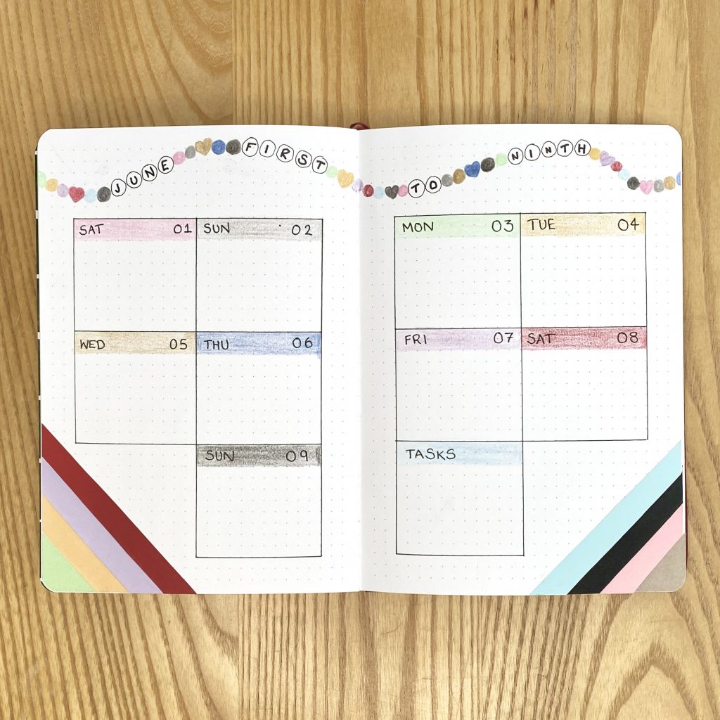
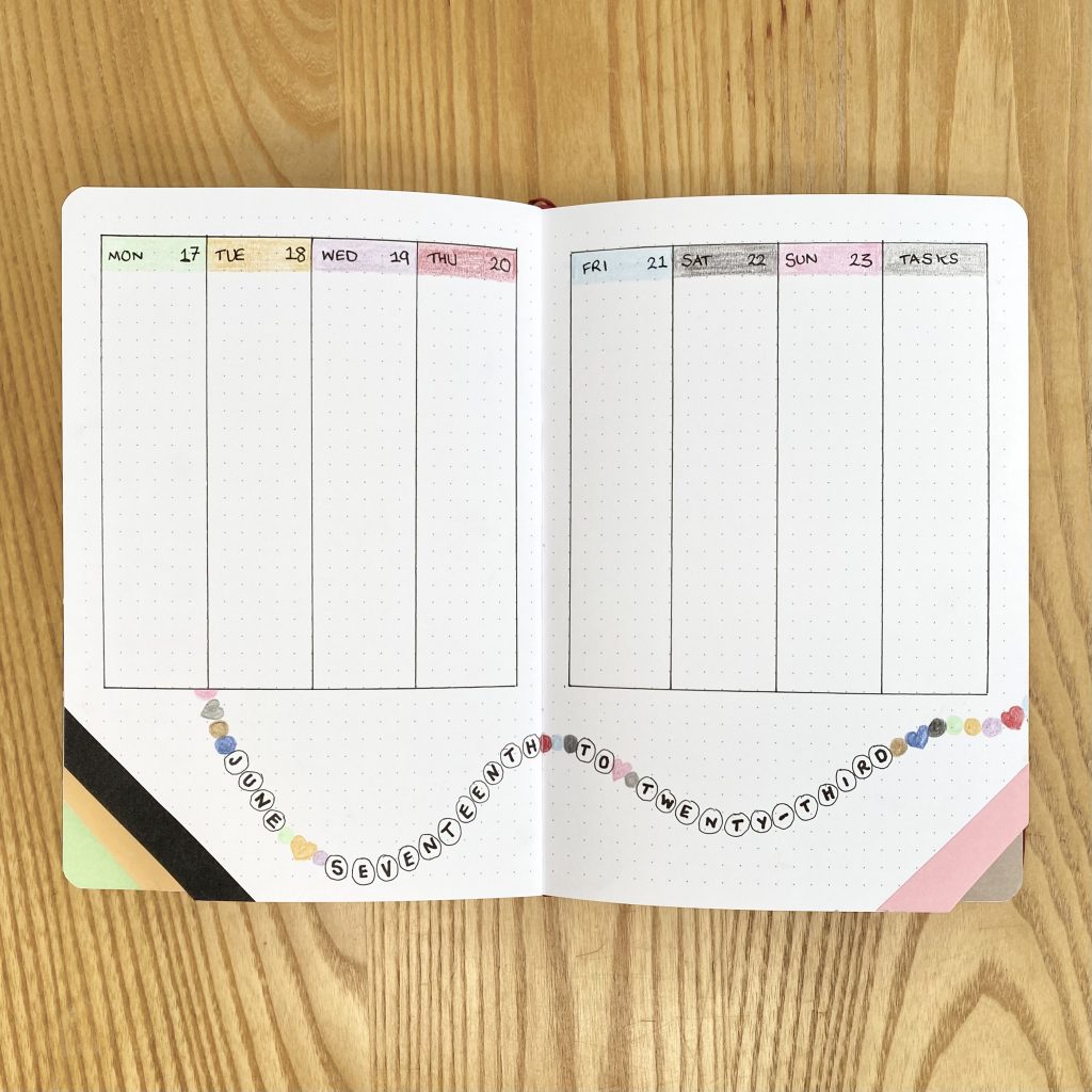
Because June begins with a weekend, I opted to just merge the first 2 days of the month in with the next week and make one big, 9-day spread. This ‘weekly’ spread, therefore, runs from 1st-9th June, so I needed 10 boxes, one for each day, plus one for my task list. I used my coloured pencils to add coloured bars to the top of each box, onto which I wrote the day of the week and the date, using my 08 Sakura pen. I used another friendship bracelet doodle for the heading, so I wrote ‘June first to ninth’ on the alphabet beads.
I’ve made no secret about my love for using tabs to separate out my Weekly Spreads, but something about it this month just felt like… urgh… a lot of work? However, not doing it felt wrong. I contemplated so many ideas and options, but none seemed to fit a) the vibe and b) my energy levels. Eventually, I had this wacky idea to make these diagonal, waterfall tabs in the lower corner and… I kind of love it? I decorated each tab with a strip of coloured paper, to help them stand out, then replicated the same design on the opposite, tab-less corner for, you know, consistency (I’m lying- it was absolutely so that I could incorporate more colours and, by extension, more Eras. This is an Eras Tour set up, after all!).
Week 2
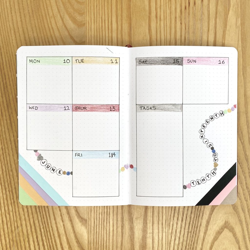
I kept all of the design elements the same throughout my weekly spreads, but changed up the layout for each one. This layout is fairly similar to the previous one, but, because I only needed space for 7 days, I was able to make my task box a little larger.
Week 3
For the third weekly spread, I opted for my favourite, vertical box layout, with the heading along the bottom.
Week 4
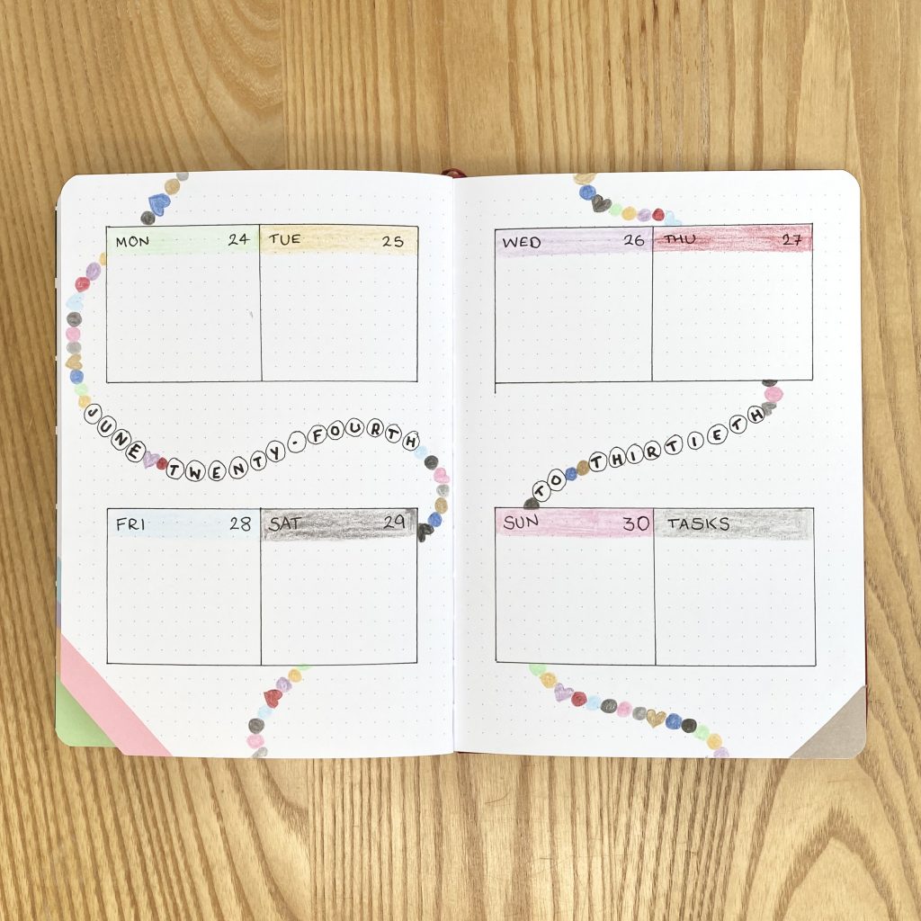
For the final weekly, I really went to town with the friendship bracelet decoration.
June Review
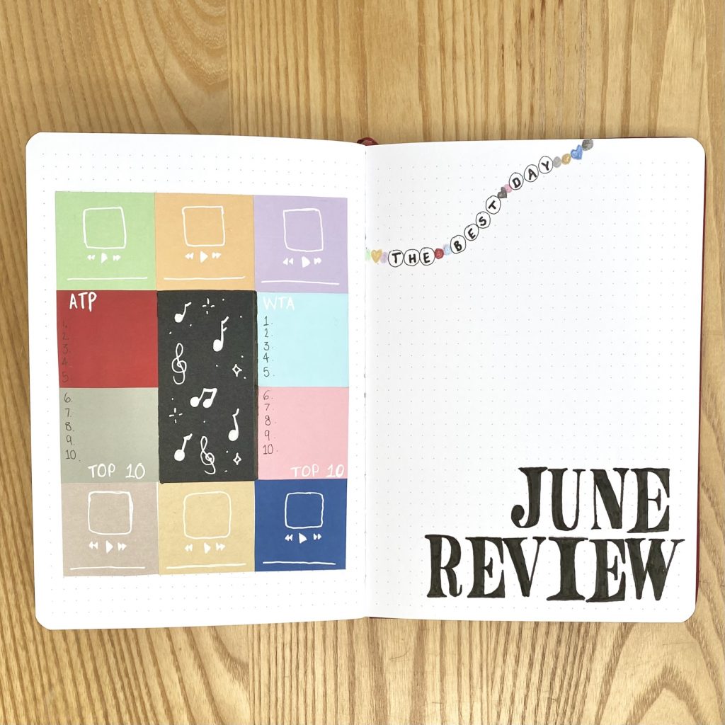
Finally, we come to my June Review spread! As always, I’ve used the right-hand page to house the ‘June Review’ heading and a favourite polaroid photo from the month. I haven’t bothered with a frame for the polaroid, or really much decoration at all, because I wanted to keep this side of the spread pretty simple. I did however, add a little friendship bracelet decoration along the top left of the page, with the (quite fitting, I think) title of one of my favourite Taylor Swift songs: The Best Day.
On the left-hand page, I typically include spaces to note down the ATP & WTA Top 10, my favourite songs from the month and my favourite memory from the month. I’ve opted to leave off the memory section for this month, because I’m pretty sure I know what it will be (and it already has a double-page spread dedicated to it!). To create this page, I created the same minimalist, block colour version of the Eras Tour poster that I did on my cover page, but just a little larger here. I used the 6 boxes along the top and bottom to house my favourite songs from the month, then used the 2 boxes down each side for the tennis top 10s. To finish it off, I decorated the centre, black panel with little musical and sparkle doodles, just to really drive the whole concert theme home. To keep this spread nice and light, I opted to use my white Sakura Gelly Roll for all of the subheadings/doodles, instead of my usual black pen.
Final Thoughts
I’m really happy with how this spread turned out- I love how colourful it is, without being too ‘in-your-face’ and I love how much it really feels like an Eras Tour-themed spread! I also love that it was pretty quick and easy to setup, which was just what I needed this month. I really think I’m going to enjoy using it over the next month and I’m hoping that it will help to get me in the mood ahead of the concert (and help me relive all the fun memories afterwards!).
I hope you’ve enjoyed this Eras Tour-inspired bullet journal setup! I’d love to hear what you think about it in the comments below!
Gemma
xxx