
This month, I really wanted a bullet journal setup that was quick and easy to create, while still being pretty and functional. The novelty of winter has definitely worn off for me and I’m craving the sunnier, longer days of spring. Easter is also early this year- it falls on the 31st of March, so I thought that a soft, pastel bullet journal setup would be perfect for welcoming in the new season of daffodils, Cadbury Mini Eggs (my one true love) and lambs. I ended up with a setup that kind of looks like the Easter Bunny threw up flowers all over it, and… I think it’s absolutely perfect.
I actually created this whole setup in one sitting (which is absolutely unheard of for me), so I definitely feel like I succeeded in my aim of making a quick and easy setup! I don’t feel like I had to sacrifice an aesthetic setup for that simplicity, though- yes, this setup was super straightforward to create, but it’s also cheery, happy and colourful. While it’s not necessarily my usual style, I just know it’s going to bring me so much springtime joy when I start using it next month.
Table of Contents
- Equipment
- Cover + Quote Page
- Monthly Calendar
- Blog Planning + Daily Sunshine
- Weeklies
- March Review
- Final Thoughts
Equipment
Because I wanted to keep this setup super simple, I made sure to keep my equipment to a minimum. As a result, this list is significantly shorter than usual!
- Tombow ABT Dual Brush Pens: N45 (cool grey 10), 062 (pale yellow), 243 (mint), 553 (mist purple) and 623 (purple sage). You can purchase the latter 4 shades together, as part of the Pastel Colours pack.
- Crayola SuperTips: pale pink and pale orange, from this pastel pack.
- Pencil.
- Ruler.
- Eraser.
- Scissors.
That’s it! Are you impressed?!
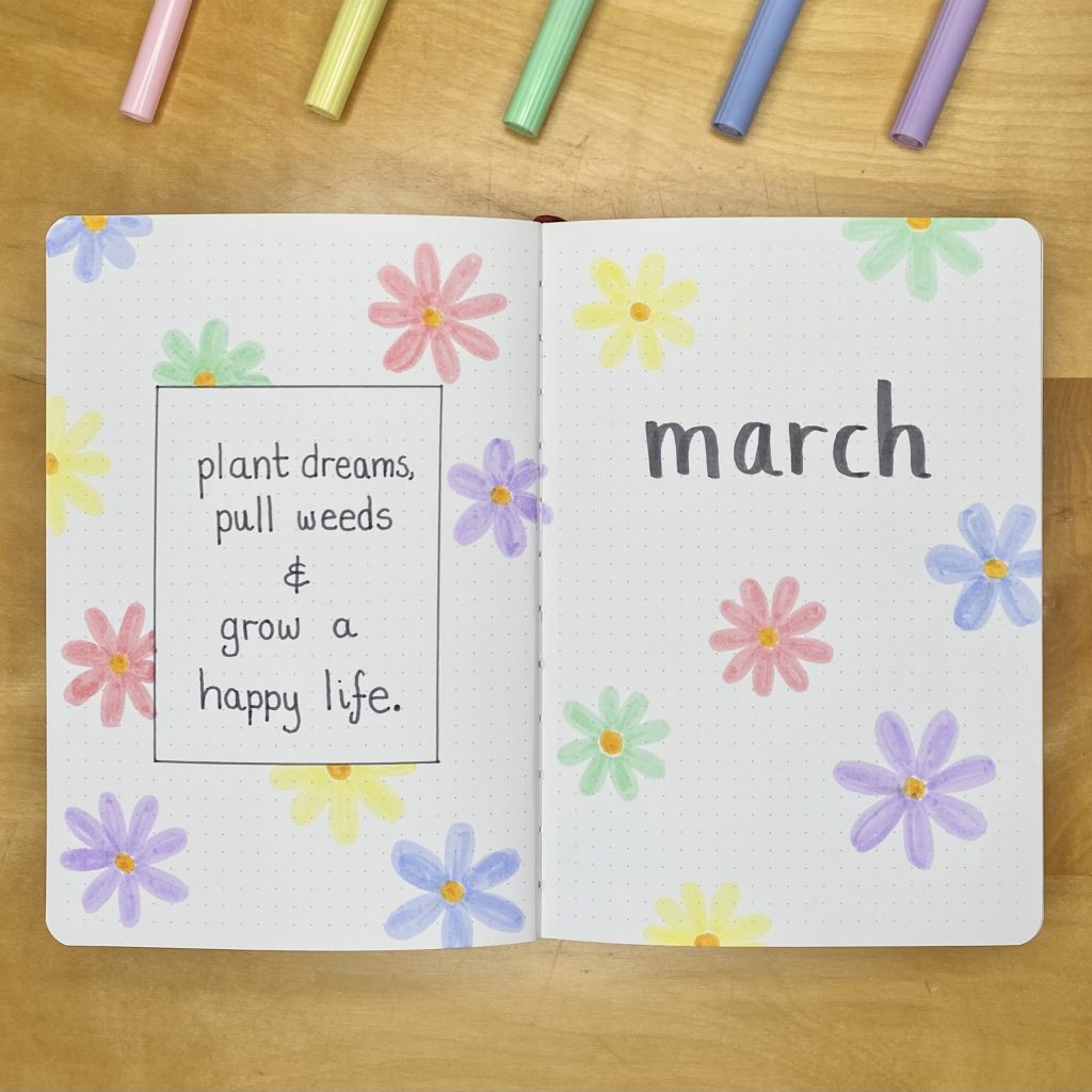
Cover + Quote Page
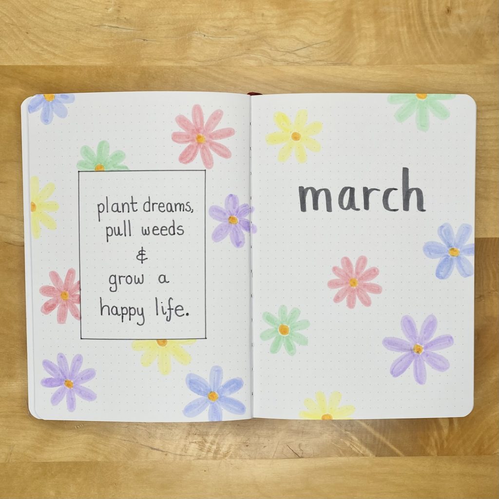
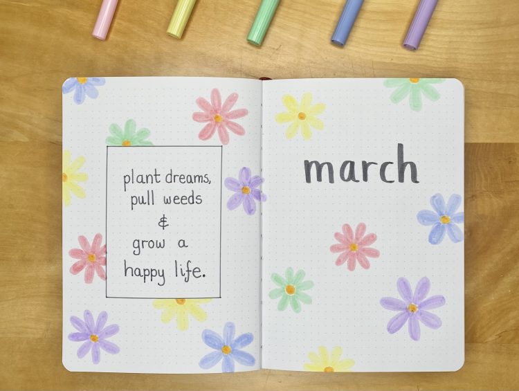
The Cover Page was the one part of this setup that I actually planned out in advance (in that I just knew I wanted a bunch of pastel flower doodles all over the page, with the heading towards the top). I used my orange Crayola SuperTip marker for the centre of each flower, then used 5 different pastel shades of Tombow/Crayola pens to make the petals. I varied the sizes of these flowers a little, just to add some dimension, but I kept the technique the same. I used the brush tip of my Tombow N45 and a simple, lowercase font to write out all of my headers, throughout the whole setup. I didn’t want to use anything too harsh that would overshadow the pretty pastel colours of the flowers, so I opted for this dark grey shade.
For my Quote Page, I wanted something uplifting and garden-focused. I chose this one: ‘plant dreams, pull weeds and grow a happy life’, which I found on Instagram (I couldn’t find the original source though- so if you happen to know it, please do let me know in the comments!). I like this quote, because I think it’s positive, inspiring and very fitting for spring. I wrote out the quote using the fine end of that same Tombow N45 pen, then used the same tip to draw a simple box around it. I then decorated the page with more flower doodles, to tie it into the Cover Page.
Monthly Calendar
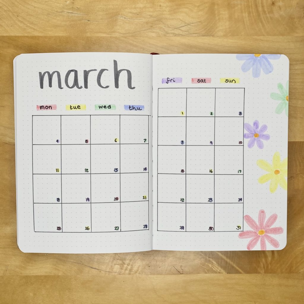
For my Monthly Calendar, I used my typical grid format. I drew out the grid using the fine tip of my Tombow N45, then used the same pastel colours that I used for the flower doodles to highlight the days of the week, along the top, and the dates themselves, within the calendar. I added the heading in the top left, in the same style as before, then filled the empty space down the right-hand side with more flower doodles.
Blog Planning + Daily Sunshine
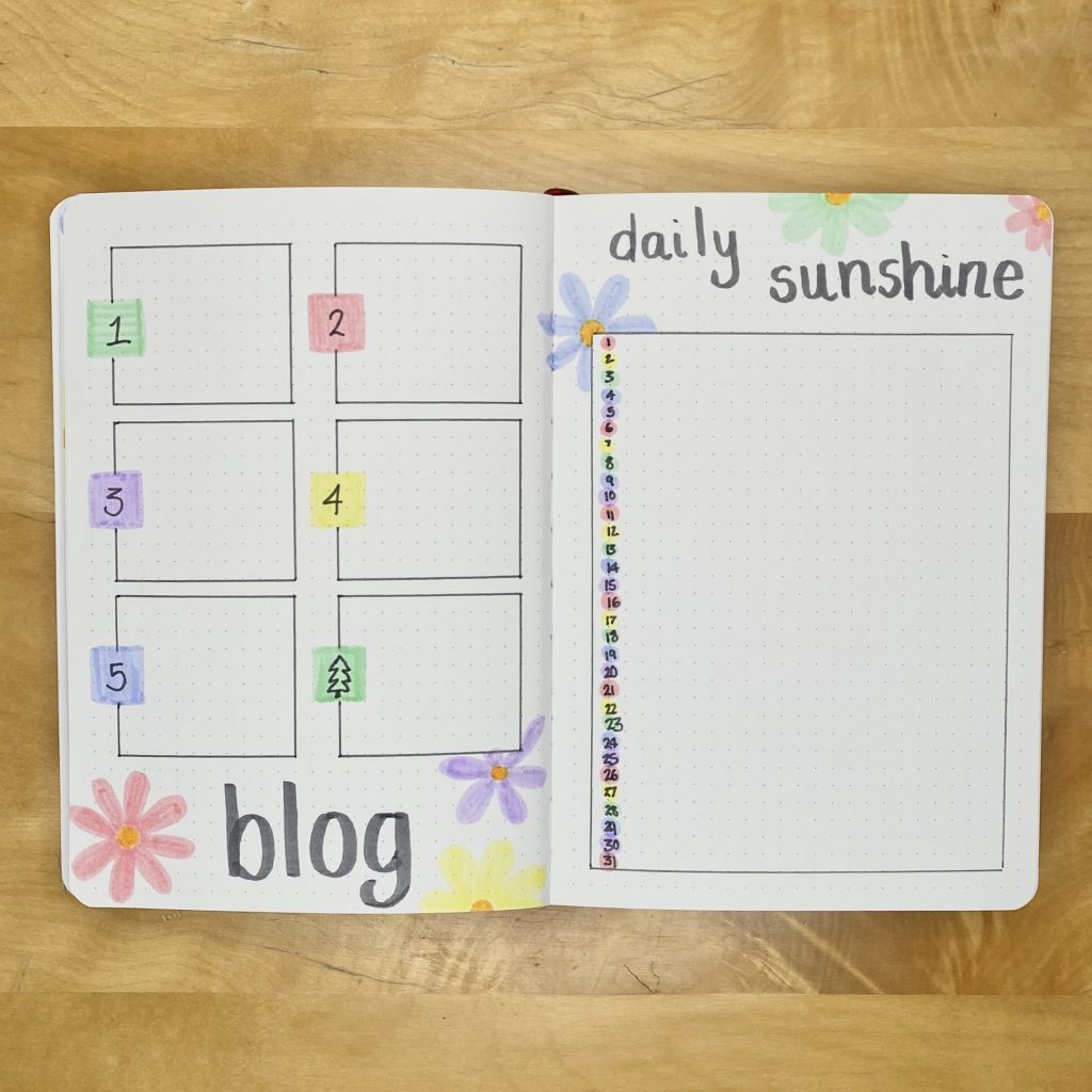
I’ve cut my Blog Planning spread back down to a single page this month. While I’ve recently been setting up a whole double-page spread for it, I’ve just not been using it quite as much as usual, so I thought that I might as well go back to a single page. I wrote the title at the bottom, along with some flower doodles, then divided the rest of the page into 6 equal boxes (3 down, 2 across). I used the fine tip of my Tombow N45 to draw out the boxes, leaving a gap on the left-hand side of each box for the subheadings. I coloured in those gaps with the pastel colours, before writing in the numbers 1-5 (for each post that I’ll be working on), plus a little Christmas tree doodle, for my Blogmas At Home prep section.
My Daily Sunshine spread is very similar to its previous iterations. I put the title along the top, with a few more flower doodles, then drew a big box around the remaining space for my daily notes on the happy/positive things that happen throughout the month. I put the dates down the left-hand side, over the top of little spots of the pastel colours.
Weeklies
Into my Weekly setups now and, as always, I’m using tabs to separate them out and help me navigate my way through the setup. I coloured in the tabs using the pastel markers, but I didn’t bother adding any colour behind the tabs, like I usually do, because I think the pastel colours stand out best against the white paper (and I was keeping things simple, anyway!). I did, however add a double line of my Tombow N45 on the far left of the first page and the far right of the last page (my March Review page), mainly to remind myself not to go past there with my doodles, but also to help balance out the first weekly spread a little bit.
Week 1
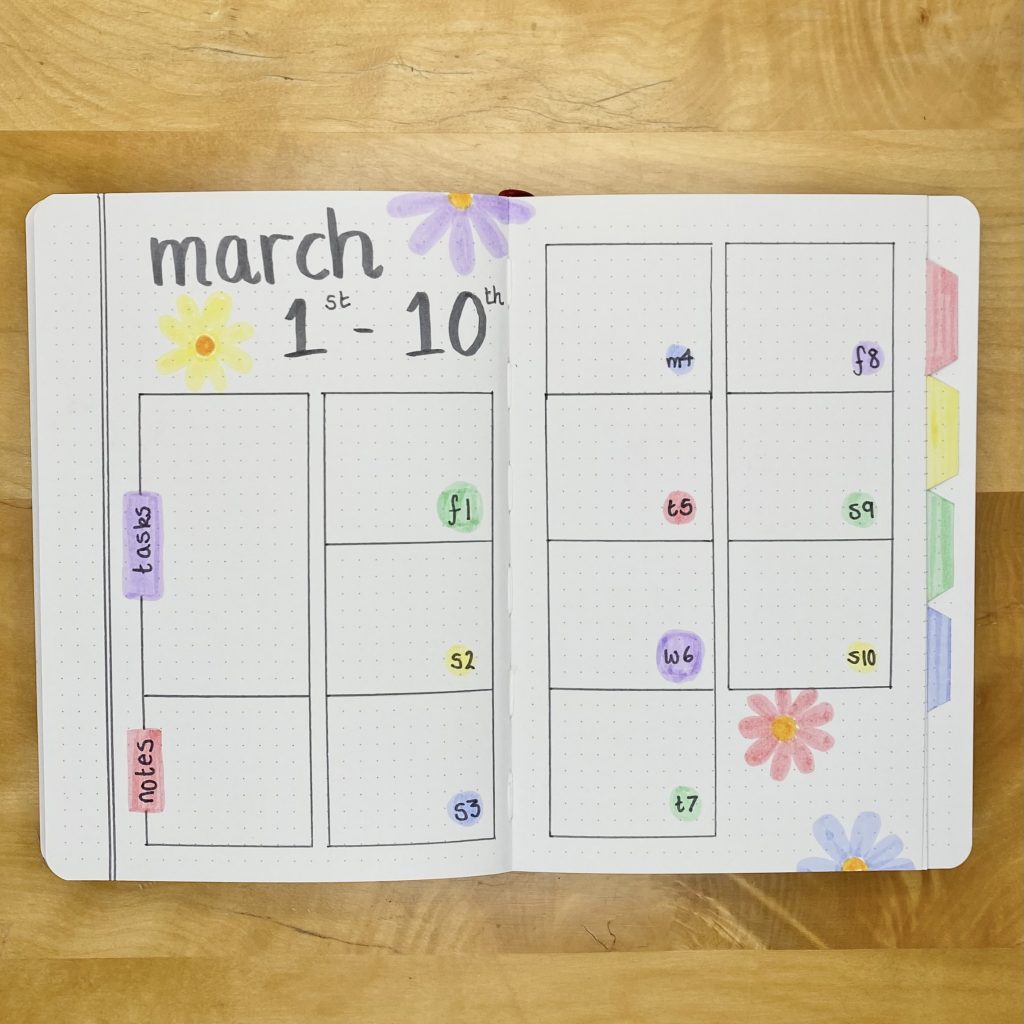
The first day of March falls on a Friday, so I didn’t bother making a whole weekly spread for those first 3 days- instead, I just merged them with the first full week and made a 10-day weekly spread. I divided each page into 8 (4 down, 2 across), and used 10 of the boxes for my daily logs. I then merged two boxes together for my task list, and used the remaining box for my notes. I added the header to the top left, along with some more flower doodles, which I also used to decorate the leftover space in the bottom right.
Week 2
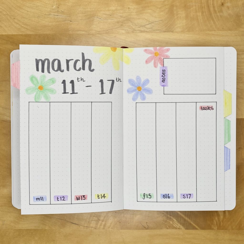
I used my favourite vertical layout for this weekly spread, where each page is split into 4 columns (one for each day, plus one for the task list). I put my notes section along the top, then filled the rest of the space with the header/more flower doodles.
Week 3
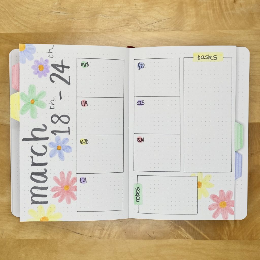
For the third weekly spread, I put the header down the left-hand side and placed my daily logs centrally on the spread. I put the task list down the right-hand side, with a space for notes at the bottom of that page, next to some more flower doodles.
Week 4
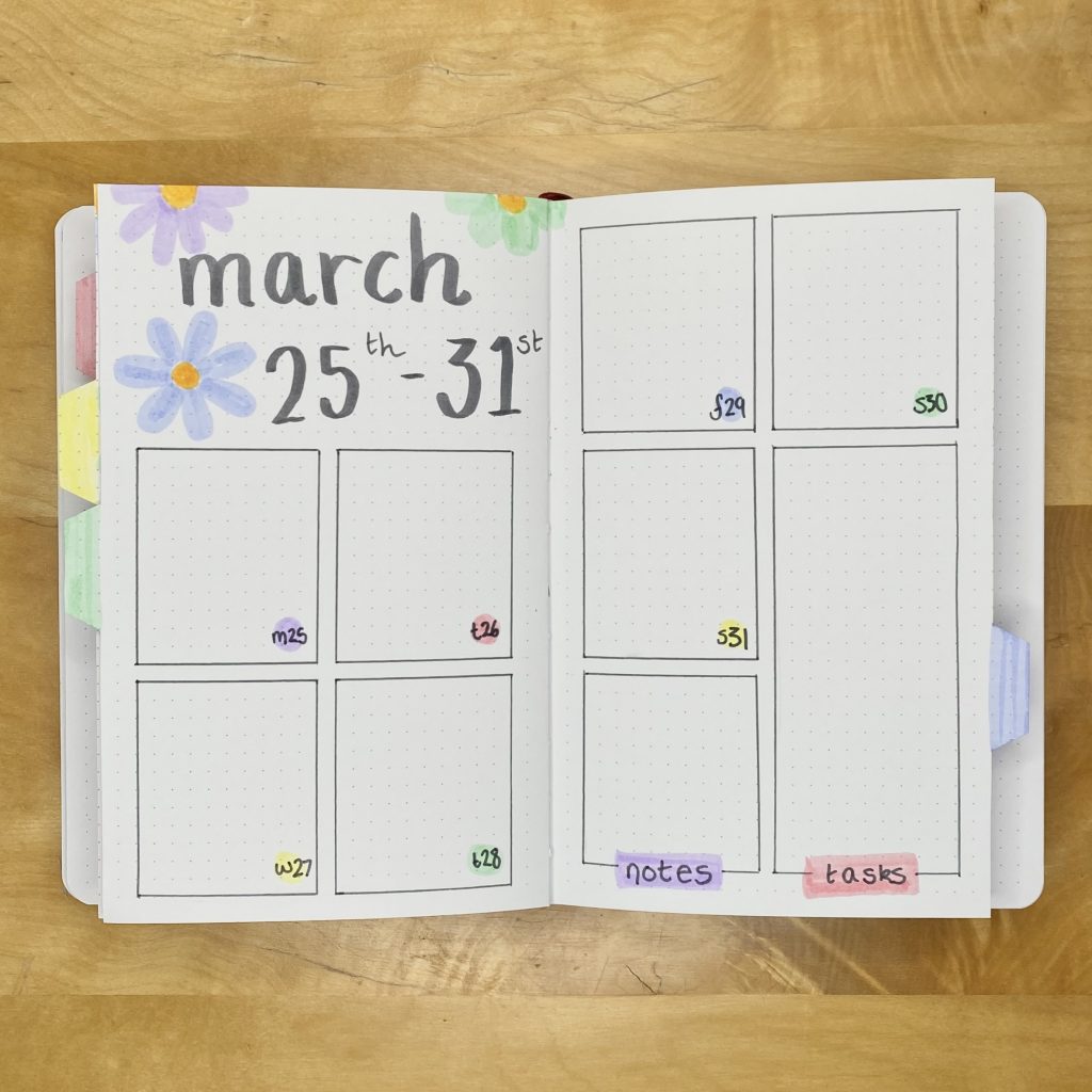
For the final week in March, I divided each page into 6 (3 down, 2 across) and used 7 of the boxes for my daily logs, 1 for my notes, then merged 2 vertically for my task list. I then used the remaining space in the top left for the header.
March Review
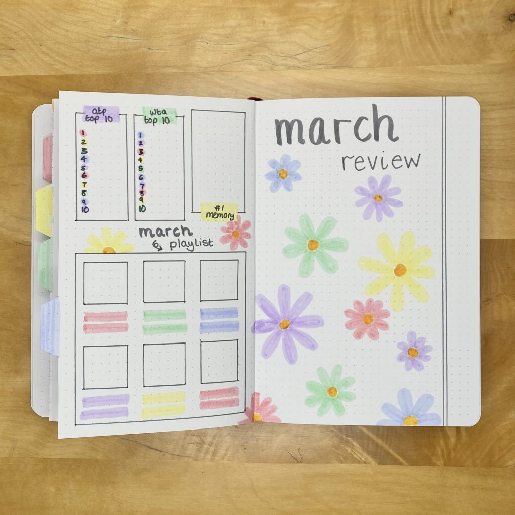
Okay, I admit, I possibly went a bit overboard with the flower doodles on this March Review page. There was a reason, though! I figured that, instead of making a frame for my monthly polaroid, I’d just draw a bunch of flower doodles and stick the polaroid over the top, so the photo will hide a lot of the flowers anyway. Still, though, until the end of the month, I’m stuck looking at this aggressively Easter-y spread. I guess didn’t really think that one through…
I kept the same format for my review sections on the left-hand page, because it’s been working really well for me: there’s a space to record both the ATP and WTA Top 10, my favourite memory and my top 6 songs from the month.
Final Thoughts
There are lots of things that I absolutely love about this setup- I love how cheery it is, how Easter-y, I love the colours, the flowers and the softness, but, most of all, I love how quick and easy it was to set up. I admit, I tend to put a lot of work into my bullet journal spreads because I like them to look really nice, but it’s nice to know that it’s possible to make really lovely setups without having to dedicate so much time and effort to them. Don’t get me wrong, I like putting in that effort (most of the time), but it’s good to be flexible!
I hope you have enjoyed my March 2024 Bullet Journal Setup! I’d love to hear what you think in the comments below and let me know- are you as ready for springtime as I am?!
Gemma
xxx


I absolutely love this and yes totally ready for Spring here
Thank you so much. I’m glad it’s not just me!