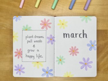
You may have noticed that I didn’t post my March bullet journal setup here on the blog and… there’s a very good reason for that: it doesn’t exist! February was quite hectic (unexpectedly so) for me this year, so I just didn’t have the time or energy to create a setup, but that’s okay! Sometimes it’s easy to forget that my bullet journal’s main purpose is to be a functional planner that helps to keep me organised and minimise the stress of day-to-day life, but, at its core, that’s really all it is. In March, then, I just had a hastily drawn calendar setup, and multiple blank pages, filled with assorted notes and to-do lists: nothing fancy and definitely nothing worth showing on here, but functional nonetheless.
April, though, is another story (new month, new me and all that). I’m back to my usual bullet journalling ways, with a proper (albeit still relatively simple) setup, vaguely inspired by 70s-style line art, but mainly just an excuse for me to pass some time by colouring.
Let’s get into it, shall we?
Table of Contents
Equipment
To create this setup, I used the following equipment:
- Uni Pin Fine Line pen: 0.5, sepia.
- Coloured pencils (for reference, I used the shades Yellow Ochre C050, Sea Green C380 and Pimento C540, from a much older version of this set, which is crazy expensive and not at all necessary for this setup, but very nice all the same).
- Scissors.
- Corner rounder.
- Circle stencil (specifically, I used the 30mm diameter circle stencil from this set).
- Pencil.
- Ruler.
- Eraser.
Cover + Quote Page

For my Cover + Quote Page this month, I opted to go for a pretty minimal, but still quite striking design, with this big line art detail and block capital heading. To make the line art, I sketched out the design with pencil first (using the circle stencil to map out the rounded shape of the corners), before adding the colour (coloured pencils, after all, cannot be erased if you go wrong…). To make the block capital heading, I drew the outlines of the letters with my brown Uni Pin pen, then (rather painstakingly, I must say), filled each letter in with the same pen.
It took me a while to decide on a quote for this month, but I eventually settled on this lyric by Ed Sheeran. I’ve been listening to Subtract again recently, and I just though that this quote had the perfect, sweet, springtime vibe that I wanted for this month.
Monthly Calendar

As usual, for my Monthly Calendar, I’ve opted for a simple grid format (where each box is 6×6 dot grid squares). I drew out the grid with that same brown pen, then wrote in the dates with the same pen. I also added a thin, drop shadow border to the boxes, just to help them stand out and add a bit of dimension to the spread. I placed the ‘April’ heading on top of the line art design on this spread, but I’m not super happy with how it looks… I definitely prefer the contrast of the brown text against the white page— I think it gets a little lost among the other colours here.
Weekly Spreads

Into my Weekly Spreads now and, as I’ve been doing in all of my setups recently, I’ve trimmed down the inner pages so that my master task lists on the left and right are always visible, no matter what week I’m on. I used my corner rounder to soften the corners of those trimmed pages, partly because it fits with the vibe of the rounded line art, but mainly to minimise my risk of paper-induced injuries!

For the line art in this section, I tried to make it so that, no matter what page I’m on, the line art flows seamlessly from one side of the spread to the other. This took a little extra time, but I do think it looks really neat.

I added drop shadows to all of the boxes, just like with my Monthly Calendar, to help them stand out on the page. I also added some simple lines to the daily task boxes and page headings, just to add a bit of extra detail.

My daily task boxes aren’t huge this month (serves me right for all of that extra decoration at the top of the pages), but they’ll still be helpful for jotting down events and appointments, especially considering I have all the extra space for listing general tasks on the left and right side.

The last three days of April fall at the start of a new week, so I opted to include smaller sections for the first four days of May on my final weekly spread too, just so I can have a clearer picture of the whole week, when it comes.
April Review

Finally, we have my April Review spread, which, as always, features a large, empty space on the right-hand page for me to stick in a polaroid from the month gone by, then more specific boxes on the left-hand page for me to fill in at the end of the month. These boxes are pretty much the same each month: I have one to list out the tennis top 10s (ATP & WTA, respectively), because I like to see how they change over the course of the year, one to write down my favourite memory from the month and one to note down my favourite songs from the month (I like to narrow this list down to six each month, so I’ve split that box up in advance). I ran out of space for a subheading for my music choices, but I’ll remember what it’s for!
Final Thoughts

I really like this setup— it was super easy to create, but the process was also quite mindful (it was basically 90% colouring, which was very fun). It’s simple and relatively minimal, but it doesn’t feel minimal (which is good, because I’m not a very minimal person). I continue in my belief that drop shadows make everything better, and I think that this setup really supports that hypothesis!
I have had a few issues with the coloured pencil sections transferring to the opposite page while the journal is closed, but it does come off pretty easily with a gentle erasing, so it’s not the end of the world (just a little annoying). I would have liked to include more colours in my line art— perhaps some more earthy browns or oranges, to really give these spreads more of that 70s vibe, but I didn’t want the line art to be too fussy (with thinner lines) or too dominant (with more thick lines) on the spreads, so I had to narrow down my colours a little.
I should also definitely get a brown pen with a thicker nib, because filling in all those block capitals and drop shadows with a 0.5 size fineliner was… not the most efficient use of my time, but it looks good, so I can’t really complain!
I hope you’ve enjoyed reading about my April bullet journal setup (especially after the March setup was MIA…). I’d love to hear your thoughts in the comments below!
Gemma
xxx


