
Speak Now (Taylor’s Version) was released last month and I have been loving listening to it so far! Speak Now was my favourite Taylor Swift album for YEARS when I was younger, so listening to the updated version has been such a nostalgic experience. I knew I wanted to do a Speak Now (Taylor’s Version) bullet journal setup, but I wanted to wait until I’d had a chance to hear all the ‘Vault’ songs, so that I could really draw inspiration from the new parts of the album. Because of that (and because I really wanted to do a Wimbledon setup for July!), I opted to use the album as my theme for my August setup, even though it was released in early July. Honestly, I’m so glad I went with that plan- the ‘Vault’ songs ended up providing me with so much inspiration!
Anyway, let’s get into it, shall we?
Table of Contents
- Inspiration
- Equipment
- Cover Page
- Monthly Calendar
- Projects + Daily Sunshine
- Weeklies
- August Review
- Final Thoughts
Inspiration
Speak Now (Taylor’s Version) has a very romantic, fairytale-esque vibe, so I tried to reflect that in my setup this month. I tried to incorporate some more ornate elements, as well as some slightly more detailed doodles to really reflect my source material. As usual, I completely overestimated my artistic abilities. My drawing are… not perfect (cursed hand, I’m looking at you), but I think they still convey the right vibe! Also, this setup is a veritable explosion of purple. In my defence, Speak Now has always been Swift’s ‘purple’ album, so I just had to do it, really.
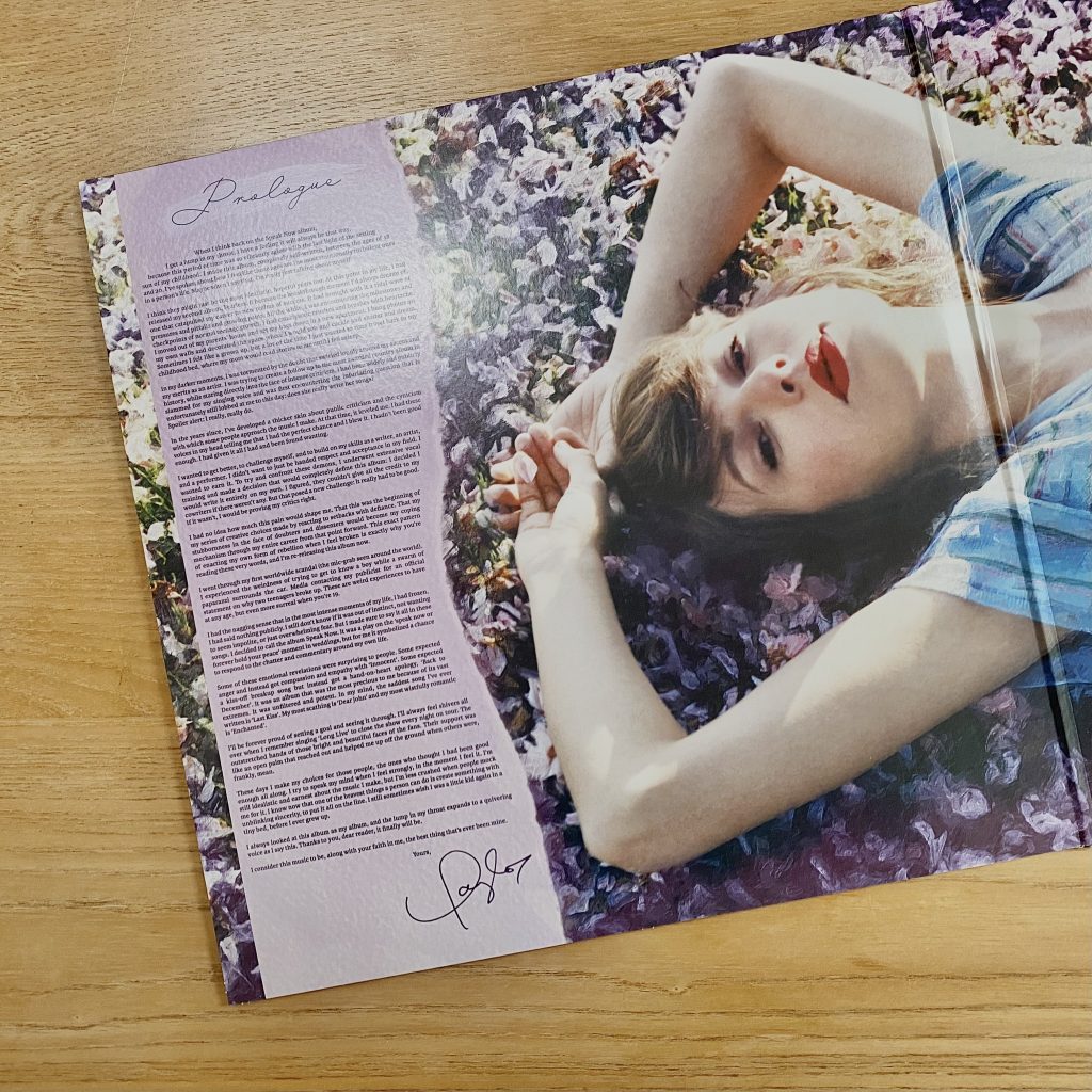
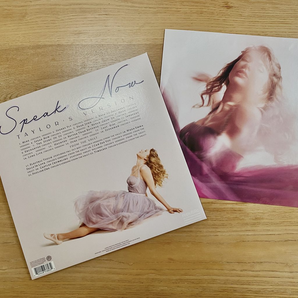
A couple of (slightly more niche) sub-inspirations (is that a word? Probably not, but it will have to do): I have recently begun a collection of Taylor Swift vinyls (because, well, take my money, Taylor), so I did refer to my new Speak Now (Taylor’s Version) vinyl (I got the Orchid colourway) for some extra inspiration! One of the recurring elements in this setup, the torn purple paper, is inspired by the inside cover, as shown above.
At the time of writing, Swift has released one music video for the new album, for the song I Can See You (Taylor’s Version) (From the Vault). The music video doesn’t necessarily fit the vibe I had in my head for this setup (it has a heist storyline- not really the flowery, purple fairytale I was rolling), but there was one thing that caught my eye: the gold picture frame. In fact, a gold frame was also featured in the promotional content for the album, posted by Taylor Nation, on Instagram. I think the latter may have been an Easter egg for the music video, but no matter- I knew I just had to include a gold frame in my setup. In fact, I ended up including 2! They’re not the same shape/style as the one in the video, because I wanted a slightly more romantic, fanciful vibe, but I think they are still a fun nod to the video.
As I mentioned before, I waited until I’d heard the ‘Vault’ tracks on the album before sketching out this setup (side note: I think these might be my favourite ‘Vault’ tracks, out of the three albums Swift has re-released- I found the others a little hit-or-miss, but these are all firmly hits for me!). Most of the doodles, therefore, are inspired by the 6 new song- with a couple of exceptions, here and there.
In terms of fonts, the back cover of the album includes two very distinct fonts: there is the ‘Speak Now’ cursive font, which is pretty similar to Swift’s handwriting, and the standard ‘Taylor’s Version’ font, which is a fine, block capital font with slightly thicker down strokes. I made use of both of these fonts within my setup. On the whole, I use the cursive font for headings/titles and the block capitals for subheadings and quotes.
Anyway, enough chit-chat. Let’s look at the equipment you’ll need to recreate this setup in your own bullet journal.
Equipment
- Muji 0.38mm pen, black.
- Uni-ball Signo Broad, gold.
- Tombow ABT Dual Brush pens: 623 (Purple Sage), 606 (Violet), 990 (Light Sand) and a selection of grey shades, from this pack.
- Crayola SuperTips: mainly purple shades (purple, plum, wisteria & heather), but also some other rainbow shades for the fireworks. (SuperTips don’t have ‘names’, so these are my best estimations of the shades. The exact pens that I used are from a combination of this pastel pack and this assorted pack).
- Kuretake clean colour dot pens, mild colors (for this setup, I only used the purple shade from this pack).
- Gold glitter paper (this stuff is great– it doesn’t shed and it’s easy to cut. The back of each piece of paper is white, so you can easily sketch out your designs before cutting, and it’s not as thick as regular card, so it’s great for bullet journalling!).
- Purple lined paper.
- Pencil
- Ruler
- Scissors
Cover Page
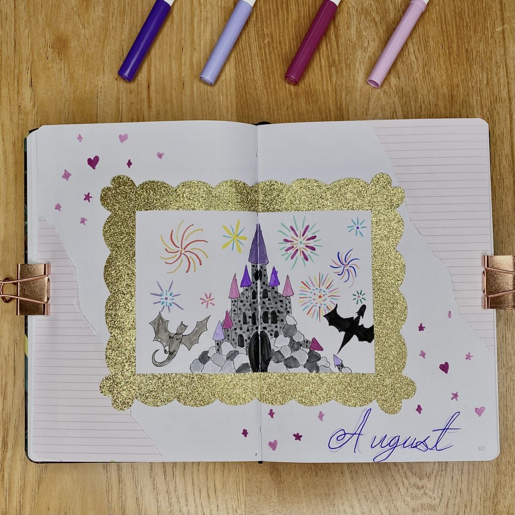
Like in my May 2023, Bridgerton-inspired bullet journal setup, I wanted to use a whole double-page spread for my cover page this month. Usually, I opt for putting my cover page on the right-hand side and a quote page on the left, but I had a vision for this setup.
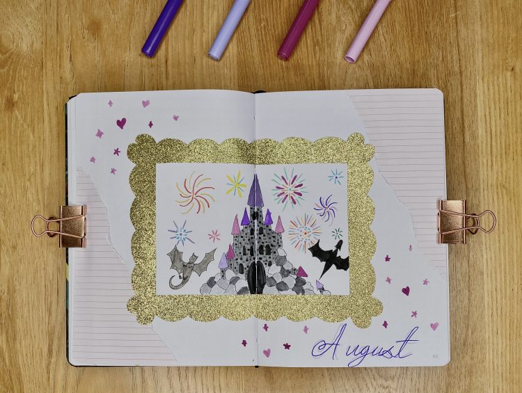
This is one of two pages that feature a gold frame. To make the frame, I used the gold glitter paper and sketched out a scalloped frame on the back, before cutting it out. Within the frame, I drew (my best attempt at) a castle (partly crumbling, of course), with some dragons (an ode to Long Live) and some fireworks (an ode to both Sparks Fly and Dear John). I used a variety of grey shades from the grey Tombow pack for the castle/dragons and a selection of rainbow colours from my two SuperTips packs for the fireworks. I really wanted this drawing to have lots of little references to songs from the album, but also to convey that magical, almost childlike, fairytale vibe. I also added some torn purple paper, for extra decoration. For the monthly header, I tried to mimic the font used for the title on the album’s back cover, using two different shades of purple (I used the fine tip of my 606 and 623 Tombow pens), and added some little heart/star/twinkle doodles around it, almost like confetti, using my plum and wisteria SuperTips.
If I’m being honest, I feel like this cover page doesn’t quite live up to the rest of the setup. I don’t know if it’s just because there’s less purple on it, or because of my lack of drawing ability, but it’s just not my favourite? On the bright side, all the little Speak Now references do make my heart very happy, so it’s not all bad!
Monthly Calendar
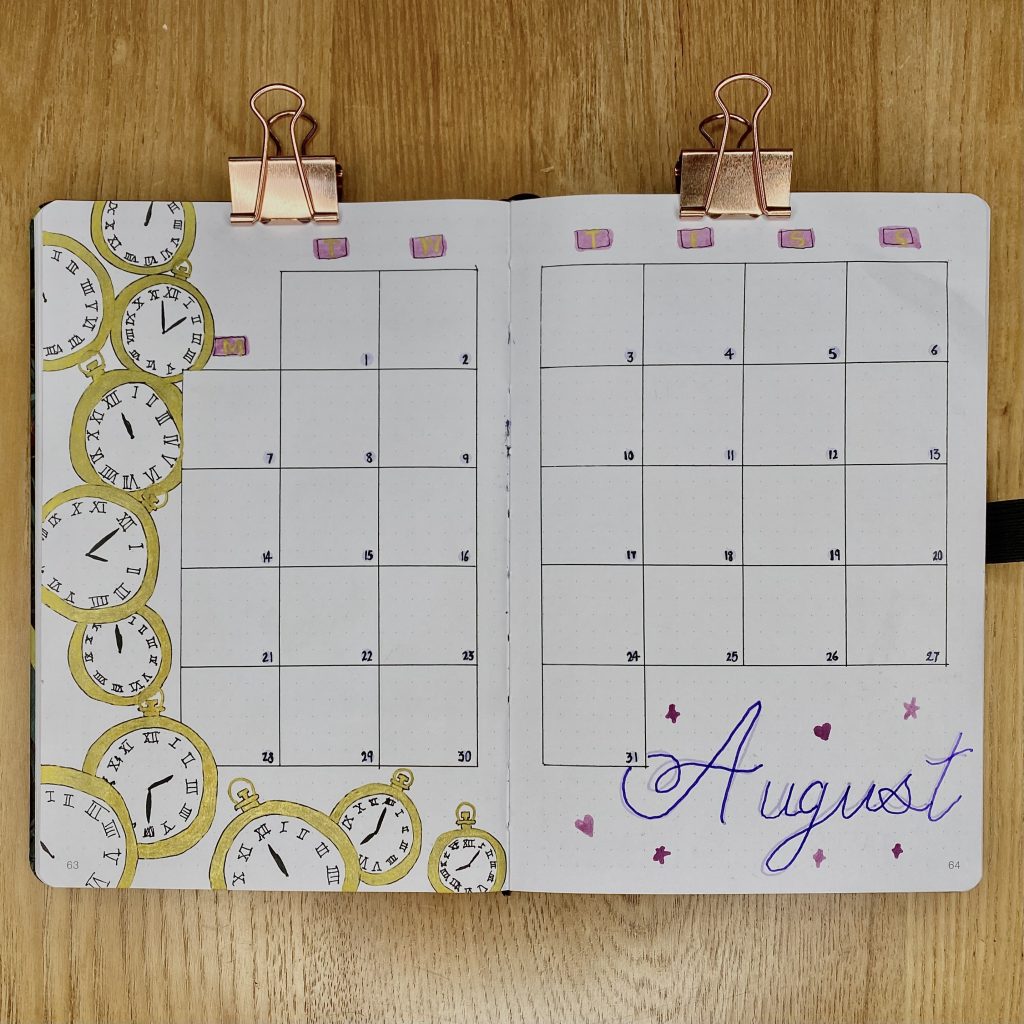
Time is a major theme throughout the album, so I knew that I wanted to incorporate some clocks into this spread (I mean, one of the ‘Vault’ songs is literally called Timeless). I opted to use a traditional, pocket watch style for my clocks, and created a cascade of them, using my Uni-ball gold pen, going down the side of my monthly calendar. I even made sure to have some clocks pointing to specific times that are referenced in the album’s lyrics!
Aside from the clock cascade, this monthly calendar was pretty simple: I opted for my typical calendar grid, with a 6×6 box for each day. I used my purple Kuretake dot pen for the dates. For the title, I used the same two-tone style as my cover page, along with the little confetti doodles.
Projects + Daily Sunshine
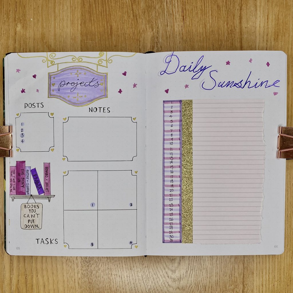
Last month, I included a ‘hub’ spread in my journal for the first time. I liked it, but I’m still tinkering with it to make sure it is as useful to me as possible. This month, we have a slightly adapted version of the ‘hub’, which I have called ‘projects’ (even though it is really just my notes for this blog!). One of the ‘Vault’ songs in the album has an antique shop as its setting, so I decided to channel that vibe into this spread. I used my heather SuperTip and Uni-ball gold pen to make an ornate, shop sign-style header at the top. Speak Now also contains a lot of references to books (both directly and indirectly), so I figured this antique shop spread would be a good place to include some little easter eggs for those. In terms of content, I have a space for my scheduled posts for August, as well as any notes. I then have a larger space at the bottom, where I can fill in any specific tasks I need to do for each post. I’m hoping this will help me stay ahead of my tasks and not leave them until the last minute! For each of these boxes, I used a more traditional style for the boxes, with inverted corners, in which I drew a little gold heart.
Moving on to the Daily Sunshine spread. I must confess, it’s not… my favourite? Similarly to the cover page, I just don’t feel like it fits in very well with the rest of the setup. Nevertheless, it is one of my most used spreads every month, so I’ll have to get over it. Serendipitously, the lined paper I had been using for decoration throughout the setup had exactly 31 lines on it, the same number of days in July, so I decided to just use a sheet of that for this spread. The lines on the paper are slightly thinner than those in my bullet journal, so I had more space for my header, which, you guessed it, I made in that same two-tone style, with confetti doodles around it.
Weeklies
As always, I am using tabs to separate my weekly spreads. For the tabs, I used the 5 main purple pens that I have used throughout this setup (4x SuperTips and 1x Tombow (623)), one for each tab, arranging them in a gradient. I usually like to place something in front and behind the tabs, so they really pop, but I thought they looked nice against the white, so I just left the spaces blank instead.
For all of my weeklies, I included a little doodle with a song lyric from the album. Other than that, and the differing layouts, all the weeklies are pretty similar: they all include a cursive header that reads ‘August’, with the ‘Taylor’s Version’ font for the dates/subheadings. Pretty much all of the boxes have inverted corners with gold hearts and the subheadings for the boxes are written along purple ribbons (I used my Tombow 623 for this). Each main header is also decorated with some torn paper and more confetti doodles.
Week 1
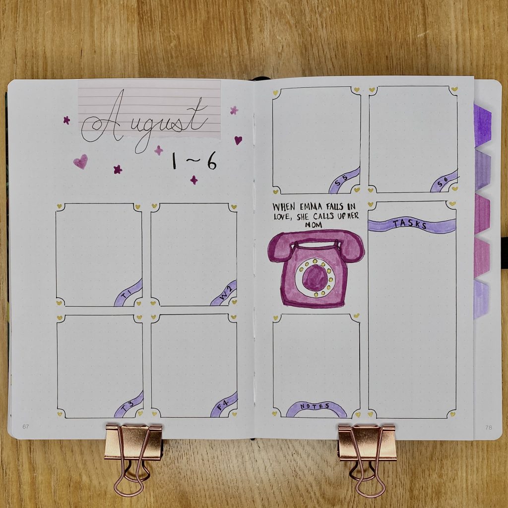
The first week of August only has 6 days, so I had space for a larger header. For this page, I included a doodle of a phone, because telephones and phone calls pop up a lot in the album’s lyrics! Admittedly, most of the lyrics that refer to phones are a little depressing, so I opted to include the nicest one, from the ‘Vault’ song, When Emma Falls In Love.
Week 2
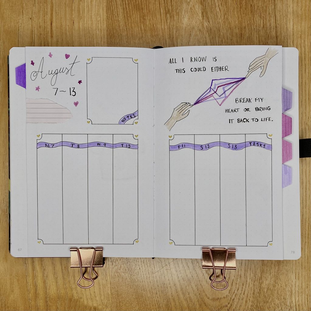
I can’t help but laugh when I look at this setup and that is because of one thing and one thing only: the CURSED HAND IN THE TOP RIGHT CORNER. I mean… look at it. I think I must have been labouring under some false sense of confidence when I decided that I, with my next-to-no drawing skills, was capable of drawing a hand and now we all have to live with the consequences. Anyway, I left it in because a) it makes me laugh and b) I’m not even sure I could do it any better. Anyway, this week’s quote is from another ‘Vault’ song from the album, Electric Touch (which features Fall Out Boy- random, huh?).
Week 3
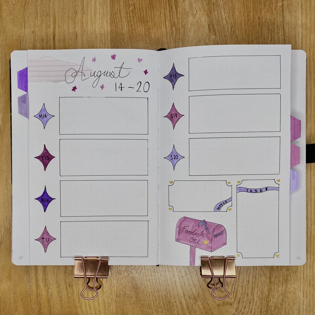
I shook things up a little for Week 3 and used larger purple ‘sparkles’ for my dates. Because these naturally have inverted corners, I felt that using the same corners for the boxes alongside them might be a bit too much, so I opted for plain rectangles. I did, however, bring back the heart corners for my note and task boxes! The doodle for this week was definitely the easiest one to create: it’s just a super simple US-style mailbox, an ode to the ‘Vault’ song Foolish One.
Week 4
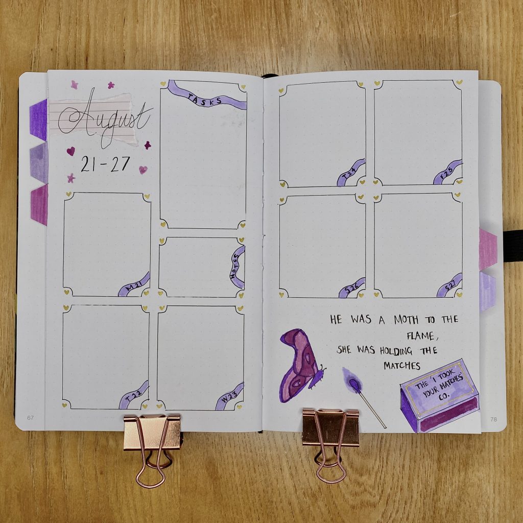
For Week 4, I returned to the heart corner boxes for all of my sections. I ended up having a much larger space for decoration at the bottom of the right-hand page, so I braved a moth drawing. I was pretty proud of my moth, but then, of course, I coloured it purple and now it just feels like a butterfly. Also, I gave it creepy legs. Sigh. Anyway, this drawing was inspired by the new line in Better than Revenge (which is randomly controversial, but I really like it!). I also added a little nod to Dear John on the match box.
Week 5
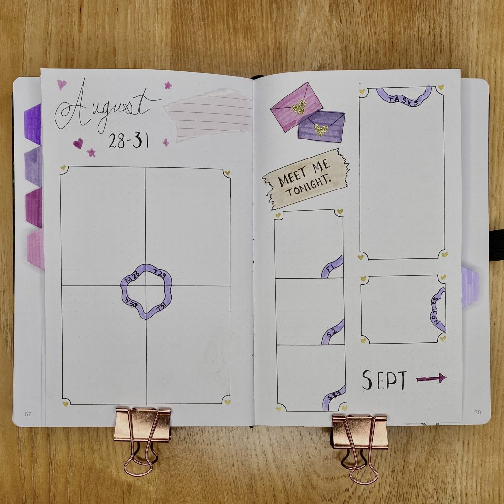
The final week in this setup contains the last 4 days in August and the first 3 days in September. As always, I like to include a little space for each of the days in the upcoming month, just so I can always see the whole week at a glance. For this spread, I kept the August days on the left-hand page and put the September days on the right-hand page, along with my task and note boxes. For decoration, I included a doodle ode to the numerous references throughout the album to letters, love letters and notes. For the note, I used my Tombow 990, to achieve that parchment-y kind of vibe.
August Review
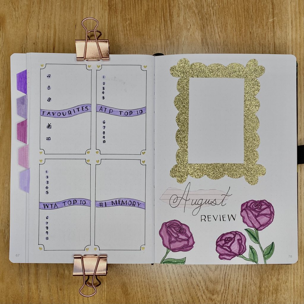
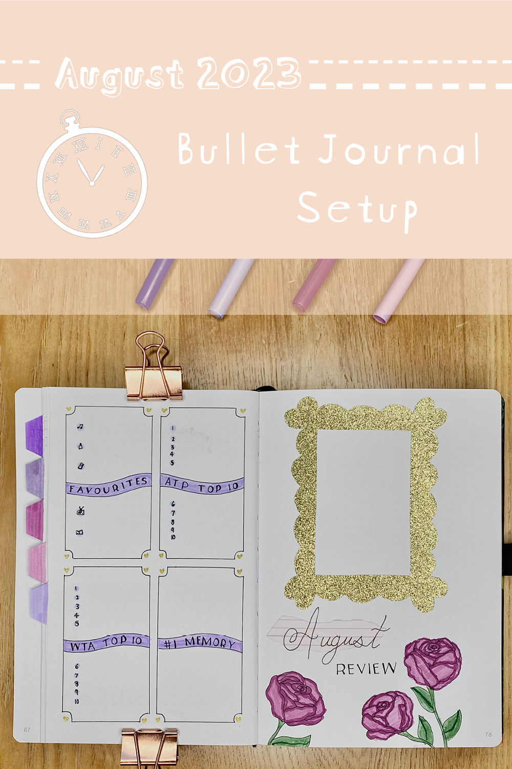
I think this spread might just be my favourite in the whole setup! As I mentioned earlier, I left a blank space on the right for the tabs, but the rest is very standard in terms of my typical review spread. On the left-hand page, I have spaces for my monthly favourites, my #1 memory from the month and the ATP/WTA top 10. On the right-hand page, I have space for a polaroid in the gold frame, which I made in exactly the same way as the larger one on the cover page. I doodled some roses along the bottom, as an ode to Back to December, and coloured them in with my plum and wisteria SuperTips. For the header, I used the same cursive font for ‘August’, over the top of the torn paper, then the ‘Taylor’s Version’ font for ‘review’.
Final Thoughts
Overall, I think this setup really conveys the romantic, nostalgic, fairytale that I was aiming for. I have to admit, the cover and daily sunshine pages aren’t my favourite, but I really love my weeklies and review page, in particular. I really did challenge myself with all the drawn elements in this setup (the HAND, I am truly sorry), so I’m proud of that, but I definitely think that I’ll be going for a much less drawing-heavy theme for September!
Have you listened to Speak Now (Taylor’s Version) yet? Let me know your thoughts in the comments!
Gemma
xxx


I’m loving reading your journal updates. You’ve a very creative mind and an engaging way of writing your ideas. You’ve inspired me to start, not to your level but dabble for the rest of the year and see if I can be a bit more organised. Thank you for taking the time and effort to do this.
Thank you so much for your lovely comment, Amanda! I hope that you enjoy journalling- I definitely find it very helpful for keeping myself organised. I think that your dabbling plan sounds great- when I first started, I only used one black pen and made super simple setups, which I think really helped ease me into the process! Please keep me updated on your journalling journey (so sorry, I couldn’t think of a way to avoid that awful alliteration!)- I’d love to hear about it!