
I always seem to struggle to decide on a theme for my September bullet journal setup. In my head, the theme should be autumnal, but, in reality, here in the UK, September is a very much an in-between month- not quite summer, not quite autumn, so I never quite know what to do! One thing is for certain though: I always end up using my much-loved kraft paper, somewhere, somehow, in a September setup. Truth be told, I use it in any setup I possibly can, but I just feel like it particularly suits the vibe of September.
After much (much) deliberation, I ultimately settled on this cityscape theme for this year. I just love the contrast of the rustic, torn kraft paper and the sharp, black silhouette- it feels simultaneously comforting and dramatic, which I am very much for.
Table of Contents
- Inspiration
- Equipment
- Cover Page
- Monthly Calendar
- Blog Planning + Daily Sunshine
- Weeklies
- Week 4
- Week 5
- September Review
- Final Thoughts
Inspiration
I took inspiration from a multitude of places (pun… kind of intended?) for this month’s bullet journal setup. First and foremost, as I mentioned, I wanted to work some kraft paper into whatever theme I ended up using, so that was my starting place. With the US Open approaching, as the not-so-subtle tennis fan that I am, my initial idea was to do something with the New York City skyline. While I’m very much a small-town girl (living in a lonely world…?), I have always loved a city skyline. I even have a picture of the London skyline on my bedroom wall! I did a bit of research, but ultimately I decided that I just didn’t have enough knowledge of the architecture in New York to make a whole journal setup inspired by it- I just think it would have felt a bit…superficial? I still liked the idea of a city skyline, but there just isn’t a city that I feel strongly enough connected to to make a whole setup about it. Then, I realised: it doesn’t have to be a full city skyline! I can just take elements of cityscapes from around the world that I like, or that I think would look cool, and place them next to each other for my own, personalised city scape.
Initially, I planned to create my cityscape using a black fineliner and a ruler to make a line art cityscape. When it came down to it though, I just didn’t think I would do a neat enough job to achieve the look I wanted. In the end, I decided to use black paper and a craft knife to cut out a cityscape. It took a little bit of patience, but I think it looks super clean and dramatic- exactly what I wanted!
Equipment
- Kraft paper (I used this brand).
- Black paper.
- Sakura Gelly Roll, 10 Bold, white.
- Muji 0.38mm pen, black.
- Tombow ABT Dual Brush pen, N15 black.
- Glue pen (I used this brand) + a regular glue stick.
- Craft knife + cutting mat.
- Alphabet stamps + ink pad.
- Hole punch.
- Scissors.
- Ruler.
- Pencil.
- Eraser.
Cover Page
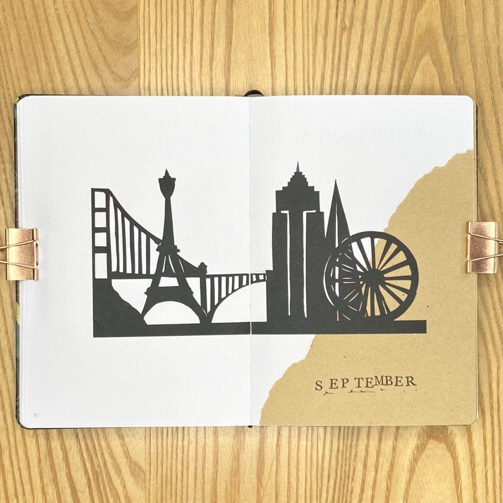
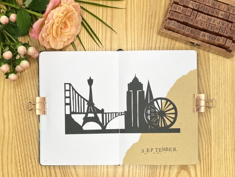
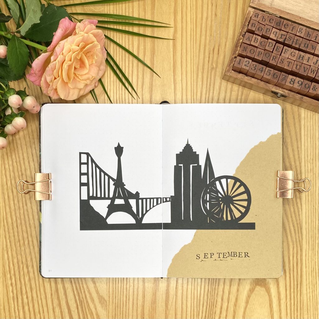
I went all out with my cityscape for my cover page. It definitely took me the longest of any of the decorations in this setup, but I didn’t mind putting a little extra effort into this one to make sure it really set the scene for the rest of the setup! I included landmarks from several different cities in this setup: there’s the London Eye and the Shard (both buildings in, as the name of the former suggests, London), then I have the Empire State Building (from New York), the Golden Gate Bridge (from San Francisco) and the Eiffel Tower (from Paris). I chose these structures because they are pretty recognisable (even in a simplified form!) and there is a good array of shapes in there, which gives my cityscape a bit more dimension.
I started out by sketching the cityscape onto some black paper. This will be the back of your cityscape, so remember to draw your buildings back-to-front if they are not symmetrical! After that, I placed the paper onto a cutting mat and used a craft knife to cut along the top of the skyline. From there, I could move the piece about more easily, which made cutting out the intricate details much more straightforward. I cut out the details, working slowly and carefully to make sure I didn’t rip the paper (though I did cut through it a couple of times! No matter though, you can just line the two edges up when you stick the cityscape into your journal). To add extra definition, I added some very fine cut-outs, both where two buildings met each other and within some of the more simply-shaped buildings. This got a little bit tricky where I had the Shard behind the London Eye, but it wasn’t too bad overall!
Once I had my cityscape, I just glued some torn kraft paper into the bottom right-hand corner, then used a glue pen to stick down the cityscape on top of that. I used a glue pen because this cityscape is very fine- if you use a glue stick, you might end up tearing it and ruining all of your hard work! I’ve never actually used a glue pen before, but I have been wanting to try one for ages and I thought this was the perfect excuse. Honestly, I loved it! I hate using glue sticks- I always end up covered in glue no matter how hard I try. The glue pen makes the whole process so much less messy. You have to work speedily, because the adhesive does dry quite quickly and it is surprisingly strong, so you can’t manoeuvre the paper around as much as you can with a glue stick, but, once you get used to it, it’s magical. 10/10, would recommend. I did cut my cityscape in half vertically before sticking it in, so that I could stick it more seamlessly over the seam between the two pages, but that probably isn’t super necessary. After that, all that was left to do was to add the ‘September’ heading, which I made using the capital letter stamps in my alphabet stamp set. And there you have it, my September cover page!
Monthly Calendar
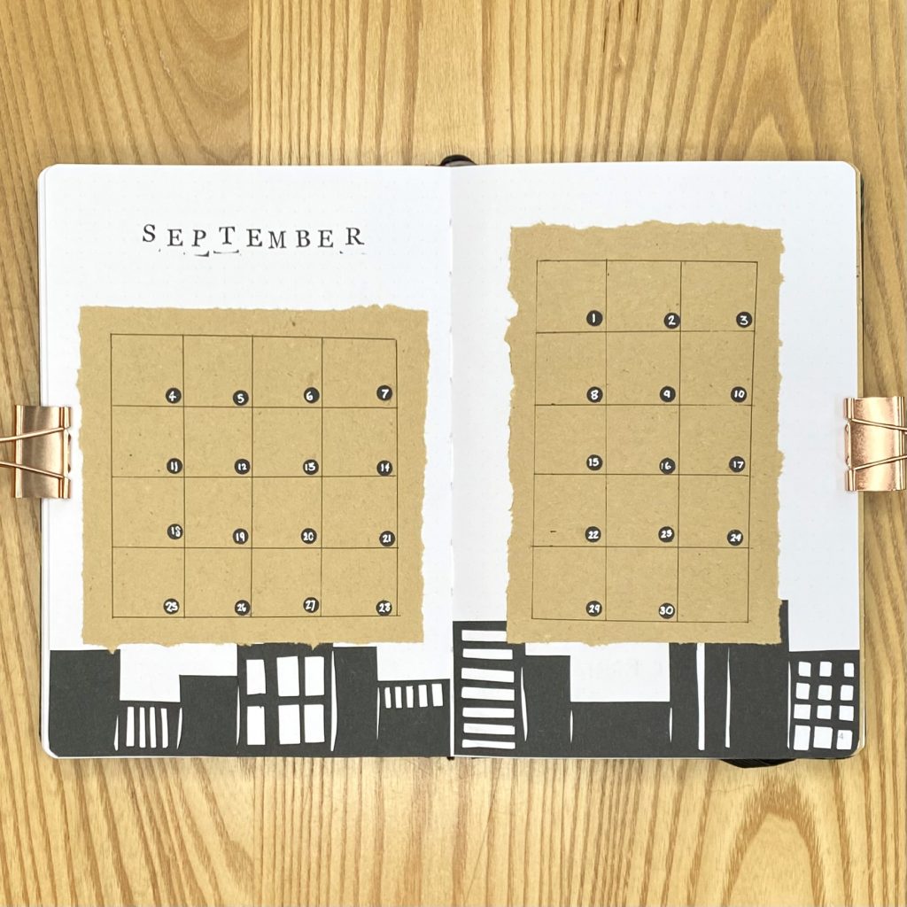
As always, I like to use a full double-page spread for my monthly calendar, so that I have plenty of space to write in all the important dates for the month. I started by decorating the page with another (more simplified) cityscape, so that the cityscape would lie behind the calendar, almost as if it is in the distance. To make this cityscape, I followed the same process that I used for the cover page cityscape, but kept all the buildings as basic rectangles. I tried to vary the size, shape and position of the windows to add some intrigue, and, as with the first cityscape, I cut small incisions between each building to add definition. Again, I used my glue pen to stick down the cityscape.
For the calendar, I stuck two rectangles of kraft paper onto the spread. I wanted to get a rustic, torn look, but I still wanted the rectangles to be quite neat (i.e., not ripped all over the place and looking more like triangles!). To do this, I drew out my rectangle, making sure to place it about 5mm in from the edges of the paper. Then, I lightly scored along each of the lines (you can do this by placing a ruler on the line, then gently dragging a craft knife/open pair of scissors along the ruler), before tearing along each scored line. This method will help you to achieve a more even tear, so that your kraft paper looks rustic, but intentionally rustic.
On top of each kraft paper box, I drew a grid of 25x25mm boxes using my Muji 0.38mm pen. For the dates, I used a hole punch and some black paper to make lots of little black dots, which I then stuck into the bottom right-hand corner of each box using a small dot of glue from my glue pen. Once they were all stuck down, I wrote the dates on each dot using my white Sakura Gelly Roll. After that, I just stamped out the September heading with the same capital letter alphabet stamps as the cover page.
Blog Planning + Daily Sunshine
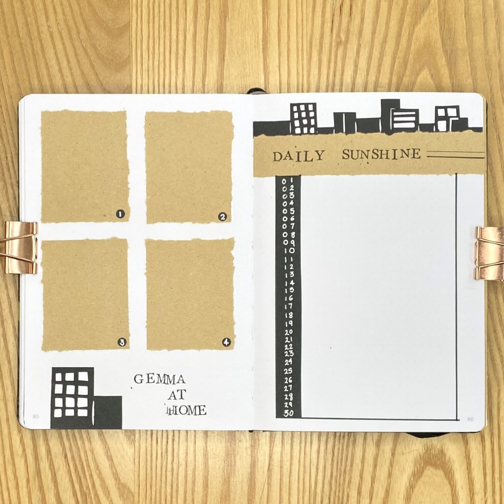
Next up, we have the page that I use for planning my blog content. If you’ve been here for a little while, you might have seen this spread evolving over the past few months, as I have been rearranging, reworking and renaming it on a monthly basis, trying to create a spread that suits my needs. Last month, I trialled some mini to-do lists, one for each post, in this spread and I found it really helpful. This month, I’ve decided to make the to-do lists a little less ‘mini’ and dedicate the whole page to them! As a result, this spread is comprised of 4 kraft paper boxes (made using the same scoring + tearing technique as the calendar on the previous spread), one for each post. Like my calendar spread, I used the black dots from the hole punch and a white pen for the labels. The heading was made using the same capital letter alphabet stamps and I kept the decoration on this page very minimal, with just two little skyscraper silhouettes.
As always with my Daily Sunshine page, I like to leave as much space as possible for myself to write out my happy memories & positive thoughts, so I only had a small amount of space to play around with in terms of decoration. In the end, I went for another cityscape running along the top of the page, above the heading, which I stamped onto a kraft paper strip. To spice things up a little bit, I also added two black lines, one thick and one thin, which I drew using my Tombow N15 and Muji 0.38mm pen, respectively. I used the same Tombow to draw out a rectangle, 30 lines tall (one per day), for writing down my happy notes, then stuck a strip of black paper down the left-hand side, onto which I wrote out the dates for the month in my white Sakura Gelly Roll.
Weeklies
As always, I’m using tabs to separate my weekly spreads in this setup. I like to do this so that I can easily navigate between the pages, but I also like the way it creates some distinction between my weekly spreads and the rest of the monthly pages. This month, I opted to use slightly longer tabs than usual, because I knew I wanted to fit the month into 4 spreads, instead of the typical 5. I covered both sides of the tabs with black paper, then stuck a strip of kraft paper onto both the left-hand side of the very first weekly and the right-hand side of my September Review page, so that the tabs would lie against the kraft paper, no matter how you looked at them.
I kept each of the 4 weeklies pretty consistent in terms of setup/decoration. Much like the rest of this setup, every heading is made with the capital letter alphabet stamps, which I also used to indicate the day of the week for each daily task list. All of the daily task lists, notes boxes and master task lists are made with kraft paper boxes, while all of the dates are made from the same black dot/white pen combination that I have used throughout the setup. For the longer subheadings, I used a small strip of black paper (about 5mm thick) and used the same white pen to write the heading in a simple, lowercase font. To decorate the pages, I stuck a simplified cityscape along the bottom of each weekly spread, so that, as you turn the page, the skyline just seems to keep going and going!
Week 1-2
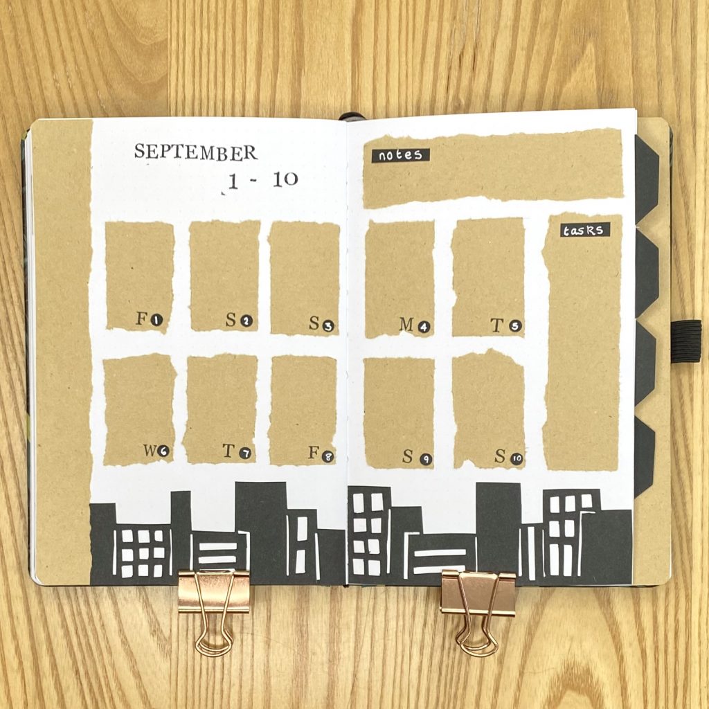
Because there are only 3 days in the first week of September, I opted to combine them with the second week and make a single spread for the first 10 days of the month. To do this, I created a 5×2 grid of kraft paper boxes, starting from the bottom left of the spread, for my daily task lists. I used the remaining room at the top of the right-hand page for a notes section, then the remaining space on the right for a master task list. I placed the header in the space in the top left.
Week 3
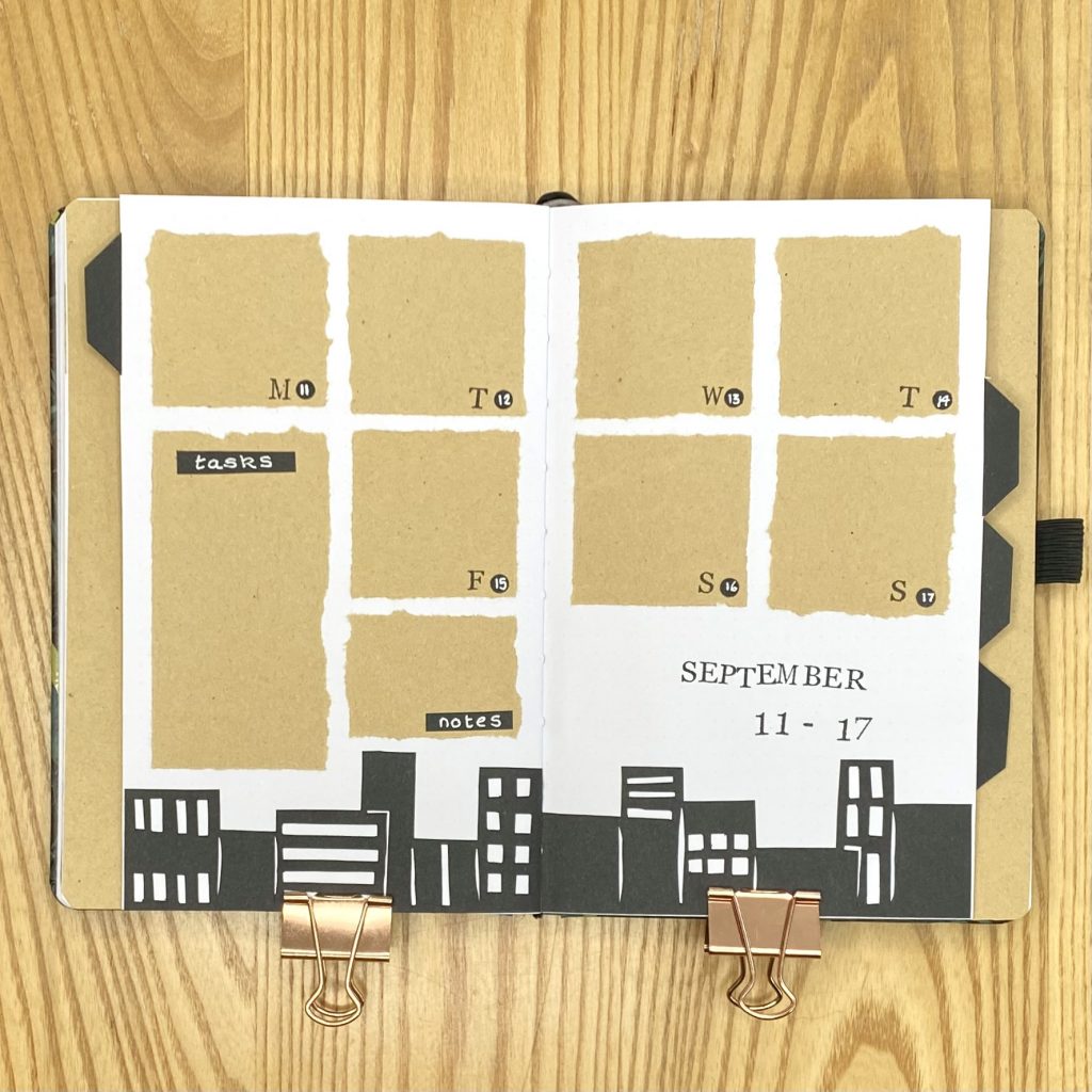
The second weekly spread spanned a single week, so it was much more straightforward to create. I opted to use square kraft boxes for my daily task lists, then filled the remaining space on the left-hand page with an elongated box for my master task lists and a smaller box for notes. On this spread, I put the header in the bottom right.
Week 4
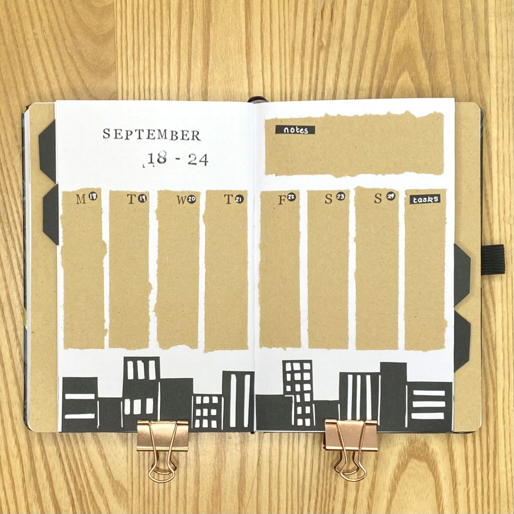
I went back to basics with the third weekly spread and used my favourite long & thin boxes for my daily/master task lists. My box for notes went at the top of the right-hand page, opposite the header.
Week 5
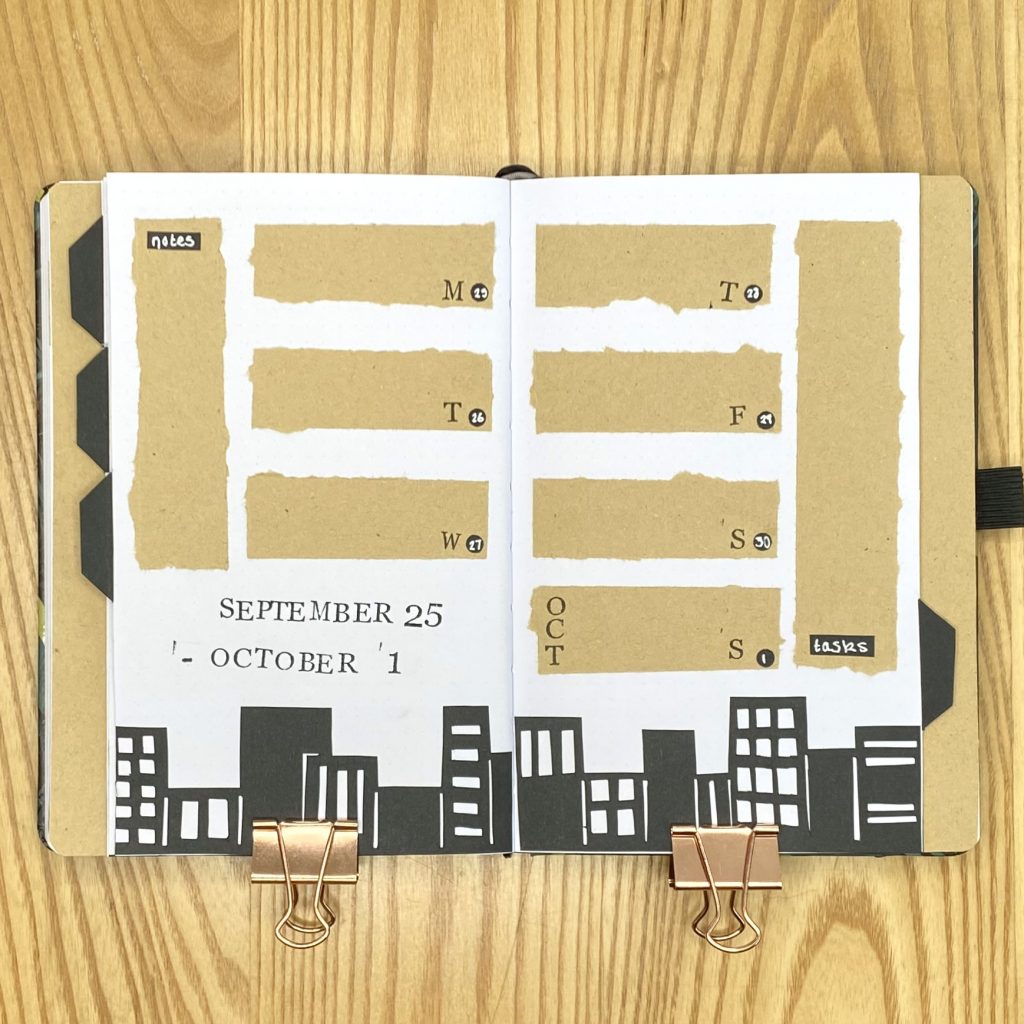
I have to admit, I don’t really like using horizontal boxes in my weeklies, but I always seem to end up making at least one spread with horizontal daily task lists. Sigh. It’s a curse. The final day of September falls on a Saturday this year, but, as always, I like to be able to see my whole week at a glance, so I did include the first day of October in this spread as well. I placed my notes box on the far left and my task box on the far right, while the daily task lists are all in the centre, with the heading in the bottom left.
September Review
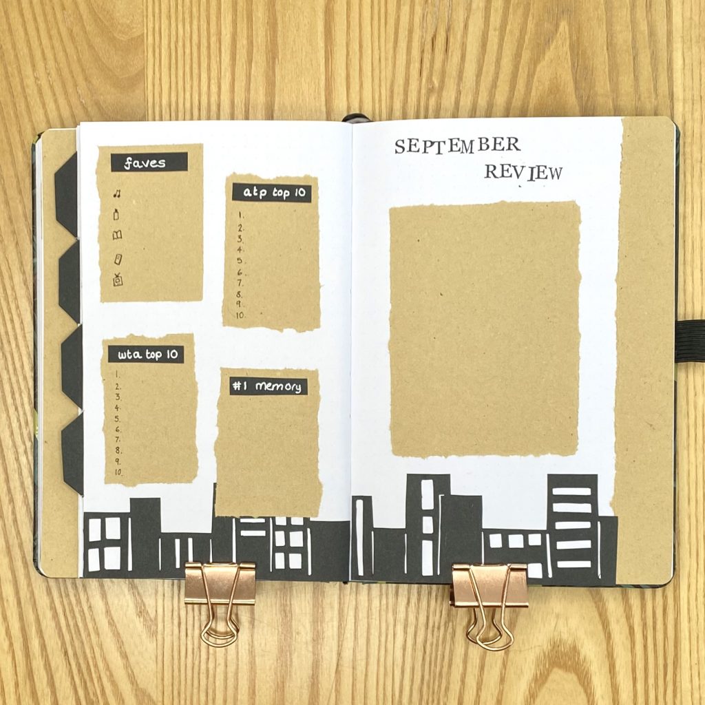
Nothing all that new with my Review page this month- I still have a space for a polaroid on the right-hand page and 4 sections for monthly roundups on the left-hand page (as always, there’s one box each for the WTA/ATP Top 10, one for my monthly favourites and one for my #1 memory). I continued on with the same decoration as my weeklies, with the skyline placed across the bottom and the kraft paper boxes, black paper subheadings and stamped header.
Final Thoughts
I am IN LOVE with this setup. I’ve been doing some more doodle-y themes over the past few months, which, while they’re fun and cute, just aren’t really my forte. I feel much more at home doing these slightly more dramatic, collage-based themes.
As an added bonus, I feel so much more confident with a craft knife after making this setup, which I think is a good skill to have! While it took a little bit of time to make all of the cityscapes for this setup, I think that the technique has such a high payoff in terms of impact.
Also, two important things to take away from this post:
- Kraft paper is love, kraft paper is life.
- Glue pens are magical and I love them.
I hope you like this cityscape bullet journal setup! Have you been to any of the cities featured on my cover page? I’ve only been to London and San Francisco, but I’d love to go to New York and Paris as well one day!
Gemma
xxx

Love your September set up. I’ve gathered bits together to start journaling, thanks to your inspiration.
Thank you, Amanda! That’s lovely to hear.