

Entering the second half of a calendar year means many things, but, for me, it means a new bullet journal (and a new bullet journal setup to create)! At the start of every journal, I like to include a series of more general spreads that I use to keep track of my life overall (as opposed to my more specific, monthly spreads). I have to admit, setting up these spreads does take a bit of time and the process often (read: always) seems to sneak up on me every 6 months, but I find these pages so useful throughout the year that it really is worth it for me!
This time around, I’ve gone for a vaguely eclectic theme that I’m dubbing my ‘ransom note, high school notebook, scrapbook-style’ theme (a super concise and punchy name, right?). It’s basically a fun amalgamation of different papers, stickers and (rather painstakingly) cut-out letters/numbers from a newspaper, all stuck into the pages of my journal. In other words, it’s organised chaos (and I’m kind of obsessed with it).
Let’s get into it!
Table of Contents
- Journal
- Equipment
- Nameplate
- Cover Page
- Future Log
- Tennis Schedule
- Appointment Notes
- Wishlist + Prescriptions
- TV + Reading Trackers
- Blog Planning
- Final Thoughts
Journal

I’ve been using the dot grid notebooks from Coral and Ink for my bullet journals for a while now. A while back, I bought a few journals in their B-Grade sale (where they sell slightly damaged/imperfect journals at a discounted price) and have been using them ever since! This is my last journal from that haul, which means I’ll have to buy a new journal for 2026 (in fact, I’m thinking of getting an extra large journal with enough pages that I won’t have to set up these initial pages twice throughout the year… if I can find one!).

This particular journal has a pale green cover with a little golden motif of a pretzel (yum) and some flowers (not yum, but very pretty!) on the front. It has gilded edges with a pretty flower pattern, plus an elastic closure, two ribbon bookmarks, a back pocket AND a pen holder. I really do love these journals: the pages are super heavy duty, so you don’t have to worry too much about your pens bleeding through and the vegan leather covers are really durable.
Equipment
For this setup, I used the following equipment:
- Uni Pin Fine Line pen: 0.5, sepia.
- Sharpie Ultra Fine Point permanent marker, black. This is great for using on paper that you stick into your journal because it dries super quickly + doesn’t smudge/ghost, but I wouldn’t recommend writing directly onto the pages of your journal with it, because it does tend to bleed through.
- Kraft sticky notes.
- Purple lined + coloured paper.
- Assorted stickers.
- Newspaper (I used a copy of Waitrose Weekend, which contains a really good range of fonts!).
- Alphabet stamps + black ink pad.
- Scissors.
- Corner rounder.
- Sakura Quickie Glue pen.
- Glue stick.
- Ruler.
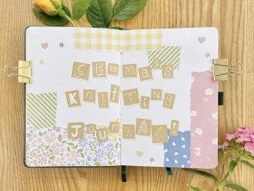
Nameplate

I figured I’d start as I meant to go on with the Nameplate in this journal, so I made up my name using an assortment of letters that I had (rather painstakingly, I admit) cut out of an old copy of Waitrose Weekend. I found the most efficient way of doing this was to cut out whole words that were written in fun/nicely-sized fonts, then cut out the individual letters as and when needed (this makes it easier to find the letters when you need them!). I used my Quickie Glue Pen to stick in all of the letters (though I used a regular glue stick for sticking in larger pieces of paper throughout the rest of setup, because I’m not that patient!).
I also added a little cluster of stickers to this page, for extra decoration, and an exclamation mark, to help infuse the 6 months ahead with a sense of fun and excitement (that should work, right?). If you’re wondering why the second ‘m’ looks weird and are suspicious that its really just an upside-down ‘w’, you would be 100% right.
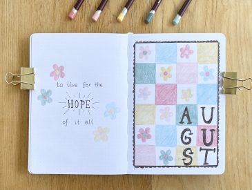
Cover Page

Onto the Cover Page now and, instead of a Quote Page alongside it (as I usually do), I decided to add a small space to write out some goals on the left-hand side. I’ve never been great at setting (and sticking to) goals, so I’m trying to keep this section very minimal: just 5 clear, attainable, but still slightly ambitious, goals. I actually haven’t worked these out yet, but I will! Either way, it’s probably more useful than a quote that I’m unlikely to look at again, so it works out!
Future Log

My Future Log is up next, which is basically a year-long calendar, squished into two double-page spreads. I like to include the 6 months that my journal focuses on, plus a further 6 months after that, because I often get sent appointment dates quite a long way in advance and I like to be able to keep track of them. In this journal, then, the first half of the Future Log focuses on July-December 2025 and the second half focuses on January-June 2026.
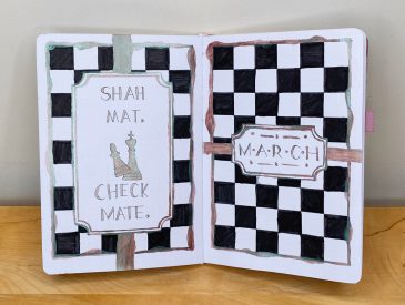
So that I’d only have to stick in the letters for the Future Log heading once, I opted to use a Dutch Door-style layout for this spread. To do this, I trimmed off the very top of the right-hand page (and used my corner rounder to soften up that cut corner, because I value the intact skin on my fingers).

For each month, I made a tiny, grid-style calendar using a piece of kraft grid paper (technically, I used grid-pattern sticky notes, but that’s just what I had). This was great because the sticky note grid was much smaller than the dot grid of the notebook, which made it much easier to fit everything into this spread! I also used a long strip of purple lined paper for a vertical calendar for each month. Again, the lines on this paper were thinner than the ones in the journal itself, which also helped me to use the space more efficiently. I used my black fine tip Sharpie to write in the weekend dates, because I like to be able to see at a glance when my beloved rest days are taking place!
This combination of calendar styles/layouts is my favourite way to set up a Future Log: the mini grid calendar helps me to visualise the structure of the month, the vertical calendar gives me plenty of space to write in any events and the highlighted weekend dates really helps me to keep track of where I’m at!
Tennis Schedule

Ah, into the most niche section in this setup (and a longtime favourite spread of mine!): my Tennis Schedule. This spread is an absolute menace to set up, spans 3 whole double-page spreads and is ridiculously nerdy, but I love it. Essentially, it’s just a place for me to keep track of what tennis tournaments are taking place when/where and record which player won each one. It sounds ridiculous, but I can’t tell you how satisfying it is to just whip out this spread whenever someone asks me which tournaments are coming up next.

The setup of this spread is on the more complicated side, but, essentially, I’ve just trimmed down the two central pages (and rounded off the corners, of course). The ‘2025 Tennis Schedule’ heading goes on these two trimmed down pages, then the schedule itself goes onto the (trimmed down) double-page spreads on either side.

For the schedule itself, I’ve used the same table-style format that I always use for these spreads, where the left-hand side focuses on the ATP (men’s) tour and the right-hand side focuses on the WTA (women’s) tour. The week number goes down the middle (this time around, written on some star stickers!), then the date that each tournament begins goes on the next column out on each side. The tournament locations go in the next columns, then the names of the winners will go in the outermost columns. As always, I use a simple rang of symbols to indicate the level of each tournament: a full circle is for Grand Slams, a 3/4 circle is for Masters 1000s, a 1/2 circle is for 500s, a 1/4 circle is for 250s and a star is for other assorted tennis events (including group events like the Davis/United Cup and year-end events like the ATP/Next Gen Finals).
Overall, my Tennis Schedule is stupidly complicated and downright unhinged, but I love it and I could never let it go.
Appointment Notes

Next up, we have my Appointment Notes. Previously, I’ve only allowed a single page for this section, but I have found myself reluctant to use it in case I fill it up too quickly and run out of space (which is, I know, counterintuitive)! This time around, then, I decided to give it a full, double-page spread, to encourage myself to utilise it, because I do think it will be helpful to keep notes (however brief) of the things that I discuss with my healthcare team, what decisions have been made, test results etc.
This spread is basically just a table of 3 columns: the date of the appointment, the appointment itself (i.e. which doctor/team), and a much larger space for notes. I haven’t sectioned off any rows because I don’t know how much space I’ll need for each appointment.
Wishlist + Prescriptions

Now it’s time for my Wishlist + Prescription pages, or, as I have been fondly thinking of it: my ‘What I Want vs What I Need‘ spread.
My Wishlist is on the left-hand page. I like to separate this out into categories, so I’ve done that here by using little squares of Kraft paper (again, of sticky note origin).
My Prescription Tracker is on the right-hand page. I’ve talked about this spread before, because it really is invaluable for keeping track of medications! I’ll put the initial of each medication in the stars along the top, allotting one column to each medication. Each mini table represents one ‘counting of the medicines’ event (and honestly, it is a bit of an event!) and I’ll put the date of each event on the hearts alongside the tables. From there, I just fill in each box: the number of tablets I currently have, the number of days that equates to and the date on which I will run out (I literally Google ‘x days from today’, using the number from the second row, which greatly speeds up this process!). Filling in this spread does take a bit of a time, but it is important to keep track of these things to make sure I never run out of important medication, so I try to just fill it in any time I get a new stock of my prescriptions.
TV + Reading Trackers

My TV + Reading Tracker spreads aren’t essential planning features, but I do enjoy looking back through my journals and seeing what I was watching/reading at each point in my life, so I like to include them anyway!
For my TV Tracker, I’ll write the name of the show I’m watching in the left-hand column, then draw as many little circles in the right-hand column as there are series of the show. As I watch each series, I colour in the respective circle, thus keeping track of where I’m at in the show. It’s a little ridiculous, but a lot of fun to look back on!
For my Reading Tracker, I put the ‘number’ of the book in the far-left column (I like to see how many books I’ve read in any given year, so I usually roll this number over from the first 6 months of the year). In the next column, I put the title of the book, then the final two columns are for the date that I start/finish the book. I mainly use Storygraph to keep track of my reading habits, but I like to transfer that information to my journal too, so I can look back on it more easily!
Blog Planning

The final spread in this setup is a more general spread for Blog Planning. I like to have a space for notes/ideas, but I wasn’t quite sure what I needed out of this spread, so I decided to keep it simple and create a few different spaces for my notes, without labelling anything specifically. We’ll see what it becomes as the months progress!
Final Thoughts

I’m kind of… obsessed with this spread? It was a menace to set up: I was very sick of cutting up and glueing in all of the letters (and trying to find some of the more elusive letters!) by the end of it. I did, however, very much enjoy sticking in all of the stickers (so easy! so fun!) and just chaotically sticking in paper, watching as the pages went from bland and sad to messy and fun and pretty.
I was worried about this setup looking too ransom/blackmail note-y, but I think all of the purple/kraft paper/fun stickers give it much more of an early 2000s, teen movie vibe, which I’m definitely happier with!
Overall, this was a labour-intensive setup, but I’m really happy with how it turned out and I think that all of the spreads will be super useful!
Gemma
xxx