
Okay, I know we’re nearly halfway through January already, but, as always, I am behind on my bullet journal. Sigh.
My theme this month was the BBC show ‘Death in Paradise’, which is a much-loved detective show here in the UK. Honestly, it’s main appeal is that it’s set on a Caribbean island so all of the visuals are so dreamy- it’s just what I need when Christmas is over and I am quickly reminded that winter in the UK is kind of a downer once all of the twinkly lights have been taken down :(. Anyway… new seasons of the show ALWAYS come out in January- as in, every single series (bar the very first one) has been released in January, so I figured I was pretty safe setting up this theme to celebrate the new season- especially seeing as we had the Christmas special on Boxing Day! Alas, it is 12th January today, and no announcement for the release of the new season has been made. Just my luck, right? Oh well, maybe this will just get us all in the mood for when the new season does drop?
Anyway, here is how I set up this tropical (albeit a little premature) Death in Paradise-inspired bullet journal setup for January…
Table of Contents
- Equipment
- Cover Page
- Monthly Calendar
- Blog Planning
- Habits + Daily Sunshine
- Weeklies
- January Review
- Final Thoughts
Equipment
- Muji 0.38mm pen, black.
- Tombow ABT Dual Brush Pens: N15 (black), N57 (warm grey 5), N79 (warm grey 2), N89 (warm grey 1), 491 (glacier blue), 725 (rhodamine red) and 990 (light sand).
- Sakura Gelly Roll, 10 Bold, white.
- Crayola SuperTips: mainly green and blue/teal shades, as well as one orange-y shade (the exact pens that I used are from a combination of this pastel pack and this assorted pack).
- Ruler.
- Pencil.
- Scissors.
- Eraser.
- Optional: tracing paper + printed mirror image of Death in Paradise logo.
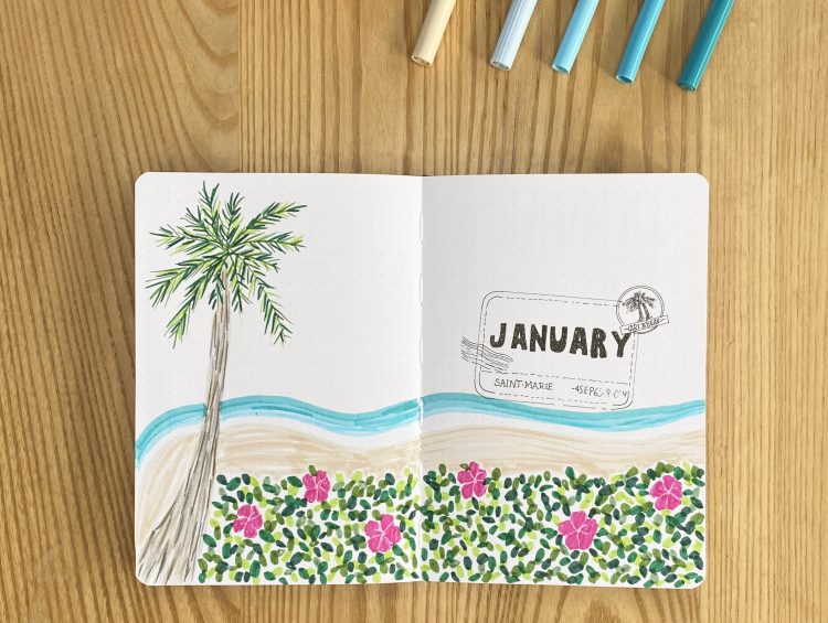
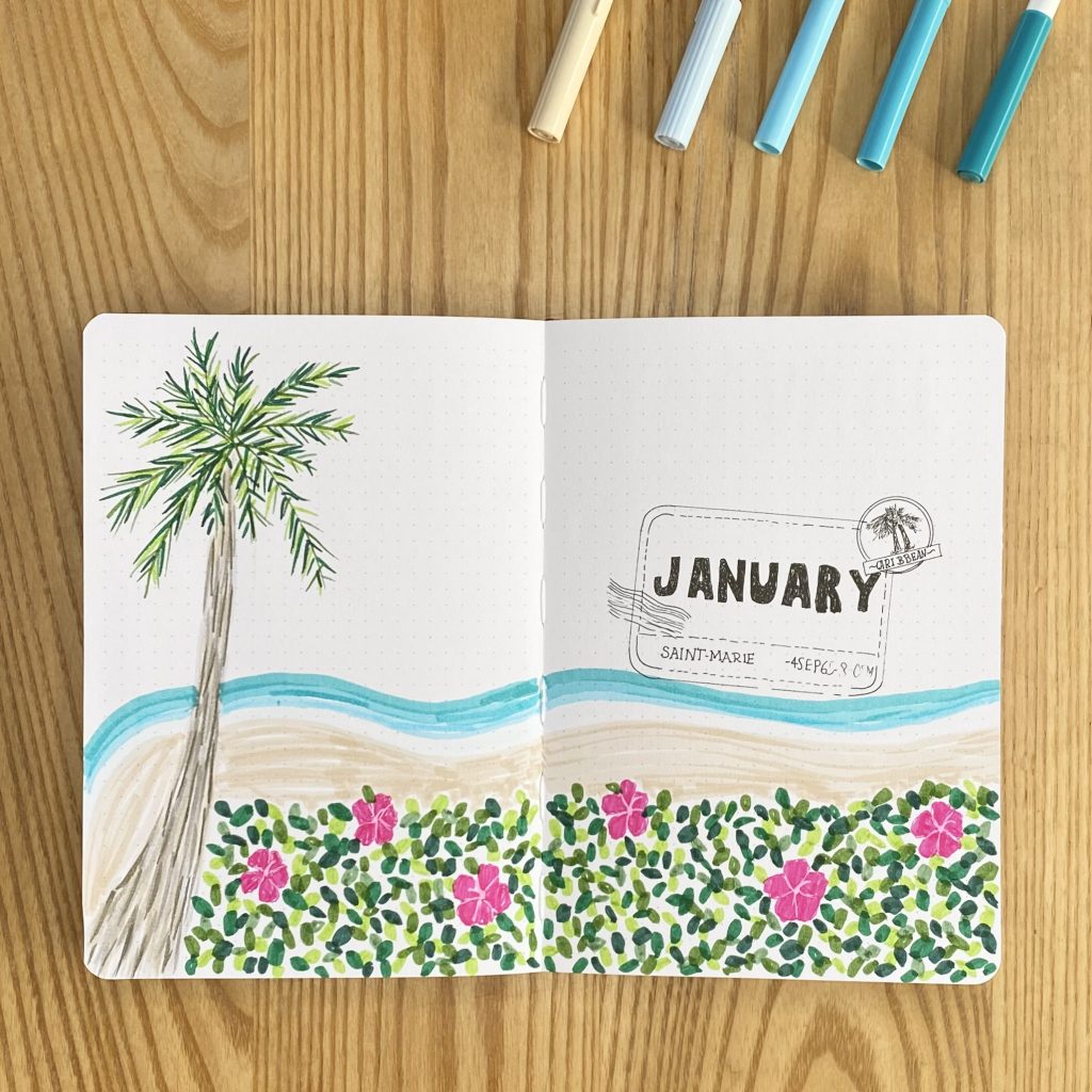
Cover Page
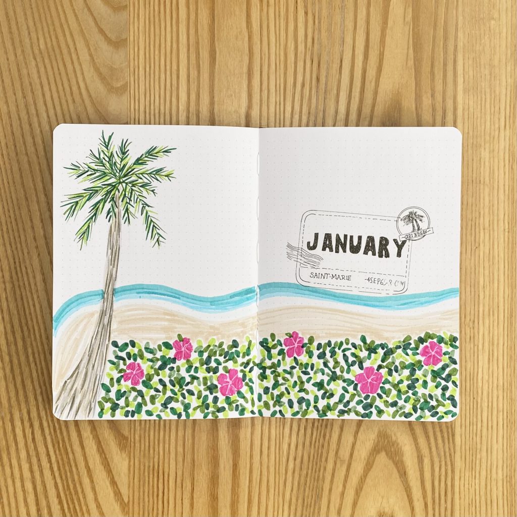
I wanted the Cover Page to really incapsulate the tropical, beach-y vibes of the show, so I opted to create a little ‘landscape’ across the whole double-page spread. I started by drawing a large palm tree on the left, using my Tombow pens in the shades N57, N79, N89 and 990 for the trunk, then an array of green Crayola SuperTips for the fronds. Along the bottom of the page, I drew some flowers (which were very loosely inspired by hibiscus- I am no botanist) with my Tombow 725, then surrounded those with some leafy foliage, using the same shades of green as the palm fronds. After that, I added the beach- I used my Tombow 990 for the sand, then added stripes of blue for the ocean, working up from the palest (the Tombow 491) to the darkest (a deep teal SuperTip) shade. Finally, I added a little bit of detail to each flower, using my white Sakura Gelly Roll.
For the ‘January’ heading, I opted to recreate the Death in Paradise logo. To do this, I printed out a mirror image of the logo, traced it (leaving out the ‘Death in Paradise’ text) with a pencil onto some tracing paper, then flipped the paper over onto my journal page and went over all of the lines again to transfer the original pencil marks. Then, I went over those pencil guidelines with my Muji pen. Finally, I wrote ‘January’ in the place of the initial text and my cover page was finished!
Monthly Calendar
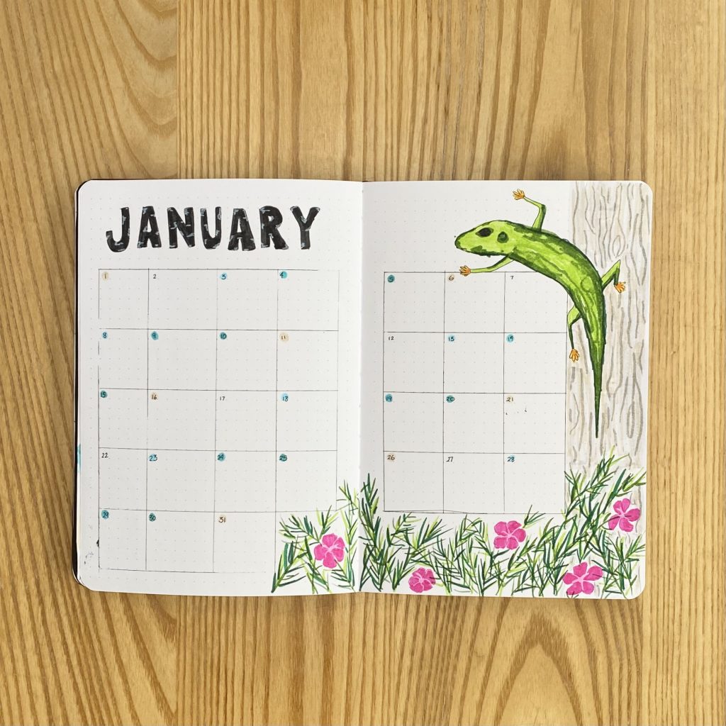
For the Monthly Calendar, I opted to use the same grid style that I usually go for, with each day situated in a 6×6 square box (although I have just noticed that something funky went on with the first 2 columns, so do as I say, not as I do, I guess?). I wrote the ‘January’ heading along the top using my Tombow N15 and used the 5 colours (Tombow 990 and 4 shades of blue) that I used to create the beach on the Cover Page, to colour a little dot in each grid space for the dates (which I wrote over the top using my Muji pen).
To decorate this page, I added some more flowers along the bottom, which I surrounded with some more green fronds, and drew Harry, the iconic lizard from the show (if you know, you know). Admittedly, drawing lizards is not my forte, but I’m pretty happy with how he turned out. I then drew a wood-style pattern on the right-hand side, using the same colours as the palm tree trunk from the cover page.
Blog Planning
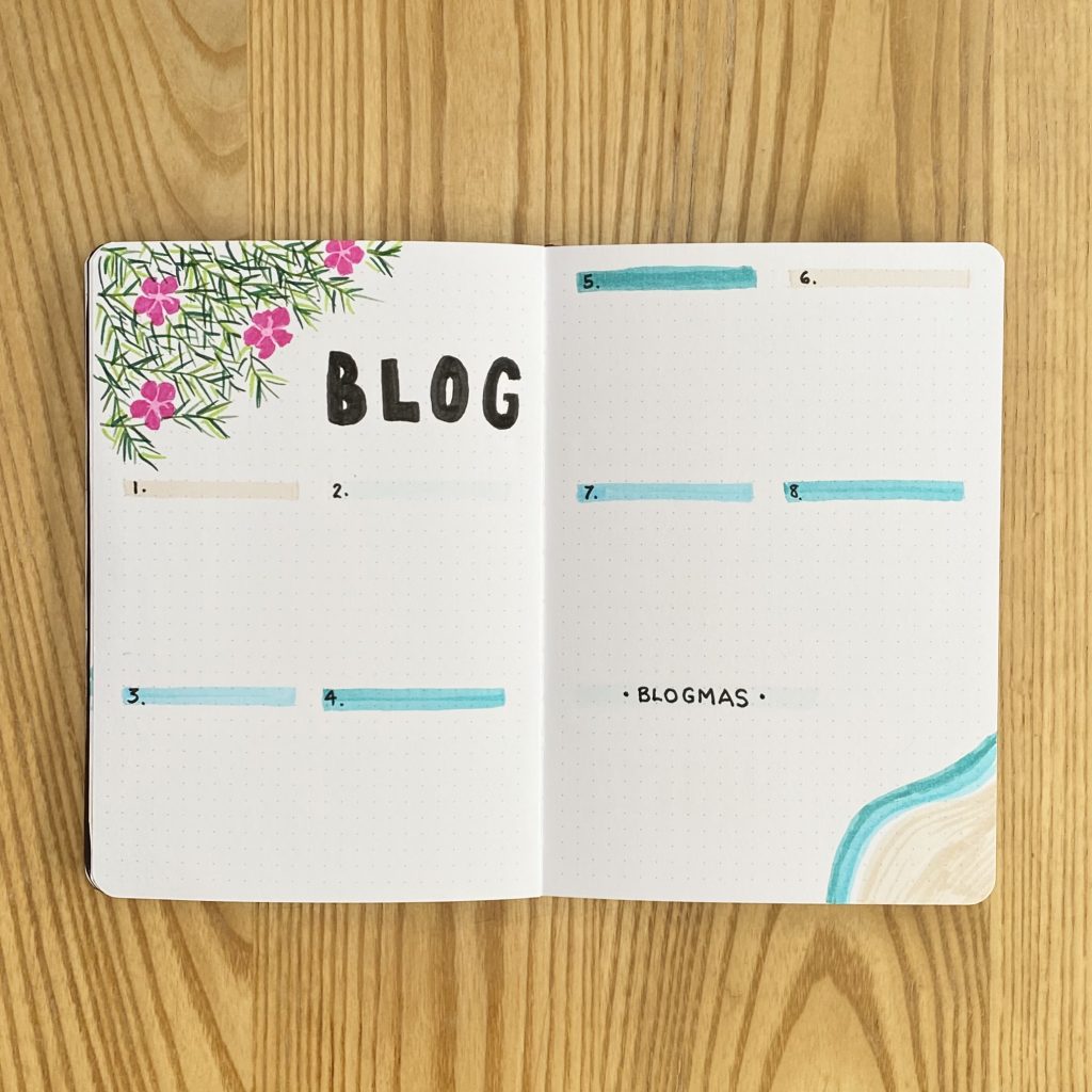
Next up is my Blog Planning spread. I added some flowers and foliage to the top left-hand corner, and a beach doodle to the bottom right, then put the heading in block capitals along the top. I have space for 8 posts on this page, each one indicated by a ‘bar’ of one of the ‘beach’ colours, as well as a space for any Blogmas at Home planning/notes at the bottom.
Habits + Daily Sunshine
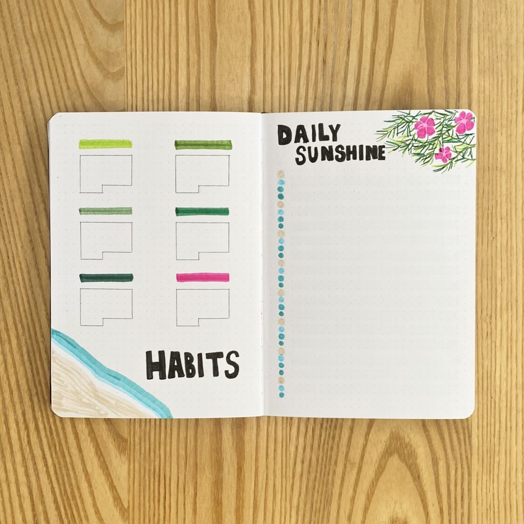
On the left-hand page, I have a space for tracking my Habits. I kind of fell out of love with habits towards the end of the last year, but I’m going to try tracking some again this month. I’m hoping to use this spread in a more productive manner than I used to- I plan to make sure that each habit is linked to my overall, yearly goals, to keep me on track and feeling positive. For each habit, I have a little subheading (made with my ‘foliage’ colours), as well as a miniature calendar for marking off when I have completed each one. To decorate the page, I added a beach doodle to the bottom left.
On the right-hand page, I have my Daily Sunshine. This is where I write down one good thing that happened each day before I go to bed, to put myself in a positive mindset. I decorated this page with some foliage doodles, then added a little dot of my ‘beach’ colours for the dates down the left-hand side, as well as highlighting every other row with my Tombow 491.
Weeklies
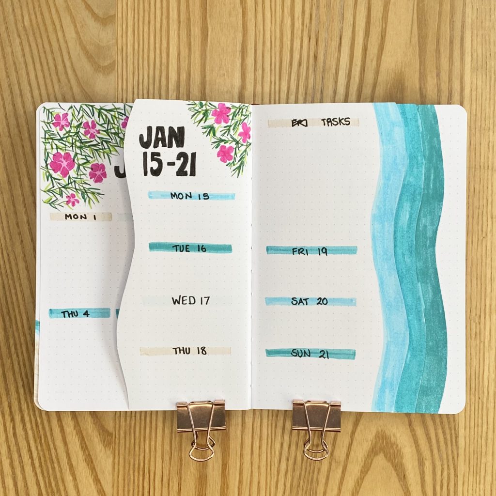
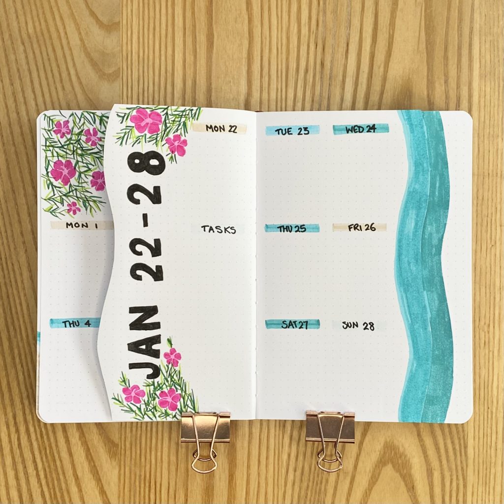
I always like to use tabs for my Weeklies, because they make it so much easier to navigate through the month. This month, I really wanted to run with the tropical, beach-y theme I had going on and try out a different style of tabs that I have seen all over my socials: waterfall tabs. To do this, I cut the first page down, quite far in from the edge, with a wavy line. Then, for each of the next 5 pages, I followed that same wave, just about 1cm closer to the edge. I coloured each wavy edge with my ‘beachy’ colours, starting with the sand colour and moving through to the darkest blue, to make the pages look like a seashore. Admittedly, this does cut down the size of my weekly spreads significantly, but I really LOVE how it looks- I think it really fits the vibe of the theme and it’s kind of fun and fresh, so I’m really excited about it.
Because of the limited space, I kept my theme layouts very similar: every weekly spread includes a space for each day and one for general tasks, which I have indicated via little bars of the ‘beachy’ colours. The headings are all made using black block capitals and decorated with some more foliage doodles.
Weekly 1
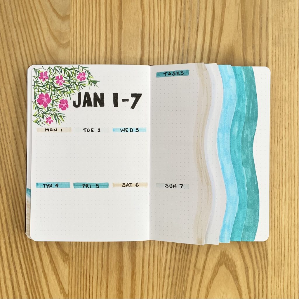
The first weekly had a good amount of space, because I had the full left-hand page to work with. This gave me a bit more room for the header and lots of space for my task list.
Weekly 2
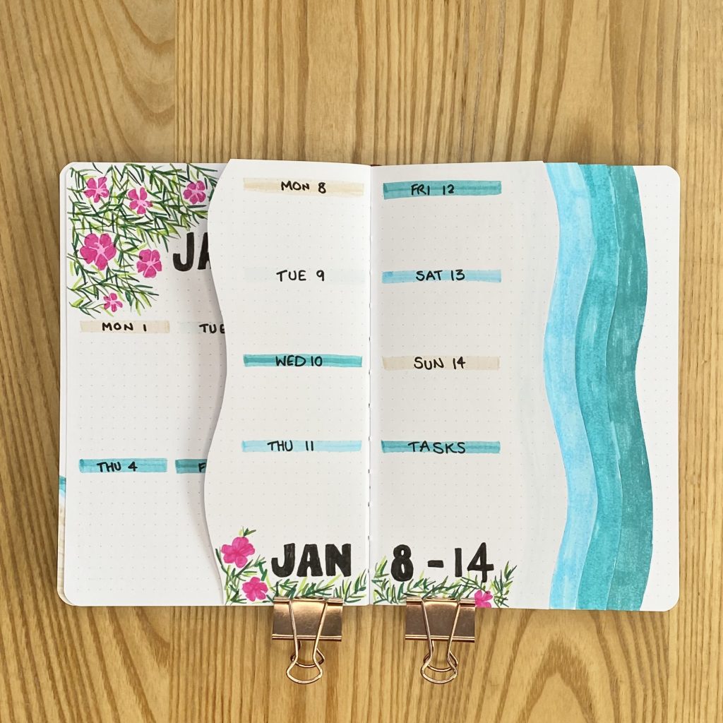
The second weekly was the smallest, so I don’t have masses of room in each of my daily sections. I made the title nice and small at the bottom of the page, to maximise the space!
Weekly 3
The WHOLE time I was making this third weekly, I was telling myself, ‘Gemma, do NOT forget that the top right is the TASK section, so do NOT write a date on that sand-coloured line’. What did I do? I wrote the date…
Weekly 4
I opted to put the title for the fourth weekly down the left-hand side, so that I could maximise the space for my daily lists. I really like how this one turned out!
Weekly 5
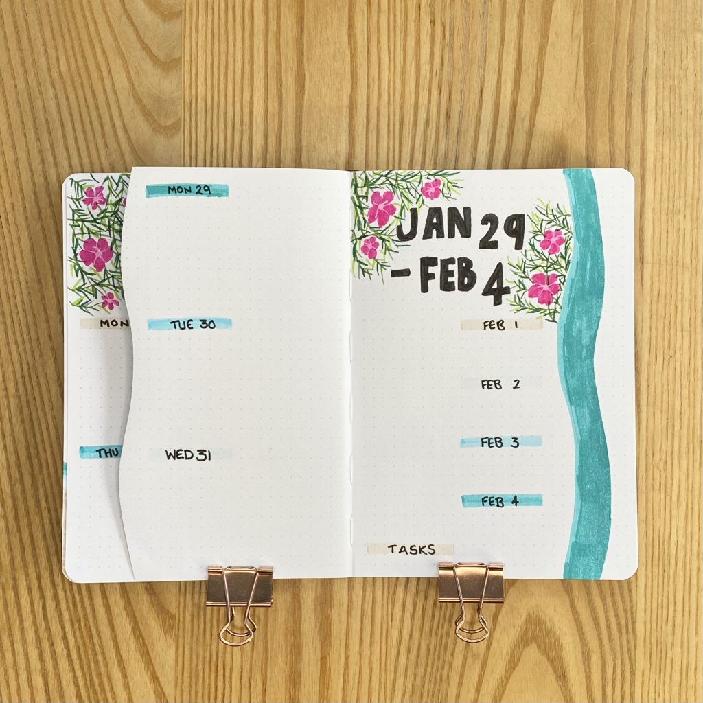
The fifth and final weekly has the most space, which is actually kind of annoying, because I only needed space for 3 full days (31st January is a Wednesday this year). I did consider making my waves flow the other way (making the first weekly the largest), but I needed the extra space for my January Review page, which is on the back of this spread. Ah well, c’est la vie. I did also include space for any notes on the first 4 days of February in this spread, as well as my usual task box, so that filled the space up a little too.
January Review
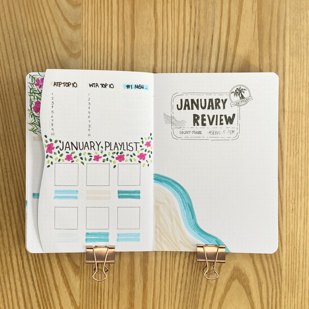
By the end of last year, I feel like I had really nailed down what I wanted my Monthly Review spreads to contain and how I wanted the layout to work. Now, it basically feels like I just need to inject a little bit of the theme into that basic formula, which really takes the pressure off when it comes to setting up these spreads. On the right-hand page, as always, I have the header and a space for a polaroid from the month. I created the header in the same way I created the title on the Cover Page: by tracing the Death in Paradise logo and altering the text to read ‘January Review’. I added another beach doodle to the bottom left-hand corner, which the polaroid will slightly overlap, to act as the decoration, instead of my usual frame.
On the left-hand page, I included the four things I like to keep track of each month: the ATP and WTA Top 10 players, my favourite memory from the month and my 6 favourite songs, with some more foliage, for the vibes.
Final Thoughts
Okay, admittedly, I do feel a little bit silly having made this whole setup to celebrate the new season of a TV show that, apparently, isn’t even coming out this month. However, I still really love how it turned out. I had my doubts as I was making it, but everything just seemed to come together in the end? I think I’ve ended up with a really cheerful and happy and bright setup that will really help me fight off the January blues.
As an added bonus, this setup was super easy to setup. Especially compared to my 2024 fairytale-themed setup, this one was so speedy and low-maintenance: it was essentially just doodling with coloured markers? While that isn’t usually my vibe (I’m a scrapbooking kind of girl at heart, I feel), I do think it really worked this time around. It’s definitely giving me all of the tropical, beach-y, Death in Paradise (sans the death, I guess?) that I was hoping for. New season or no new season, I’m still happy I made this spread.
And that’s my January setup! I hope you’ve enjoyed reading about it and let me know- do you watch Death in Paradise?
Gemma
xxx


Looks great
Thank you very much!