As I’m sure you can tell (seeing as we’re already a third of the way through May at this point), my bullet journal setup this month took a little bit longer than expected to create. In my defence, there was a lot of waiting for paint to dry, but still… Hopefully next month I’ll get myself sorted in advance!
My theme for this month is, of course, Bridgerton (I swear, I swear, there will be some non-Bridgerton-themed posts coming SOON… alongside a couple more Bridgerton-themed ones (#sorrynotsorry)…). With Season 3 coming out this month (in 6 days, to be precise!), I didn’t really have a choice in the matter- I just had to honour the occasion with a bullet journal theme. I did actually do a Bridgerton theme for my May setup last year, as well, but I’ve gone for a very different vibe/colour scheme this time around, so it doesn’t feel too similar!
Table of Contents
- Inspiration
- Equipment
- Cover + Quote Page
- Monthly Calendar
- Blog Planning + Daily Sunshine
- Weeklies
- May Review
- Final Thoughts
Inspiration
As I mentioned, my theme for this month was Bridgerton– specifically, Bridgerton Season 3, the first half of which is set to be released on 16th May. I wanted to go in a completely different direction to my previous Bridgerton-themed bullet journal setup, so I really tried to focus on some of the themes and colours associated with the upcoming series.
Firstly, I went for a dark green and gold colour scheme. This was inspired by the new logo that the Bridgerton social media accounts have been using, in honour of the upcoming season. I opted to use POSCA Paint Pens for this, to get deep, opaque colours without risk of bleeding or ghosting. It did mean my spreads took a little bit longer to create, because I had to wait for each layer of paint to dry (and the pages did curl up a little bit, too), but, all in all, I think it’s made for a really successful setup.
I also took inspiration from several other themes/symbols from the show. These include:
- Wallflowers
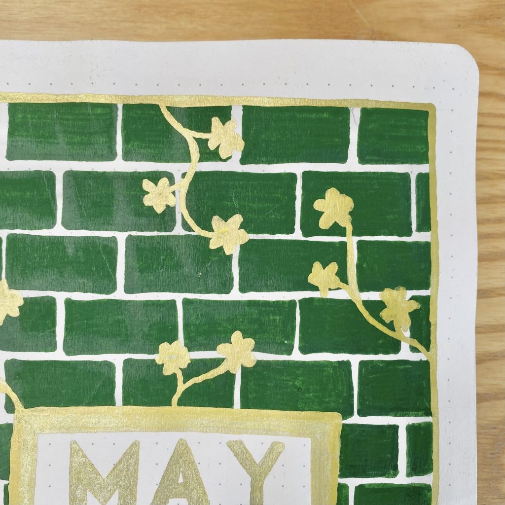
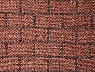
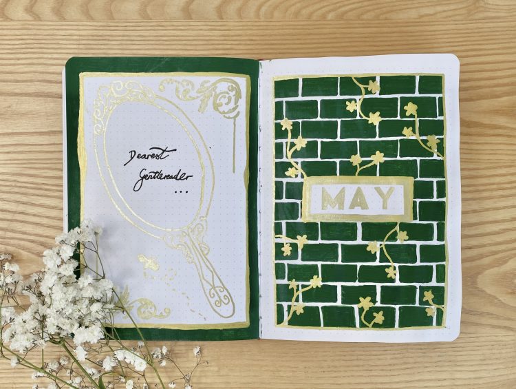
The tagline for the upcoming season of the show is ‘Even a wallflower can bloom‘, which, of course, refers to the leading lady of Bridgerton Season 3 (and OG wallflower): Penelope Featherington. It’s clear that the concept of the wallflower will be integral to the plot of the upcoming season, so I really wanted to incorporate it into my setup somehow. In the end, I opted to create these green ‘brick wall’ backgrounds, then layered over some golden flower doodles, as if they were ‘growing’ up the walls.
- Mirrors
The so-called ‘mirror scene’ from the books has been all any Bridgerton fan can talk about in the run-up to this new season, so the mirror has, of course, become an iconic symbol that has been used throughout the promotional content. Because of this, I wanted to incorporate some mirrors into my setup, so I gave drawing a couple of ornate, golden mirrors a go!
- Bees
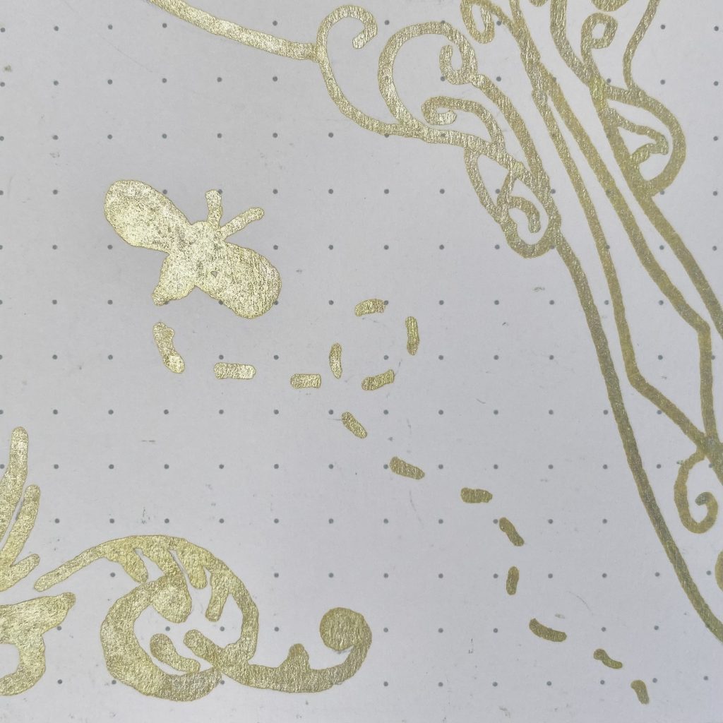
Bees are a running motif throughout the Bridgerton series, so it felt only right to include them in my setup. Every now and then, I’ve included a little, golden, bee doodle as a nod to that.
- Lady Whistledown’s Society Papers
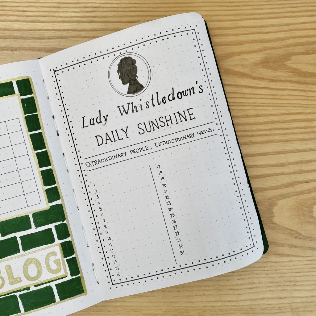
The gossipmonger Lady Whistledown is a central character throughout the series, but will (for obvious reasons, if you’ve seen the first two series) really come to the forefront in the upcoming season. While I do have a whole page inspired by the iconic scandal sheets, I also reused the decorative border from those sheets in my weekly setups, to link my spreads together and give Lady Whistledown the recognition she deserves!
Equipment
Despite being quite an involved, ornate setup, I kept the equipment that I used for this setup fairly minimal:
- POSCA PC-5M Paint Pen, English Green.
- POSCA PC-3M Paint Pen, Gold.
- Sakura Pigma Micron, black (sizes: 01, 05, 08, 10 and Graphic 1- I bought mine in this pack).
- Ruler.
- Scissors.
- Pencil.
- Eraser.
Cover + Quote Page
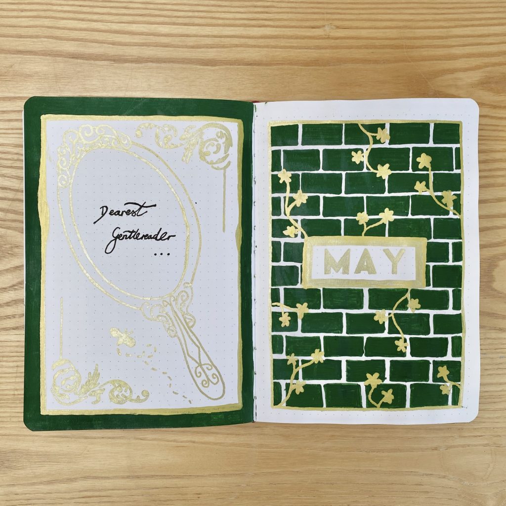
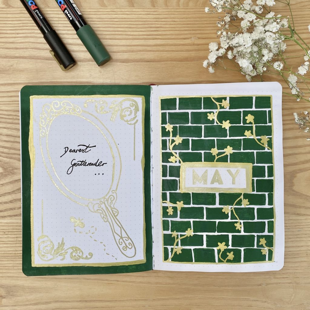
For my Cover Page, I really ran with the wallflower design and created a whole page of bricks and golden flowers. I put the ‘May’ heading in the centre of the page, written in a block capital font (as my little nod to the classic, minimal font used in the show).
For my Quote Page, I created a green and gold border, then drew an ornate hand mirror in the centre of the page, using my gold pen. Inside the mirror, I wrote ‘Dearest Gentlereader’ (though I could not for the life of me decide whether it should be Gentlereader (one word) or Gentle Reader (two words)- everywhere online seems to use two words, but surely if it’s a play on gentlemen, it should just be one?! I just don’t know). To further decorate the page, I added my first little bee doodle, along with some swirly corner frames, inspired by the promotional content for Bridgerton Season 3.
Monthly Calendar
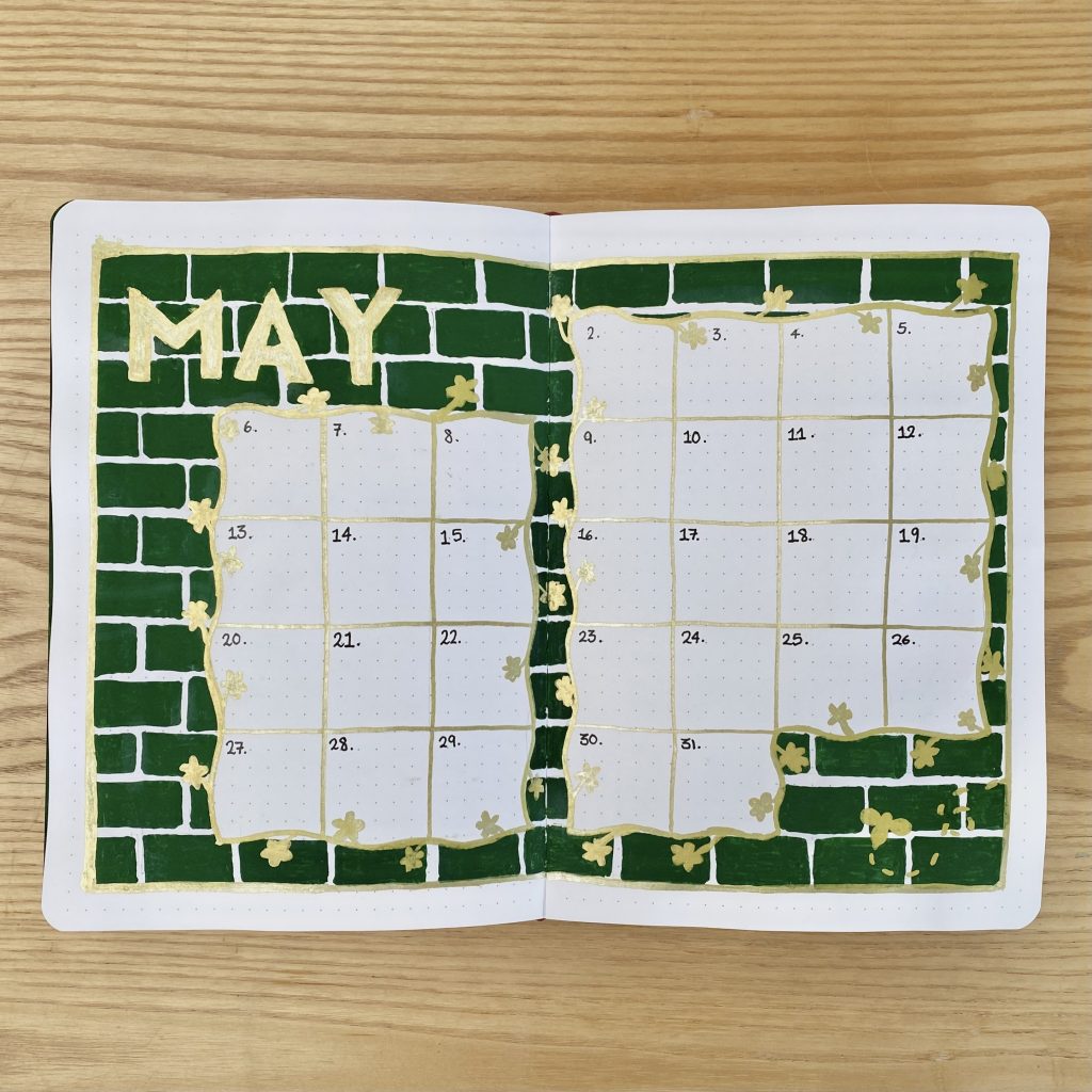
As always, I like to use a double-page spread for my Monthly Calendar, because I like to have plenty of space to write in any events/notes. For this spread, I used that same wallflower-inspired background, but, instead of doodling the wallflowers randomly across the background, I drew the flowers around the calendar grid. I placed the ‘May’ header in the top left, using the same, golden block capital font, and added another bee doodle in the bottom right.
Also, let’s absolutely not discuss the fact that I just… completely missed off 1st May in my calendar…? I have no idea how it happened, but I truly did not even notice until I was writing in the dates after I’d decorated the whole spread. Whole thing. Luckily, because I’m so late with my journal this month, it won’t affect me anyway!
Blog Planning + Daily Sunshine
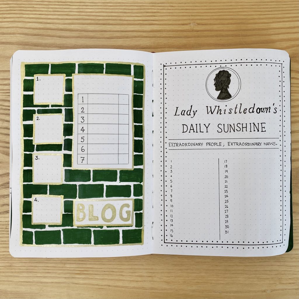
Another spread that uses my wallflower-inspired background, my Blog Planning page has 4 boxes down the left-hand side, for any quick notes on my upcoming posts. I have also included a larger, more detailed box for a super fun, upcoming project I have planned, so keep your eyes peeled for that one! To keep a sense of ✨mystery✨, I haven’t added the subheading for this section yet, but I will be writing that in with a black fineliner.
For my Daily Sunshine page, I opted to forgo the wallflower background and instead tried my best to replicate the design of the Lady Whistledown scandal sheet, as seen in the show, using just my Sakura Pigma Micron pens. The layout does mean that I’ll have limited space to note down my happy memories from this month, but I think it’s worth it (I can always write super small, anyway!).
Weeklies
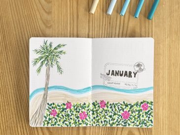
I typically use tabs to separate out my Weekly Spreads, but, recently, I’ve been experimenting a little with different methods/styles of doing this. Back in January, I tried out waterfall-style tabs, where you cut away the whole edge of each page, increasing the width of the pages as you go to get a staggered effect. I decided to do something similar for this setup, but I alternated between wavy floral and straight dark green edges, to achieve a pretty, striped effect. So that my spreads looked fully-decorated no matter what page I was on, I decorated the left-hand side of the first page with more of my green brick pattern.
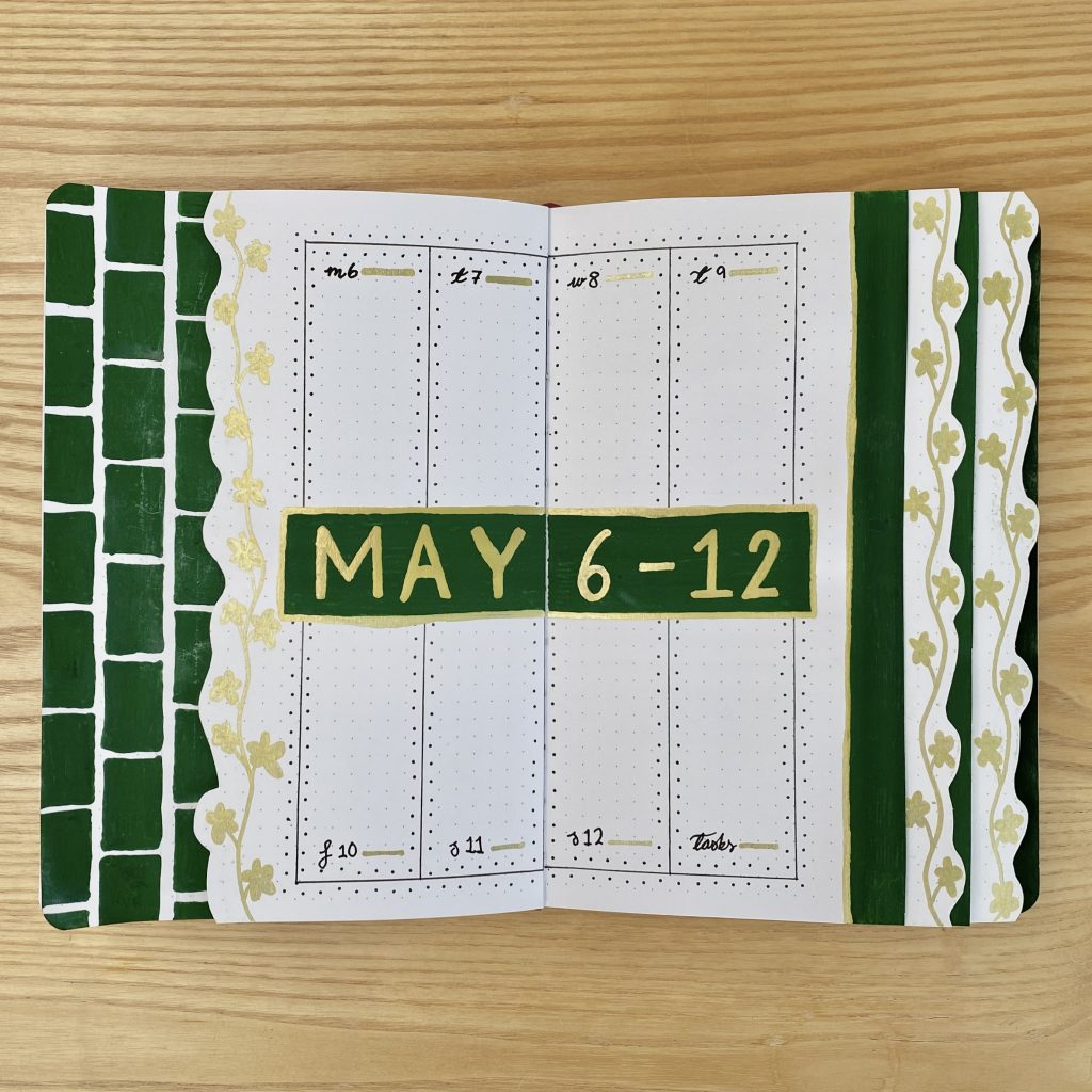
Although I varied the orientation of each of my Weekly Spreads, I tried to keep the style/decorative features quite consistent throughout. In general, I used the same Lady Whistledown border that I used on my Daily Sunshine spread to section up the pages, wrote the subheadings in black script and highlighted them with a line of gold, then used the same font/style for the green and gold headings (except for the first page, where I accidentally drew an extra box… oh well).
Week 1
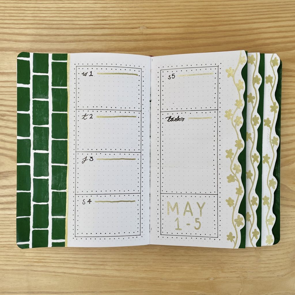
The first 5 days of May run from Wednesday-Sunday, so I only needed 5 daily task list spaces on this spread. I used the remaining space for my task list/heading.
Week 2
I think this might be my favourite layout from all of this month’s weeklies: 4 vertical boxes along the top, 4 along the bottom and the heading right across the middle.
Week 3
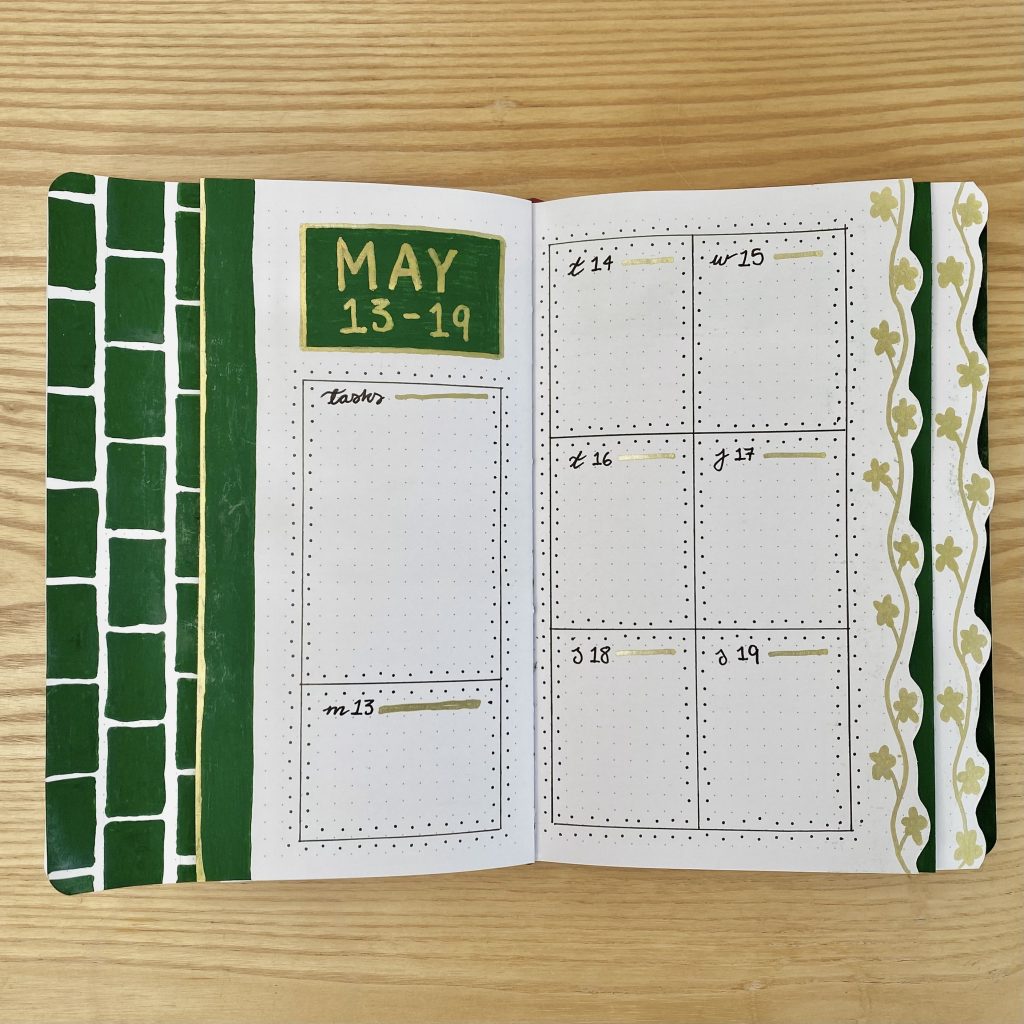
For this spread, I split the right-hand page into 6 sections (a 3×2 grid). I then used the bottom of the left-hand page for the remaining daily task list and the rest of the space for the heading/task list.
Week 4
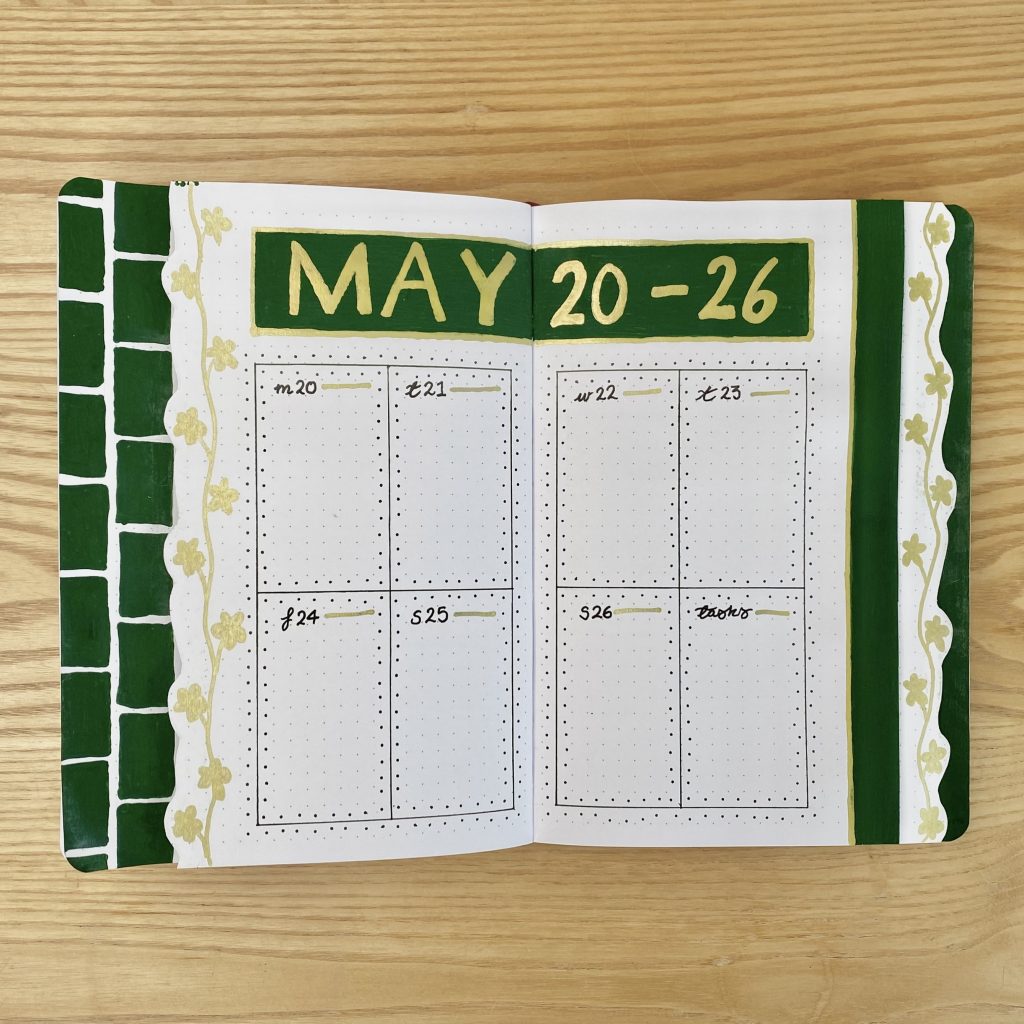
For my fourth weekly, I put the heading along the top and split the remaining space into 8 (one 2×2 grid on each page).
Week 5
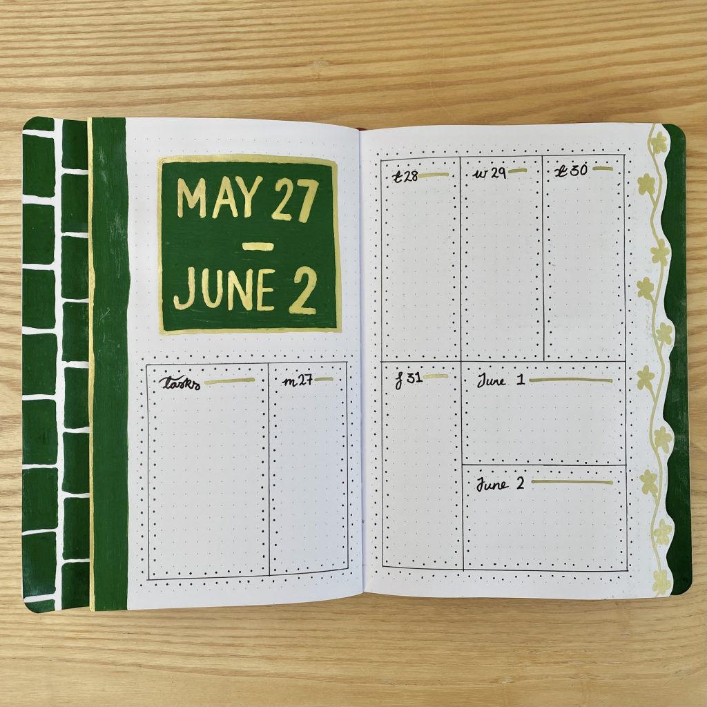
As usual, with my final weekly, I like to include all the days from Monday-Sunday, regardless of whether they fall in the right month or not, just to help me visualise the whole week. To set up this spread, I divided each page in two horizontally, then used vertical boxes for the days in May and horizontal boxes for the days in June, to distinguish between them. I also included a (slightly wider) task box.
May Review
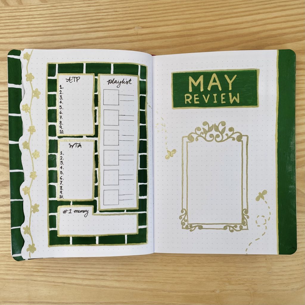
For my May Review page, I’ve included all my standard sections: places to list out the ATP & WTA Top 10, to write out my top memory for the month, to note down my top 6 songs from the month and, finally, to stick in a polaroid picture. As always, I’ve placed the polaroid section on the right-hand page, along with the header, then fit the other sections into the left-hand page.
To decorate the left-hand page, I went back to my brick background (minus the wallflowers, because a) there wasn’t enough room and b) my wallflower tab gave enough floral decoration for me!). I decided to make a ‘frame’ for the polaroid this month (for the first time in a long time) and tried to mimic an ornate, rectangular mirror with my gold pen, by using lots of swirly details. Admittedly, this could just be a picture frame, but I’ll know that it’s meant to be a mirror, so I’m happy. To finish off the spread, I added two, final, little bee doodles.
Final Thoughts
This setup brought a lot of firsts for me: it was my first time using a dramatic colour scheme like this, my first time using paint pens and my first time (attempting to) draw mirrors! Overall, I’m really happy with how it turned out- it’s a very different style for me, but it’s exactly the kind of opulent, Bridgerton-y, #polin vibe I was going for!
When it comes to the paint pens, I was really happy with how they worked here. I didn’t get any bleeding or ghosting (minus one tiny patch on one of my weeklies) and the colour is pretty opaque. I did find it could be a little patchy if I didn’t press the nib down frequently enough, but I think that’s a case of user error. It was a little bit tedious having to wait for each layer of paint to dry on each page, which is part of the reason this setup took me so long to create, but honestly, it was so worth it. If I had created this setup with regular markers/gold ink pens, the colour would absolutely have transferred to the opposite pages while I was setting it up, which I feel would have ruined the effect. Long story short, it required a little extra time and effort, but the end result was better for it!
I hope you’ve enjoyed reading about my May 2024, Bridgerton Season 3-inspired Bullet Journal setup! I’d love to hear your thoughts in the comments- including whether or not you’ll be watching the new season of Bridgerton on 16th May!
Gemma
xxx