
January’s nearly over, which can only mean one thing: it’s bullet journal setup time!
Over the past month, I’ve been rewatching one of my favourite TV series: Veronica Mars. It’s basically a noughties, Neo-noir, teenage detective show, but it’s full of witty dialogue and pop culture references, which makes it extra entertaining. It’s also very much a cult classic- I find that not a lot of people in the UK have heard of it, but I just happened to stumble across it at the start of lockdown and got hooked. I really love it, so, if you haven’t seen it, I’d definitely recommend giving it a watch! Having said that, it does deal with some tough themes, so you might want to have a little look at some trigger warnings beforehand, especially if there are any particular themes that you prefer to avoid.
Actually, on the topic of trigger warnings, I’ve recently discovered a super helpful website for vetting films and TV shows- it’s called Does The Dog Die, and it has a long checklist of potentially triggering events/features that members of the community fill in for each piece of media. While it’s not 100% accurate/comprehensive because it’s a collaborative database (a bit like Wikipedia), it can be a very useful starting point. You can find the page for Veronica Mars here.
Anyway, I digress. As I said, I’ve been rewatching the show recently (for the fourth time, but we don’t need to get into that) and I thought it would be fun to do a Veronica Mars-themed setup for my bullet journal this month. I wasn’t really in the mood for the typical February Valentine’s theme, but there’s a pretty iconic romantic pairing in the show, so I figured it kind of worked out okay. Let’s get into it, shall we?
Table of Contents
- Inspiration
- Equipment
- Cover + Quote Page
- Monthly Calendar
- Blog Planning
- Daily Sunshine
- Weeklies
- February Review
- Final Thoughts
Inspiration
I drew most of my inspiration from the opening credits of Seasons 1-2 and the boxset. Because the show can get a little dark in places (I’m looking at you, Season 3), I really wanted to keep this setup light. While the show can get a bit intense, it also has a lot of fun and humorous elements, so I decided to focus on that aspect of it. I didn’t want to get stressed out by my own bullet journal, after all!
Ultimately, I went for an aqua colour scheme, with some brown Kraft paper and plain, lined paper accents. I used a lot of pencil throughout the setup, as well as lots of doodles, inspired by the opening credits. I basically wanted to give the whole setup a ‘school notebook’ vibe, so there’s lots of torn grid/lined paper, lots of little doodles, and sketchy, imperfect lines.
I used a combination of two main fonts throughout the setup: one was just a simple, messy block capital font, while the other utilised a more traditional, serif style, which I shaded with some diagonal lines. I based the latter on a font called ‘Fredericka the Great‘. I think it did a really good job of giving the setup a little bit more impact, while still keeping that handwritten, messy vibe.
Equipment
Compared to some of my other setups, I actually kept things pretty minimal in terms of my equipment for this one. I only used the following supplies:
- Muji 0.38mm pen, black.
- Tombow ABT Dual Brush Pens: N15 (black) and N89 (warm grey 1).
- Pencil crayons, aqua and dark grey.
- Pencil.
- Ruler.
- Eraser.
- Lined paper.
- Black paper.
- Brown Kraft paper.
- Assorted sticky notes.
- Craft knife + cutting board.
- Spare washi tape.
Cover + Quote Page
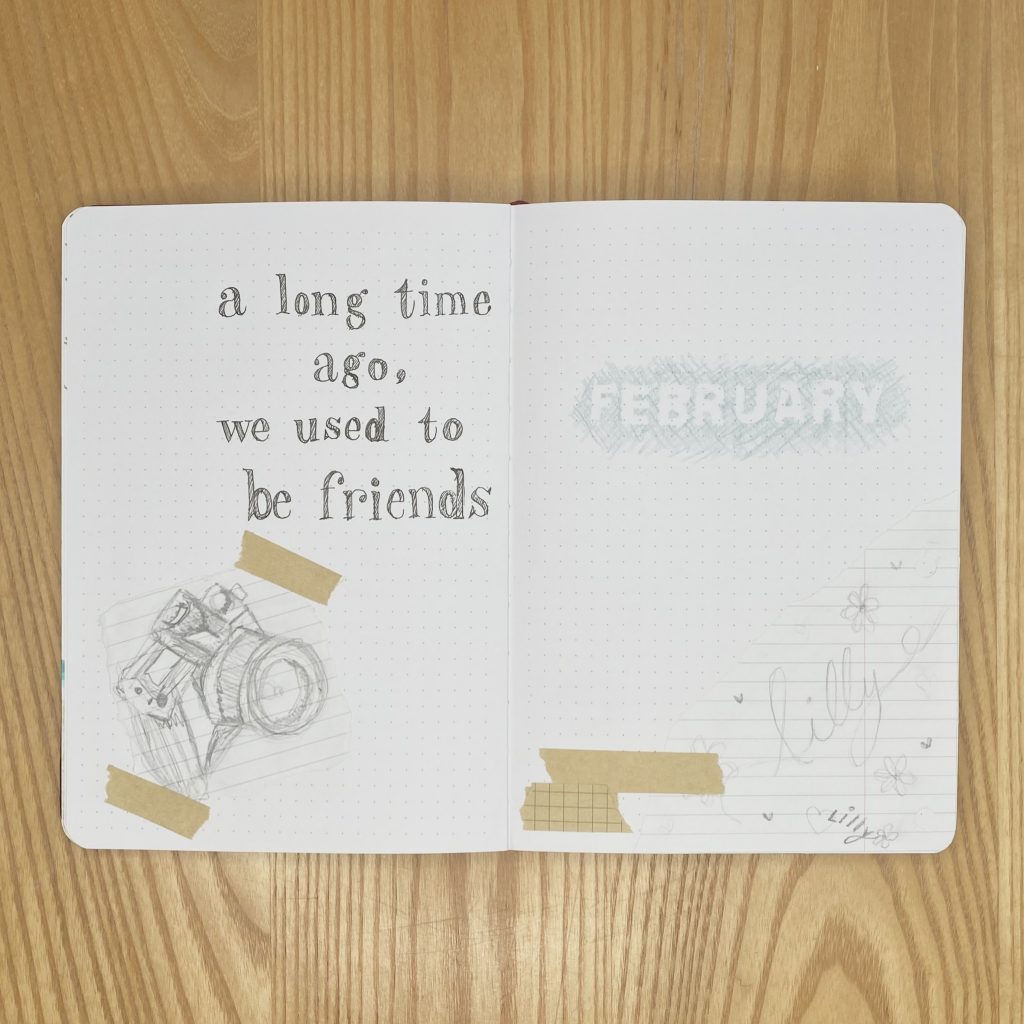
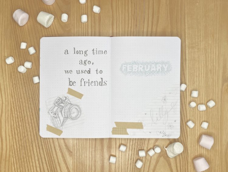
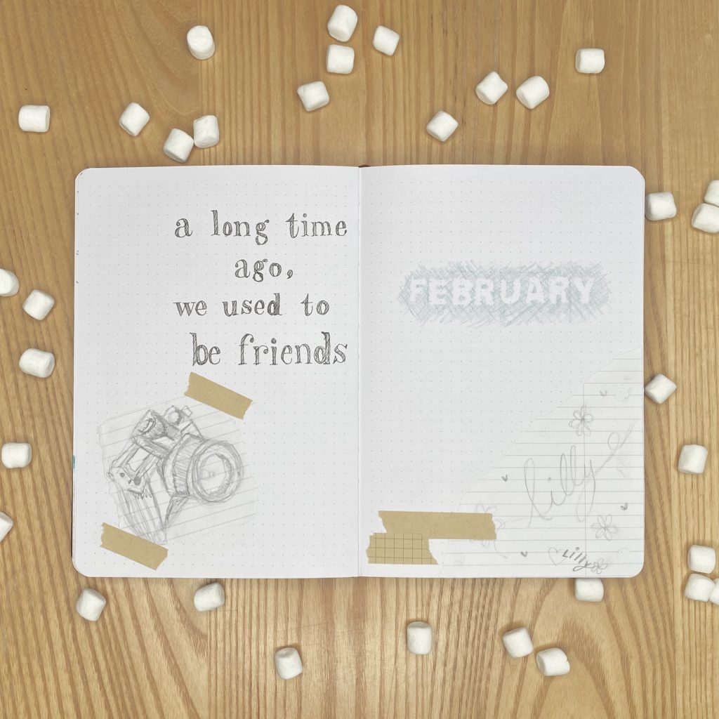
On my Cover Page, I wanted my header to resemble the Veronica Mars logo from the opening credits of seasons 1-2. The logo is meant to look like an aqua pencil has been scribbled across a notebook page to reveal the indented writing from the page before (very Sherlock Holmes, right?). Because bullet journal pages are much thicker than typical notebook pages, and because I wanted my header to be super bold, I couldn’t actually use this method, so I had to find a different way to achieve this effect. I ended up using my craft knife to cut each of the letters of ‘FEBRUARY’ out of some spare washi tape I had. (I found that the easiest way to do this was to use a mostly transparent washi tape and sketch the letters onto some scrap paper beforehand. I then stuck a strip of the washi tape over the top and used the sketch beneath as a guide for cutting the letters. Of course, I then had to carefully peel the washi tape off the paper for each letter, which was a bit tiresome, but what can you do?). I then stuck each washi letter into my journal and scribbled over the whole area with an aqua pencil before carefully peeling off the letters to reveal the negative space beneath. Yes, it was exactly as painstaking as it sounds, but I’m really happy with the result!
To decorate the rest of my cover page, I tore off the corner of some lined notebook paper, and used my pencil to sketch out some of the specific doodles from the opening credits. I then added a few strips of some faux ‘washi tape’, which I made by cutting strips of assorted sticky notes and tearing the edges.
For my Quote Page, I opted to use a quote from the theme song, instead of the show itself, because a) there are too many good quotes to choose from and b) I wanted it to be super clear that this was a Veronica Mars setup. To decorate my quote page, I sketched out (my best attempt at) a little camera on lined paper, to make the setup even more quintessentially Veronica Mars.
Monthly Calendar
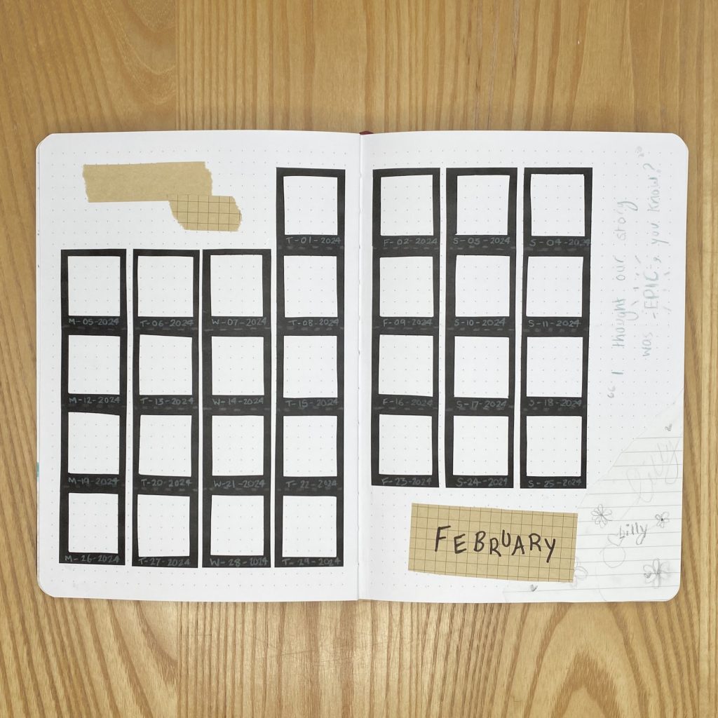
For my calendar this month, I took inspiration from the design of both the boxset sleeve and the DVD case of the film (yep, there’s a film as well! I meant it when I said this show is a cult classic). Both feature these black, film reel/polaroid strips (I’m so sorry, my knowledge of photography stuff is practically non-existent- does anyone know what these are even called?), so I decided to make the calendar out of them. Each day has its own ‘strip’, which I made from black paper (with the help of my trusty craft knife). I tried to give each strip a perforated look by drawing a dashed line along the bottom of each individual polaroid, using a dark grey pencil crayon. I then used my aqua pencil to write the dates in the larger spaces at the bottom of each polaroid- I tried to mimic the style of the timestamps that you used to find on developed photos, so I put the initial of the day of the week, then a dash, the date, another dash, and finally ‘2024’. I really love how the aqua pencil looks against the black paper (it doesn’t show up quite so well in the photo, but it’s super vibrant in real life!) and I think this calendar ended up looking really cool- it definitely gives me all of the Veronica Mars, photography vibes that I was hoping for!
To decorate the rest of the spread, I used the fine tip of my black Tombow to write ‘February’ on a piece of grid-pattern sticky note, added another piece of lined paper with some doodles and, for good measure, wrote one of the most iconic quotes from the series out using my aqua coloured pencil (I mean… Logan ❤️).
Blog Planning
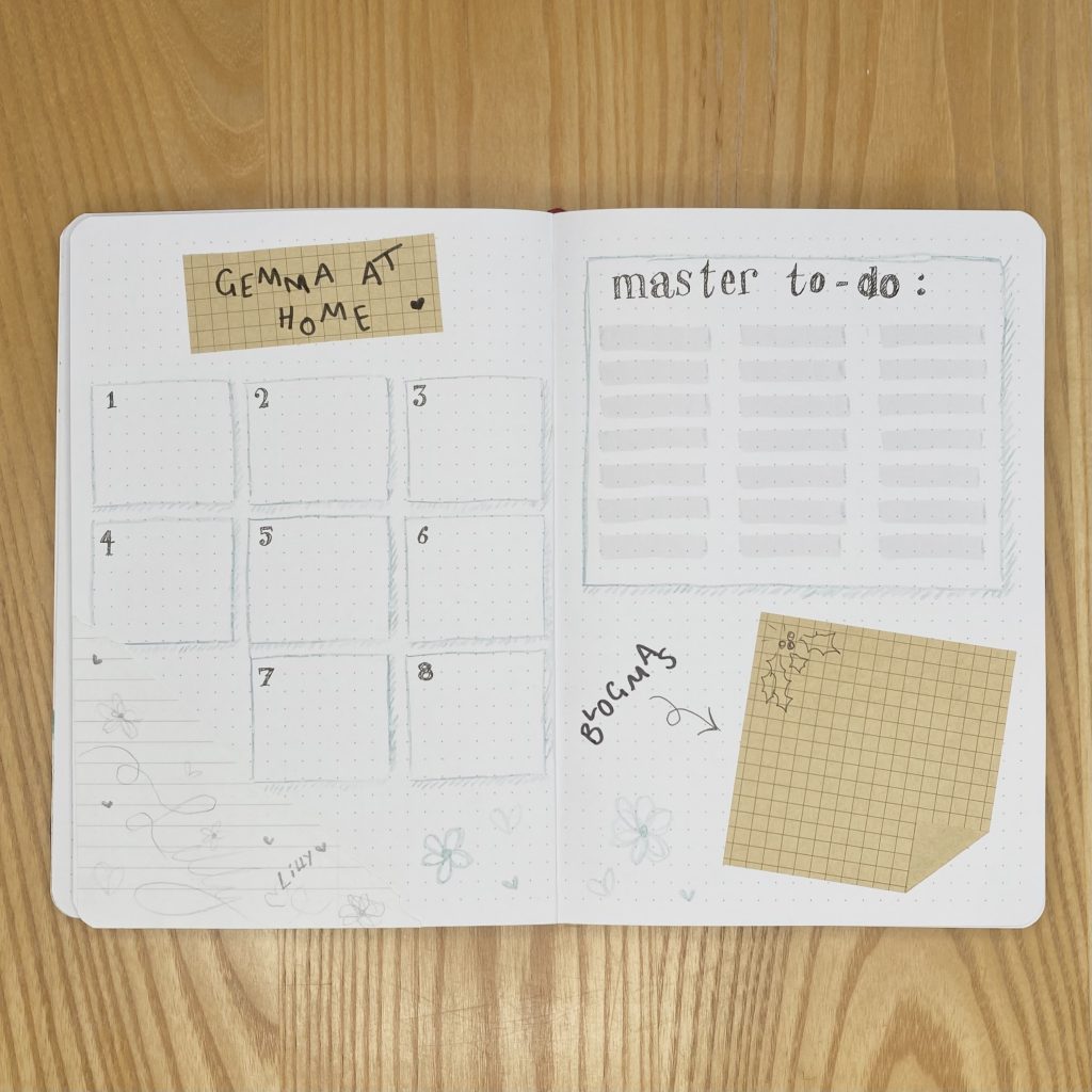
Next up, we have my Blog Planning pages. For this spread, I drew all the boxes with my aqua pencil and added a messy drop shadow to each one. On the left-hand page, I have a space to write any notes for each of my upcoming posts. On the right-hand page, I have a master to-do list and a space for any notes on the work I do in advance for Blogmas At Home this year. For this section, I just used a full grid-pattern sticky note, folded up and stuck down one of the corners, then stuck the whole thing in at an angle. I also added a (slightly questionable) doodle of some holly, for a little bit of festive cheer.
Daily Sunshine
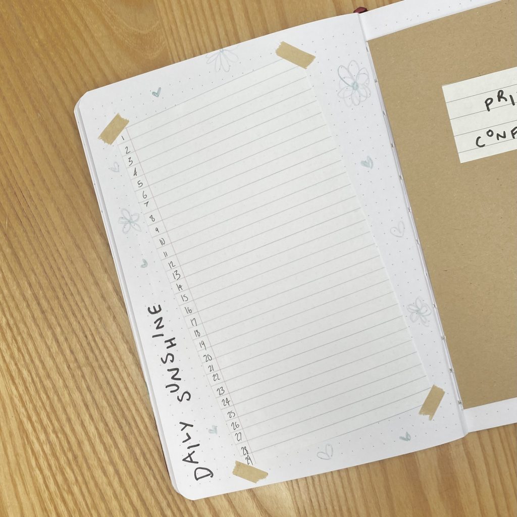
Because of how I set up my weekly spreads this month (you’ll see those in a moment), I decided to save some space by putting my Daily Sunshine page alongside my weeklies. I gave habit-tracking another shot last month after having a pretty long hiatus from it and… it was very unsuccessful, so I’ve scrapped that this month. I do love this ‘Daily Sunshine’ page though, where I write down one good thing (big or small) that happened every day, so I made sure to include that, as always.
To create this page, I just cut a rectangle of lined paper, making sure that the finished piece had 29 lines (one for each day of February). I wrote the dates down the left hand side, in the margin, then stuck the paper in at a slight angle and added some more sticky note ‘washi tape’ on each corner. I finished off the page with some aqua doodles and the ‘DAILY SUNSHINE’ header, down the left-hand side.
Weeklies
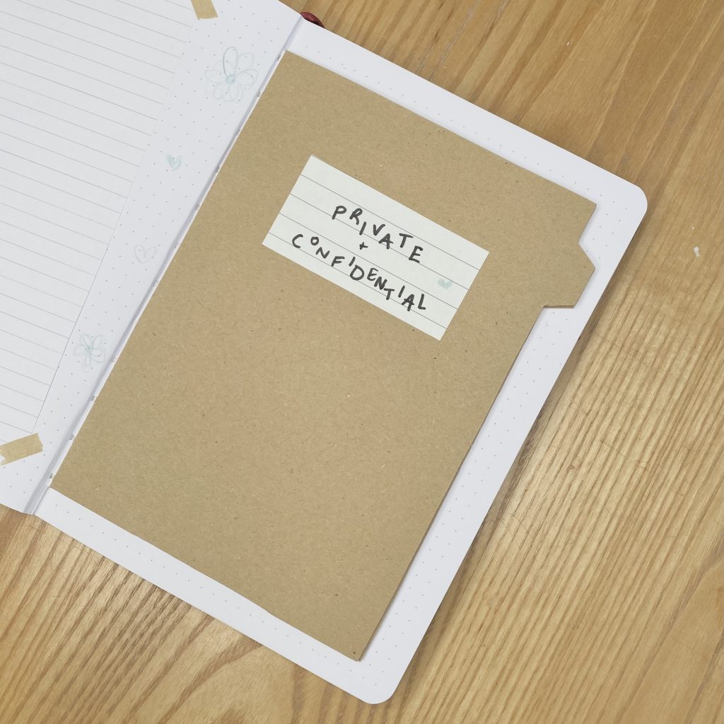
For my weekly spreads this month, I had the idea to create a mini ‘folder’ within my journal. Those classic, brown paper files feature prominently throughout the series- whether they’re the students’ school files that Wallace is stealing for Veronica, case files for clients or even doctor’s medical files! ‘Tis the life of a teenage private eye, I guess. Anyway, I thought it would be very on-brand to include a folder in my setup, so I opted to create one using the Dutch Door technique (i.e. trimming the pages down, here from the top, bottom and edge, to make a mini ‘booklet’ within the journal).
I covered both sides of the first and last pages of my ‘folder’ in brown paper and cut a tab in the same place on each of them, so they would line up when the folder was closed. I trimmed the 4 pages between those two brown pages down even more, so that they were hidden within the ‘folder’, and cut more tabs into them, as I always like to do. Essentially, my first weekly uses the inside cover of the folder and the first white page, my second, third and fourth weeklies have two white pages each, then my final weekly uses a white page and the other inside cover of the folder. You’ll see what I mean once we get into them.
Week 1
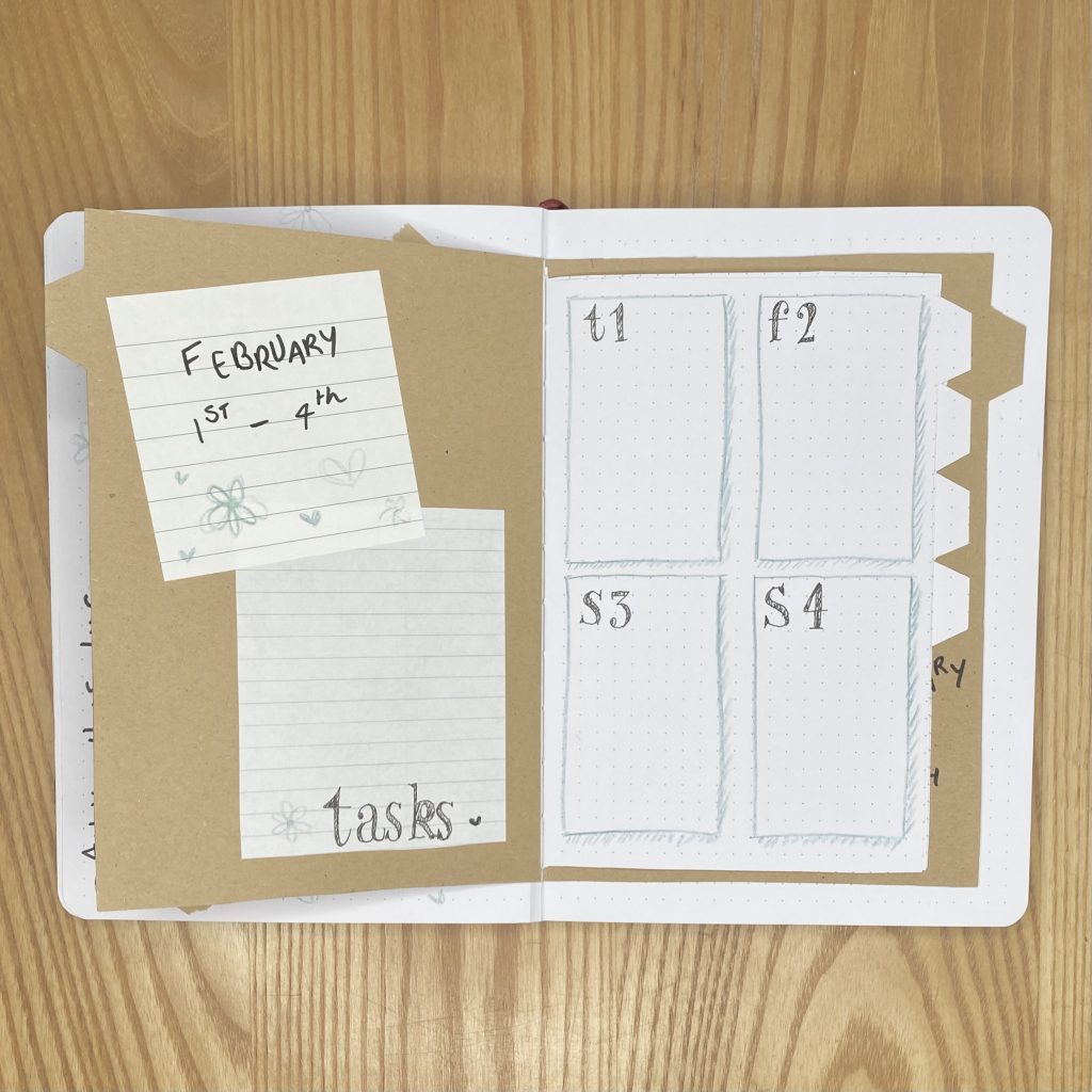
As I mentioned, the first weekly spread spans the inside cover and the first white page. I stuck in a lined sticky note and a piece of lined notebook paper on top of that inside cover, so that I could write on it more easily, and used those spaces for the header and my master task list. On the right-hand page, I made 4 boxes, one for each of the first 4 days (Thursday-Sunday) in February. I drew the boxes using my aqua pencil, with a drop shadow like those on my Blog Planning page, then wrote in the dates using the same, sketchy font as earlier.
Week 2
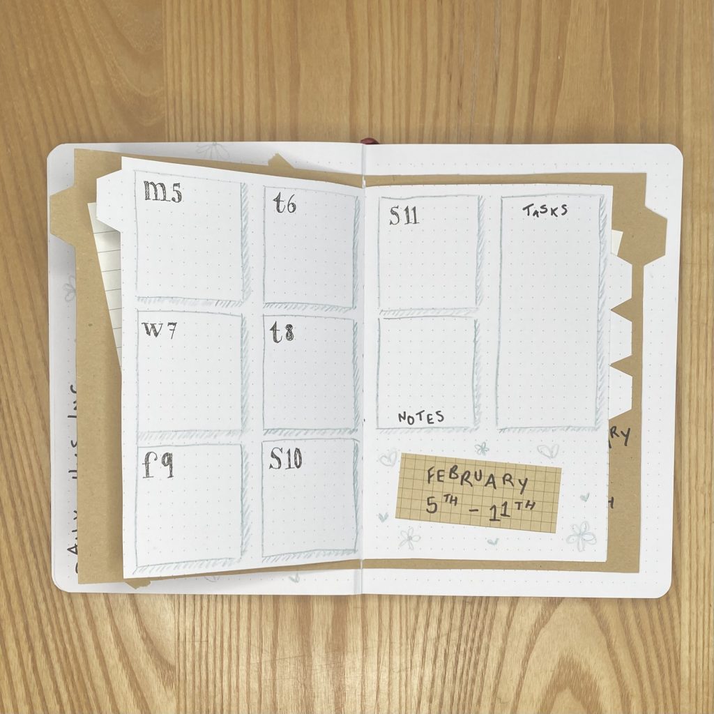
For my second weekly, I divided each page into 6 individual spaces (2 across, 3 down). Each day of the week, as well as my notes section, was allocated one of those boxes, while my task list spanned two spaces, one on top of the other. I wrote the header for this weekly on a piece of grid-pattern sticky note and stuck that into the remaining space.
Week 3
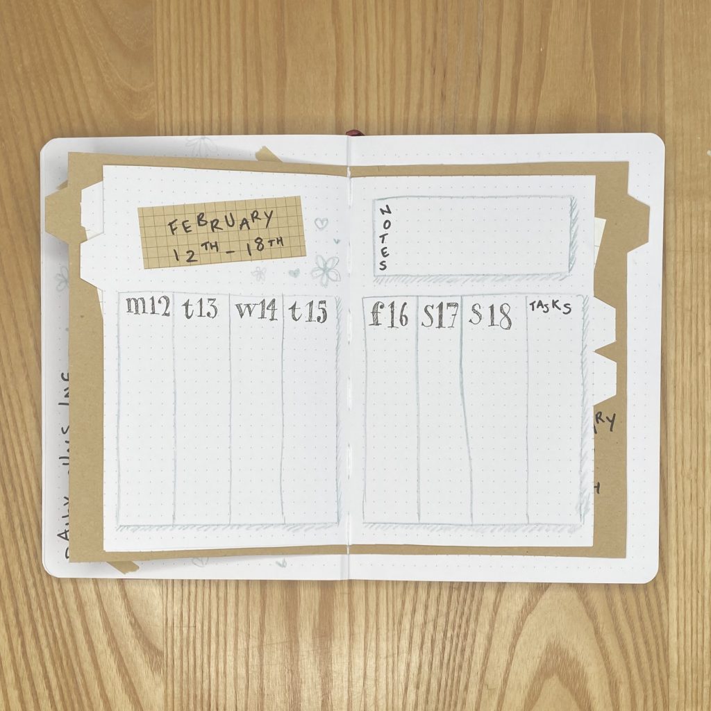
For my third weekly, I opted to use my favourite vertical layout, where each page is split into 4 vertical columns (one for each day of the week, plus one for my task list). I used the space at the top for my header and my notes section.
Week 4
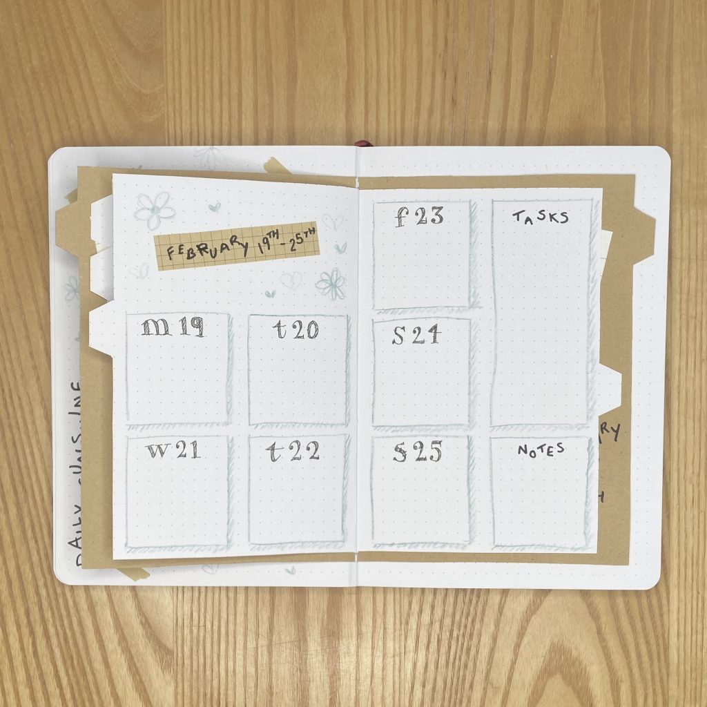
For my fourth weekly, I repeated the layout from my second weekly, just changing where I put the header. I mean, there’s only so many orientations that I can dream up!
Week 5
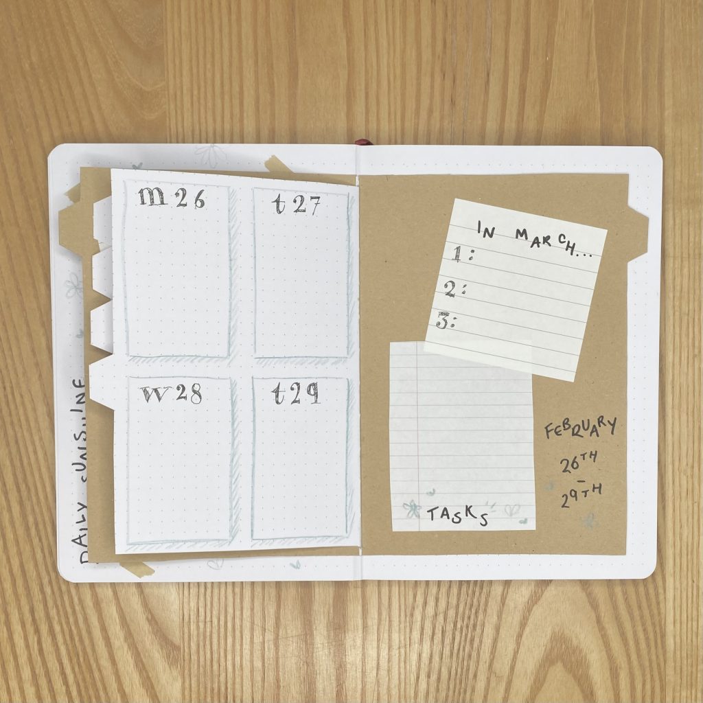
The fifth and final weekly included the other inside cover, so I basically copied the setup from the first weekly setup, just in reverse, so the daily boxes are on the left-hand page and the header/task list are on the right. Instead of writing the header on the sticky note, though, I wrote it directly onto the kraft paper and used the sticky note for the first 3 days of March (i.e. Friday 1st-Sunday 3rd).
February Review
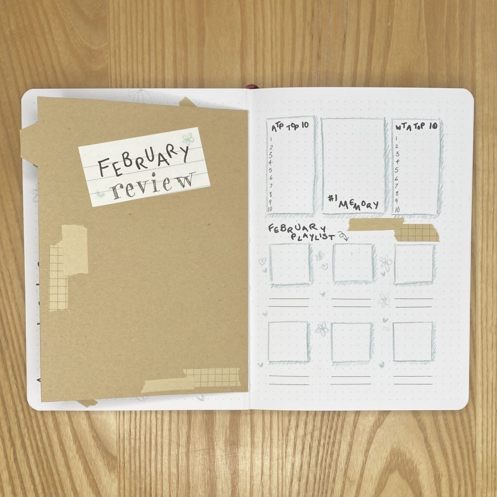
I switched things up a little with my Monthly Review spread this month, in that I… literally just switched the pages around. I know, I know, groundbreaking stuff. Because the space on the left was smaller than on the right, I figured it made more sense to put the header/space for the polaroid picture there, and put all of the more detailed notes on the larger, right-hand page. As always, I have spaces on that page for the ATP/WTA Top 10, my favourite memory and my 6 favourite songs from the month.
I kept things really simple with decoration for this spread- just the same aqua boxes that I have used throughout this setup, some more faux ‘washi tape’ and a couple more doodles.
Final Thoughts
I am so happy with how this setup turned out. I was so worried about getting it right and how much work it was going to be that I really procrastinated making it, which made me so stressed. However, aside from a couple of more labour-intensive features (specifically, the weekly ‘folder’, the monthly calendar and the cover page header), it was actually a really quick setup to create. I think my ideas really paid off in this setup and look super effective- particularly my weekly ‘folder’! I also think that it has a definite Veronica Mars vibe without being dark or moody in any way- just what I wanted! Overall, I’m pretty proud of this one.
I hope you enjoyed my February, Veronica Mars-themed setup! Please let me know what you think in the comments below and tell me: have you seen Veronica Mars? What did you think?
Gemma
xxx
While I haven’t seen Veronica Mars, I do appreciate how creative that folder insert is for your weekly spreads. Thank you for sharing with us!
Thank you very much Nick! That is so kind of you.
Never seen the show Gemma but love your layout
Thank you so much!