

I don’t often go for a full-on, Valentine’s-inspired theme for my February bullet journal setups but, this year, I felt an all-consuming urge to litter my monthly pages with as many hearts as I possibly could. I can’t explain it— it just happened.
Initially, I had planned to use a classic, red and pink colour scheme. Then… I watched Wicked. I’ve never been a huge fan of pink and green as a colour combination (despite Nigella’s best efforts in her 2015, Simply Nigella era), but, (for obvious reasons) ever since watching the film, the combo has just been stuck in my head. Because of that, I decided to go for pink and green hearts, which actually worked well, in a Galentine’s kind-of-way, because I LOVE the friendship between Galinda and Elphaba in the film (and musical, which is actually the first musical I ever saw live!). The colour scheme then seemed to spiral into a whole Wicked theme, that is sometimes subtle and sometimes… less so.
Long story short, this setup morphed and changed as I created it. Some pages are super maximalist, while others are much more simple and minimal. I just had fun with it and let whatever happened happen— it was a bit of a different experience for me!
Table of Contents
- Equipment
- Cover + Quote Page
- Monthly Calendar
- Weekly Spreads + Daily Sunshine
- February Review
- Final Thoughts
Equipment
To make this setup, I used the following equipment:
- Uni Pin Fine Line pen: 0.5, sepia.
- Sakura Quickie Glue pen.
- Heart craft punch, small (I’ve had mine for years, so I can’t give you an exact link, but there are loads of similar products available online!).
- Coloured paper: dark green, mid green, mid pink, pale pink.
- Scissors.
- Corner rounder.
- Ruler.
- Pencil.
- Eraser.
Cover + Quote Page

The Cover Page was my starting point for this whole setup— it was the only page that I had any real ‘plan’ for before I started! I wanted to create a cascading effect of little hearts, almost like confetti, or the sparkles in a snow globe. To do this, I cut out loads of paper hearts from coloured paper (in my chosen pink and green shades), using a little heart-shaped craft punch (I’ve had this one for years, so I’m not sure where exactly it’s from, but you can find loads of similar ones online). I arranged them first, to check that I was happy with the positioning, then stuck each one in (rather painstakingly, I must say) with my Sakura Quickie Glue pen.
For the heading, I wanted to mimic the whimsical font from the title screen of the film, so I did my best to replicate it. I used my sepia fineliner for this and, to keep things simple, I decided to omit the drop shadow from the original font. To make the text stand out, I filled in each letter with that same, brown fineliner.
The Quote Page was actually the final page that I created in this setup and… I think you can tell that, by that point, I was kind of done with glueing in the hearts. As a result, this page is a little too minimal for my liking, but it was either that or a paper heart-induced meltdown, so I can’t say I’m unhappy with my decision. The quote, of course, is “Defying Gravity”, after the iconic song from the musical (and film, now!).
Monthly Calendar

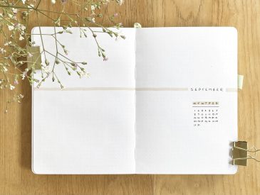
The Monthly Calendar might just be my favourite spread in this setup— I really like the simplicity of it! To create it, I drew out a simple grid-style calendar using my sepia fineliner, then stuck a little paper heart into each box, on top of which I wrote the date (using that same, brown fineliner). I drew all of the lines freehand and went over each one twice to make them a bit more bold. I also added little heart-shaped details to each corner of the grid, to make the spread look a little more ornate (and to incorporate more hearts, because, obviously). To finish off the spread, I wrote the ‘February’ heading in the exact same style as the Cover Page in the space in the top left.
Weekly Spreads + Daily Sunshine

I had this crazy idea to house my Weekly Spreads inside a Grimmerie-inspired dutch door this month, just to pay tribute to this setup’s Wicked theme. In the film, the Grimmerie is an important spellbook that has a really interesting, angular shape and ornate design. However, I didn’t want to cut my pages down too much (because I like to have lots of space for my daily task lists) so, in the end, I opted to keep the pages cut straight and to draw the Grimmerie shape on, instead.
The original Grimmerie is a brown leather book, with an ornate, debossed pattern and gold hinges. I loved mimicking that ornate pattern, but I kept things simple by just using my sepia fineliner for the whole drawing, adding touches of block colour here and there, within the pattern to add dimension.

I drew the Grimmerie design on the first and last pages of my weekly spreads, so it’s almost like they’re enclosed within the book itself. As I have been doing recently, I used the remaining space on the far left and far right for my master tasks/notes sections, so that I can easily reference them at any point throughout the month. This month, I also decided to add in two smaller sections: one for any recurring, daily tasks and one for my blog schedule, just so I can keep both of those things at the forefront of my mind.
All of these design changes meant that I had two empty spaces leftover: one on the very first page and one on the very last. I’ve been hoping to get back into using my Daily Sunshine spreads (where I write down one positive thing that happened every day) at some point, so this felt like the perfect opportunity! On the first page, I have space to write down one good thing each day, from the 1st to the 14th February. On the last page, there’s space for Daily Sunshine from the 15th to the 28th February.
Week 1

Into the individual weekly spreads now! As I often do, I have merged the first two days of February (which fall on a weekend) with the first full week, just to save some time, as well as some space in my journal! As a result, I divided this spread into 10 sections (5 down, 2 across), used 9 boxes for the 9 daily task lists, then used the remaining space for the heading.
Week 2

For the first 7-day weekly spread, I went for my classic 4×2, vertical layout.
Week 3

The third weekly spread uses exactly the same layout as the second, but I’ve changed the location of the heading to the bottom left-hand corner.
Week 4

The final week of February only contains 5 days, so I could afford to give each daily task list a little more space in this spread. I divided the spread into 6 sections (3 down, 2 across), then used the space in the top right for the heading.
February Review

Finally, we come to my February Review spread. I’ve kept the layout of this one pretty much identical to my January Review spread last month, but, of course, this time around, I’ve added about a hundred little paper hearts to decorate it.
On the left-hand page, I have spaces to write in the ATP & WTA Top 10, as well as a place to write down my favourite memory from the month gone by. Below those, I have 6 spaces to note down my 6 favourite songs in February.
On the right-hand page, I have the heading (with ‘February’ written in that same, Wicked-inspired font), and the rest of the page is filled with another paper heart cascade, over the top of which I can stick in my monthly polaroid photo.
Final Thoughts

Overall, I like this setup, but I don’t think it’s my absolute favourite— I think because I didn’t have any real plan going in and it changed so frequently as I set it up, it ended up being such an amalgamation of so many different themes/inspirations all combined together that I just feel a bit discombobulated by the whole thing! Having said that, it definitely gives me the Wicked, Galentine’s, female friendships vibe that I was going for, so I think it will be a nice setup to use over the next month. As much as I love all the hearts, I could very happily go the rest of my life without having to glue a tiny paper heart onto anything, so there’s that too.
I hope you’ve enjoyed reading about my February 2025 bullet journal setup! It’s a bit different to my usual style, but it was still a lot of fun.
Gemma
xxx