Welcome to Blogmas At Home! For the next 24 days, in the run up to Christmas, I’ll be posting here on the blog on a dailybasis. Yep, you read that right. 24 posts in 24 days, all because I am straight-up addicted to the Christmas spirit and have SO MANY ideas and dreams and plans and… I’m already getting overexcited. Keep it together, Gemma.
Today is Day 1 and we’re kicking things off with my December 2023 Bullet Journal setup. To be honest, I absolutely meantto post this setup a week ago, but it ended up taking a lot longer than I originally planned- not so much the actual making of it, but deciding how to get what was in my head onto the paper. Sometimes, I guess, bullet journalling is just like that. Anyway, it all works out, because it just means I can post it now for Blogmas At Home!
Christmas is my favourite time of year, so I knew I wanted a festive theme for my bullet journal setup this month. I ended up using one of my favourite Christmas films, Klaus, as inspiration and I really love how it turned out!
Table of Contents
- Inspiration
- Equipment
- Cover Page
- Monthly Calendar
- Blog Planning + Daily Sunshine
- TV Schedule + Christmas Countdown
- Weeklies
- December Review
- Final Thoughts
Inspiration
Klaus is one of my favourite Christmas films. It’s kind of… weird…? at the start, but by the end it is so warm and festive and uplifting. It’s essentially an origin story for Father Christmas, but it’s not your average origin story. There’s a postman, warring clans and Margu 🥹🥹 (more on her later).
I knew I wanted to give my setup a really Christmass-y feel, so I made sure to include lots of gold in my colour palette, which was otherwise mainly blue and red (inspired by the outfits of the Sami characters in the film). I also experimented with some different art styles and techniques, in an attempt to capture the animated nature of the film. I used two main fonts throughout this setup: the first is the font used in the title of the film- it’s a pretty detailed golden lettering with a red outline. For the other font, I did a basic sans-serif, lowercase font, which I wrote in a sort of uneven, scattered way- children learning to write (and writing letters…) plays a big part in the film, so I wanted this font to seem like it had been written by a little kid.
I really wanted this setup to have a sense of childhood nostalgia and innocence about it- so I tried really hard not to worry about being too perfect. I used a ruler for a couple of things, here and there, but most of the time I drew the lines freehand and didn’t worry if they were a bit wobbly. It was a bit hard for me- I love my ruler, but I do think it was the right move for the theme!
Equipment
For this setup, I used the following equipment:
- Muji 0.38mm pen, black.
- Tombow ABT Dual Brush Pens: Warm Grey 1 (N89), Light Sand (990), Cool Grey 12 (N35), Cool Grey 10 (N45), Cool Grey 5 (N65), Chinese Red (856), Cobalt Blue (535), Process Blue (452).
- Crayola SuperTips: light brown, dark brown and 4 shades of green.
- STAEDTLER Metallic Marker pens: gold and silver.
- Faber-Castell PITT Artist Brush Pen, Indian Red (192).
- Sakura Gelly Roll, 10 Bold, white.
- Colouring pencils: red, blue, brown, gold and peach.
- Brown kraft (printer-friendly) paper, along with various other shades of brown paper.
- Parchment-coloured paper.
- Red and blue coloured paper.
- Gold glitter paper.
- Scissors.
- Glue stick.
- Glue pen (optional- I like to use this for more detailed pieces, but you can just use a glue stick if you prefer).
- Ruler.
- Pencil.
- Eraser.
- Tracing program + compatible device (I used Procreate on my iPad and used an Apple Pencil for added precision).
- Printer.
I know this list is loooonnngggg, but this setup is one of my more involved ones! You don’t need all of this equipment- for example, you could easily trace the images the old-fashioned way with tracing paper, or even draw them freehand. This is just what I used to achieve these spreads.
Cover Page
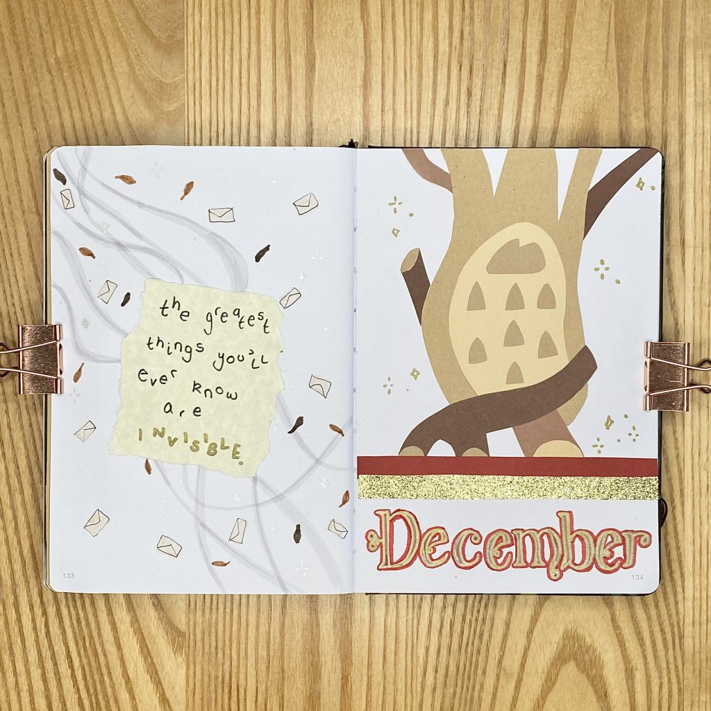
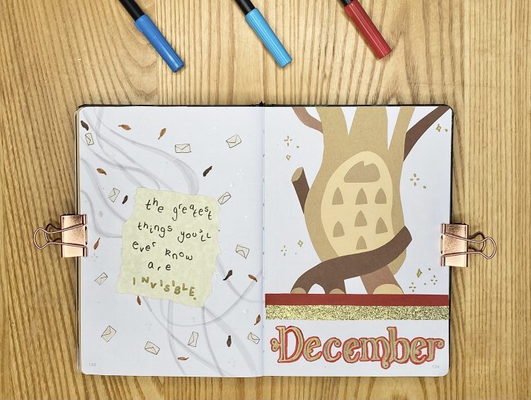
For my Cover Page, I wanted to include the ‘family tree’ from the film. I would have loved to include all of the little figurines that go onto it too, but I just couldn’t figure out how best to represent them. To make the tree, I tried a new technique of cutting out the different elements from different shades of brown paper, then sticking them all together like a puzzle. I sketched out the tree to begin with, then traced each of the individual elements to make the pieces. I really love how this turned out- I think it definitely fits the animated vibe I was going for, but it did take a while!
For the December header, I recreated the Klaus font, using my dark red Faber-Castell, gold STAEDTLER and red Tombow pens. I added some strips of coloured paper (red and gold glitter), then added some little sparkly doodles around the tree with my gold STAEDTLER pen.
For my Quote Page, I opted to use a quote from a song that is featured in the film: ‘Invisible’ by Zara Larsson. I LOVE the scene in which this song is used, so every time I hear it I can’t help but smile. I also thought it was a particularly fitting quote for this time of year.
I wrote the quote onto some parchment coloured paper, in the simpler of the two fonts, using my Tombow N35 and gold STAEDTLER pens. To decorate the page behind the quote, I tried to recreate the magical ‘breeze’ that features throughout the film. For this, I used my Tombow N89 to draw some swirling lines, then added some little brown leaf doodles (using my Crayola SuperTips), as well as some envelopes (using my Tombow 990) and silver sparkles (using my silver STAEDTLER).
Monthly Calendar
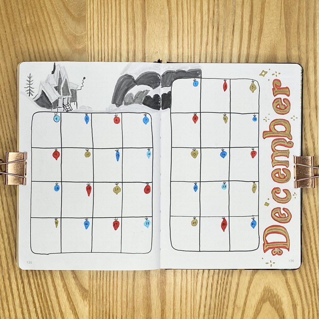
For my Monthly Calendar spread, I opted to use my typical grid-style layout (this time with 6×7-sized boxes). I drew the grid freehand, with my Tombow N45, then used my red and blue Tombows, along with my gold STAEDTLER pen, to draw a little bauble in each box, for the date. I drew a little string and bow on each one with my Muji pen, then used the same pen to write the date over the top.
To decorate this page, I recreated the December header from my cover page down the right-hand side and added some more gold sparkles. In the space along the top, I tried yet another art style: using an assortment of grey Tombow pens to make a super minimal drawing of one of the shots in the film. I think it worked pretty well and it was much quicker to create than the paper tree on the cover page (though I still have a soft spot for my puzzle tree).
Blog Planning + Daily Sunshine
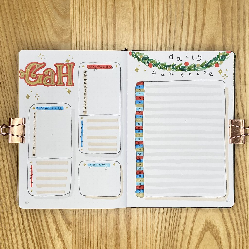
I’ve been using both of these spreads for a good while now, and I’m been really enjoying them. On the left-hand page, I have my Blog Planning spread (unfortunately titled GaH, for Gemma at Home, because I did not realise the initials of this blog spelt out ‘gah’ until I created it). It looks a little different here, because I had to tailor it to Blogmas at Home, but I have a checklist for each post (with some messy scribbles because I, apparently, cannot count), spaces for notes and a little space to look forward to January posts.
On the right-hand page, I have my Daily Sunshine spread. I kept this one pretty simple- just a large box for noting down one happy memory per day. I coloured each row in on the right hand side, rotating the 4 colours I’ve used throughout the setup- it’s giving… scarf? For the header, I made a little garland using my green Crayola SuperTips.
I also went a bit crazy on this double-page spread with highlighting and drop-shadowing. It’s kind of… clashy? But I love a drop shadow, so I’ll forgive it.
TV Schedule + Christmas Countdown
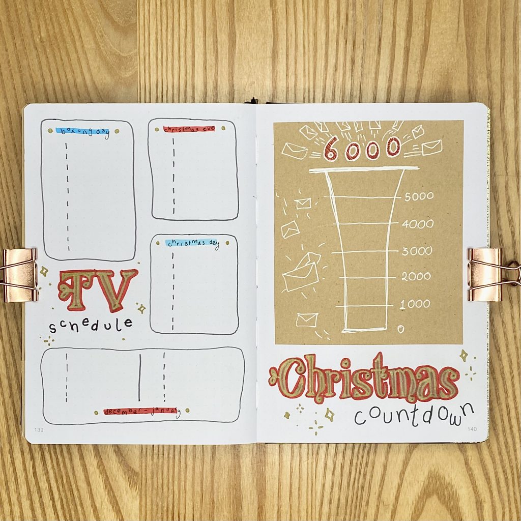
Now we have my December/Christmas-specific spreads: a TV Schedule and Christmas Countdown. I used to love getting the Christmas edition of the Radio Times every year and finding out when all of the Christmas specials were on TV. I created my TV Schedule to keep track of all of the things I want to watch/catch up on- Christmas TV is so fun and nostalgic for me, so I definitely don’t want to miss anything!
The right-hand page might just be my favourite design in this whole setup: my Christmas Countdown! I modelled this one after Jesper’s letter tracker in the film (which is why it goes from 0-6000 instead of 1-24). Every day, I’m going to colour in 1/4 of a section, so that, on Christmas Eve, I’ll have coloured in the whole thing and it will be CHRISTMAS TOMORROW! It’s basically like a less exciting (read: less chocolatey) advent calendar, but it’s just a little bit of festive fun, really.
Weeklies
As always, I’ve used tabs to separate out my weekly spreads. I used my beloved glue pen to cover each tab in coloured paper, alternating between blue and red. I also stuck in two strips of gold glitter paper, one on the far left of the first weekly spread and one on the far right of the December Review page, so that the tabs would stand out more (but also to add an extra bit of Christmassy sparkle to the setup).
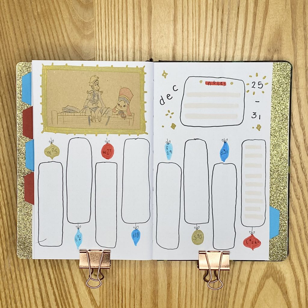
I kept my weeklies pretty consistent in terms of style/decoration- just switching up the layout of the boxes for each week. I drew all the boxes freehand, using my Tombow N45 and wrote the headers using my Tombow N35, with my simpler font, decorated with more golden sparkles. For the daily lists, I used more bauble doodles for the dates, then wrote the day of the week along the top using my Muji pen. For the note and task boxes, I highlighted every other line with my Tombow 990, then used my red and blue Tombows to highlight the header. Finally, I added two little gold dots on either end of each header.
On each of my weeklies, I have included a little ”drawing’ of a scene/character from the film. I really wanted to include depictions of my favourite character (Margu 🥹🥹🥹 she’s SO ADORABLE) but… my drawing skills are very, very limited (read: nonexistent). Usually, if I want to include a drawing from a reference, I will trace it. I do this by printing the mirror image of the reference image, tracing it with a pencil onto tracing paper, then flipping the paper over and going over the whole thing again, to transfer the original pencil lines. Then, I go over the lines with my Muji pen and THEN I can finally add colour. Honestly, it’s a lot of work. It’s really effective and I do like it as a method, but, considering I wanted 5 (super small and intricate) drawings for this setup, it just seemed like a ridiculous amount of work. Instead, I traced the reference images digitally (I used the Procreate app on an iPad, with an Apple Pencil, for extra precision). When I was done, I turned off the background layer, then exported my drawings as PNG files (this file type preserves the transparency of the background). I resized the images on Pages, then printed them directly onto my brown kraft paper. I then cut around each image, coloured them in with coloured pencils and stuck them into my bullet journal. I also drew a little frame around each image with my gold STAEDTLER, just to help tie them into the setup a little more. I really liked this method- it was definitely a much quicker way of doing it and I liked that it gave my setup a kind of colouring book-vibe.
Week 1
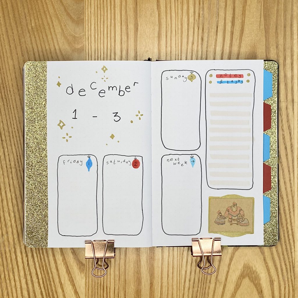
There are only 3 days in the first week of December, so I could make extra large boxes. I meant to use two separate boxes for the notes and tasks lists, but I got confused and ended up using one box for both! To fill in the extra space, I added a space for any events that might be coming up in the next week.
This week’s drawing is of the titular character, Klaus, when he tries on his Sami outfit for the first time- it’s one of my favourite scenes! I decorated it with a simple, curved frame.
Week 2
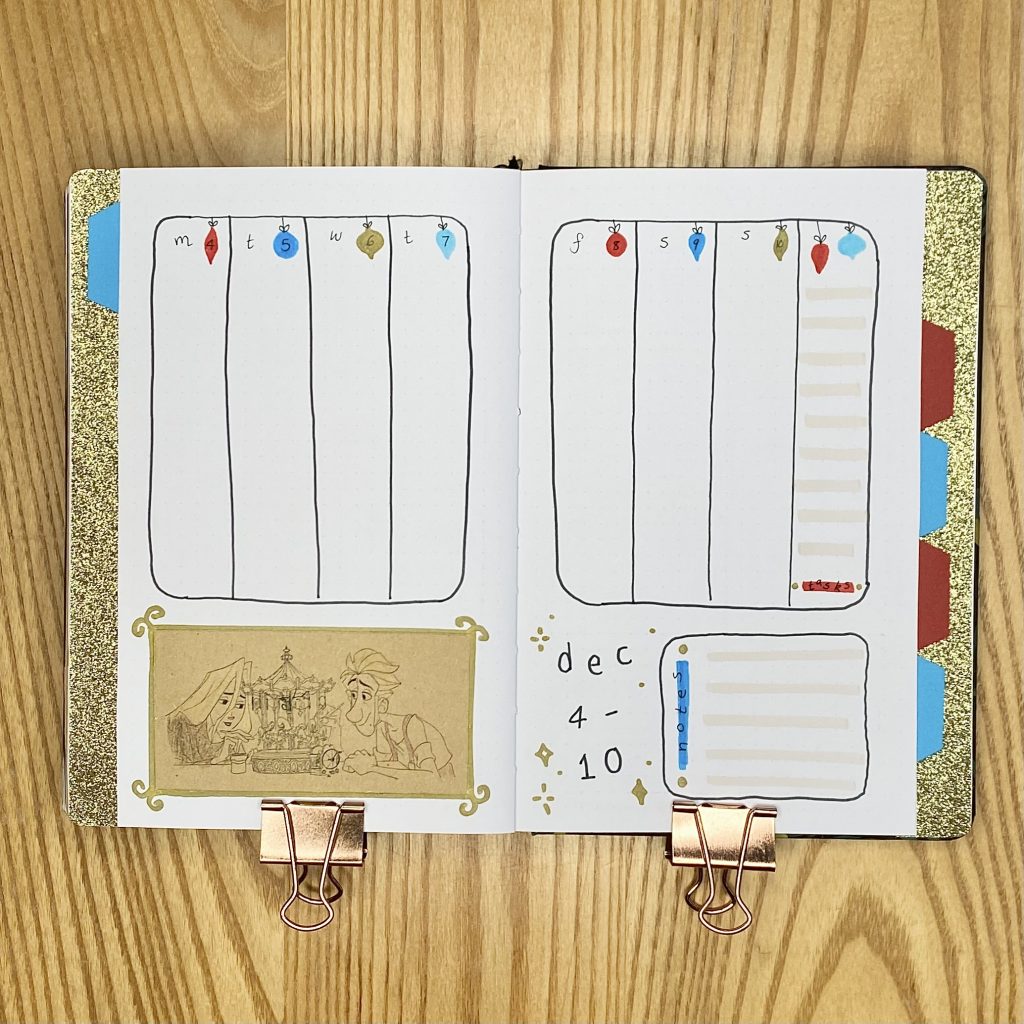
For Week 2, I opted for my favourite vertical layout, with the rightmost column used for tasks and a little box at the bottom for notes.
This week’s image is of Jesper and Alva, when they’re painting a toy carousel. The frame for this one is very simple- just a thin outline with some swirls on the corners.
Week 3
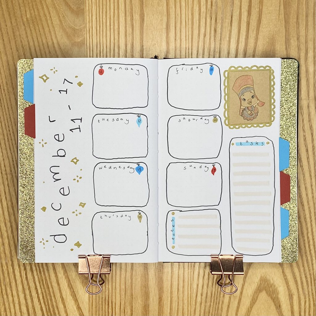
For this week, I placed the daily list boxes down the centre of the page, with the task and notes boxes in the bottom right. I have absolutely no idea why one of my bauble dates is on the left when all the rest are on the right, but we’ll just embrace it!
Finally, a Margu sighting! This week’s drawing is her in her first appearance and her cuteness makes me want to CRY. For this frame, I went for a simple outline with a scalloped edge.
Week 4
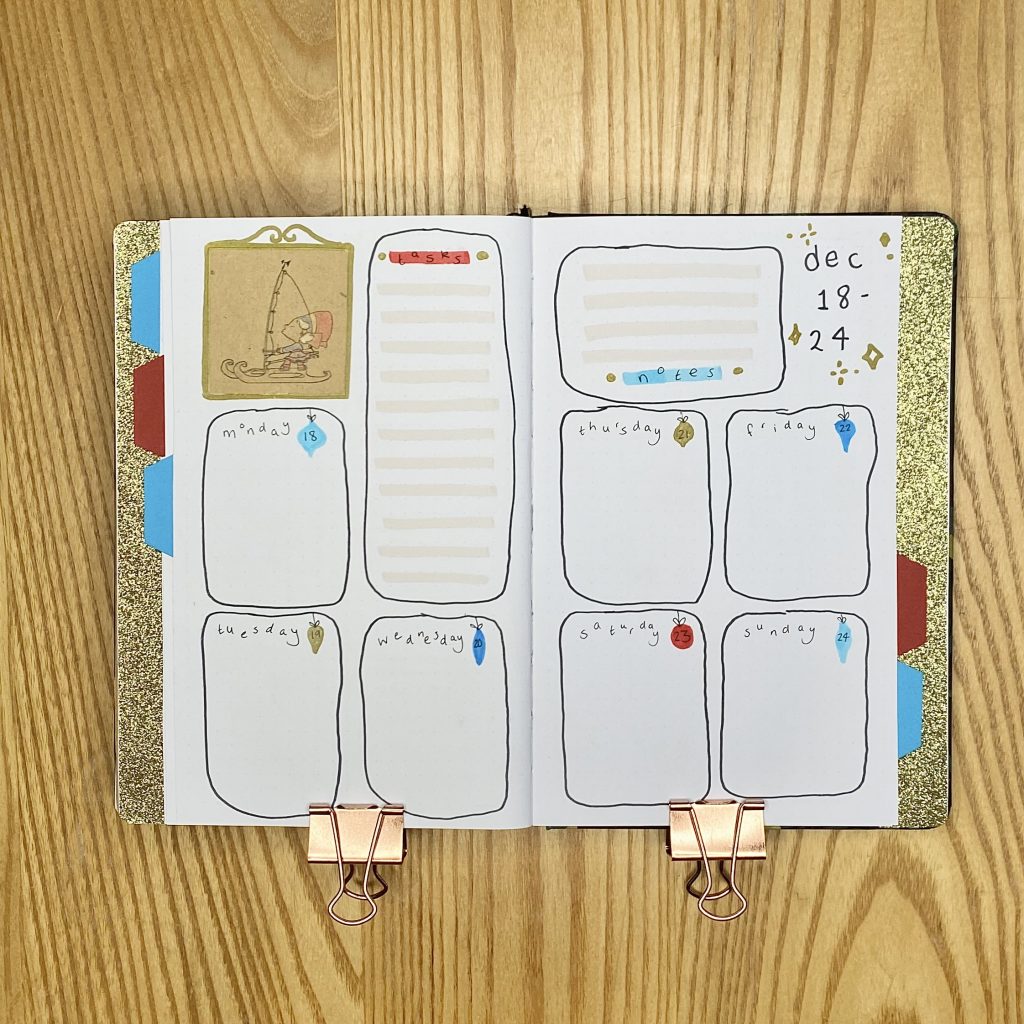
Week 4 is where my boxes really started going a bit all over the place- this is why I like using a ruler! I’m not crazy about this layout- it just feels a bit… scattered to me? No matter, I have all the sections I need so it will still be very useful.
The drawing for this week is Margu sailing on her sledge/boat/ski thing, which makes me so happy. Again, just another simple frame, with a swirly top.
Week 5
For the final weekly (which, funnily enough, is actually a full week, which means we’re ending 2024 on a Sunday, which feels so satisfying), I used vertical columns again, but alternated between putting the date at the top and the bottom of each column, to shake it up a little.
The drawing for this week is Jesper and Margu chatting on the pier, which is such a sweet scene. I did a chunkier frame for this one, with little spikes.
December Review
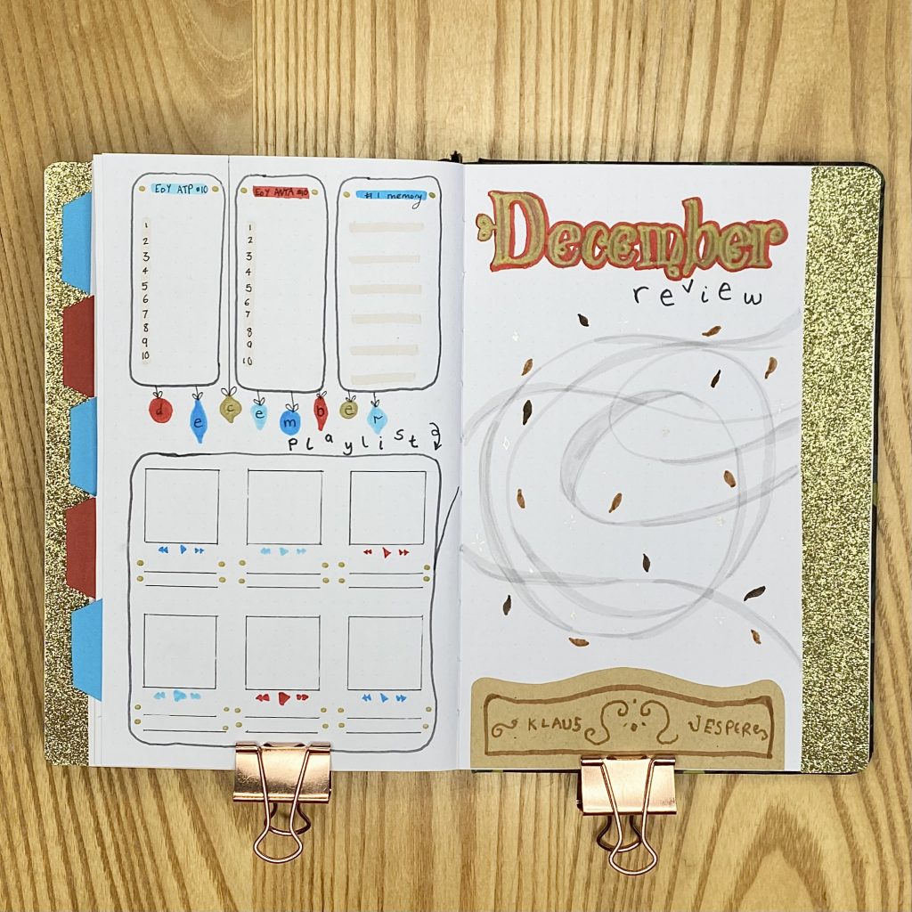
For my December Review page, I stuck with the same layout that I have used for the past couple of months. On the left-hand page, I have 3 boxes along the top: 2 are for the ATP and WTA year-end top 10, while the one on the right-hand side is for my favourite memory from the month. I made the headers for these boxes in the same way as my notes/tasks boxes from my weekly spreads. I also used my Tombow 990 to highlight all of these boxes.
Below those boxes, I have my December Playlist. For the header, I wrote each of the letters of ‘December’ on individual baubles, then wrote ‘playlist’ underneath in the simple font that I have used throughout the setup. Like the past two months, my playlist box for December has 6 little spaces for my top 6 songs of the month.
As always, the right-hand page will house a polaroid from the month. Sometimes I make a frame, but I thought it would tie this whole setup together nicely to repeat that magical ‘breeze’ that I drew on the quote page, instead. I’ll stick the polaroid over the top of this, so it will look kind of like the breeze is carrying the memory. For the header, I used the film font for ‘December’, then the simpler font underneath for ‘review’. Finally, I added in a little nod to the carved sleigh from the film, with ‘Jesper’ and ‘Klaus’ etched into it- I used brown kraft paper and a brown Crayola SuperTip to make this, then stuck it into the bottom of the page.
Final Thoughts
Honestly, this setup was a labour of love. I found it really hard to translate the ideas I had in my head and the magic of the film into the pages of my bullet journal. It took me a long time, partly because it involved a lot of work, but partly because I just kept getting stumped! However, I am really happy with how it turned out! It’s not perfect, but I think it’s so fun and festive and it has that almost childish vibe that I really wanted to achieve (while still looking polished and put together and intentional). I’m really proud of myself for all the problem-solving I did while making this setup and I think my hard work really paid off! I’m so excited to use it this month and feel the magic of Klaus every single day.
Let me know if you’ve seen Klaus in the comments below- I feel like it’s kind of a niche Christmas film, but it really is one of my favourites (did I possibly mention that?) so I’m on a personal mission to convince everyone to watch it.
So! That was it! Day 1 of Blogmas At Home. I hope you enjoyed it- if everything goes according to plan, I’ll be back tomorrow with another festive post. See you then!
Gemma
xxx