Does anybody else feel like they have already fallen behind this year? I think the fact that I am only just posting my January bullet journal setup now, in… February, demonstrates that I really need to get myself together…! Honestly, this post is so belated that I seriously considered skipping this month, but, ultimately, I decided not to because a) I really love this theme and b) the theme is not month-specific, so it could still serve as a source of inspiration for future months!
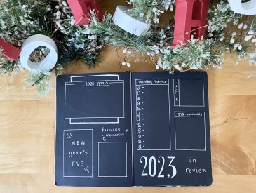
Anyway, onto the setup. Last January, my bullet journal theme was a 1920s/Art Deco/Great Gatsby theme, which I loved. I decided to recreate that this year, but I wanted to distinguish between the two setups, so I decided to change up my colour scheme a little bit. Last year, I used a black, gold and silver colour palette. This year, I introduced an additional dark pink/burgundy shade. This colour was inspired by a dress I saw on Strictly Come Dancing, which you can see here. I just loved how, despite eschewing the black/gold we typically associate with the Art Deco style, the dress still screamed 1920s. As well as the colour, I really liked the square pattern of the dress, so I tried to incorporate that into my setup as well. I suppose, then, my theme this month was ‘Great Gatsby with a Strictly Twist‘… oddly specific, I know. I must admit, I feel like a bit of a fraud choosing this theme (for the second time, no less!) because The Great Gatsby is, well, not my favourite book. Nevertheless, the aesthetic is right up my alley, so I’ll have to get over that for the greater good of my bullet journal. Maybe I just need to give the book another try? Anyway… let’s get into it.
First up, the stationery I used for this setup:
- Black paper
- Burgundy paper (I used this, but it was definitely closer to card than paper. If you can find paper in a similar shade, I would use that instead)
- Uniball signo broad pens, gold and silver
- Sakura gelly roll, white
- Tombow ABT dual brush pen, N15 Black (I got mine in this pack)
- Muji 0.38 pen, black
- Instax mini link smartphone printer
- Scissors, glue, ruler, pencil, craft knife & cutting board
With that covered, let’s get into the spreads themselves…
Cover & Quote Pages
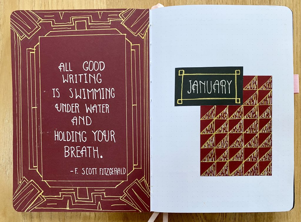
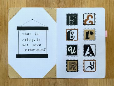
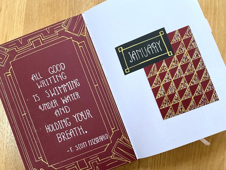
I like to start all of my monthly setups with a cover page (on the right side) and a quote (on the left). The cover page is where I chose to reference the Strictly Come Dancing dress by introducing that same pattern of squares/triangles highlighted by beaded fringing (which I mimicked using my gold and silver Uniball pens). For the quote page, I created a dramatic border using just the gold pen, referencing the promotional art for the 2013 film adaptation of The Great Gatsby. For the quote itself, I felt it was only fitting to use an F. Scott Fitzgerald quote, but I quickly realised that I had used up all my favourites from The Great Gatsby in my setup last year! Instead, I found this quote, which I believe is from a letter written by F. Scott Fitzgerald to his daughter: ‘All good writing is swimming under water and holding your breath’, which I wrote in the silver pen. I used the same font throughout this setup, which is my (simplified) interpretation of an Art Deco font. The letters are all tall and slim, horizontal details are placed 1/3 of the way down from the top or up from the bottom of each letter, and ‘A’, ‘U’ and ‘R’ have an added curl on the left-hand side (as can be seen in the above photo)(even if I did forget to add it to the ‘U’ in January…).
Month at a Glance
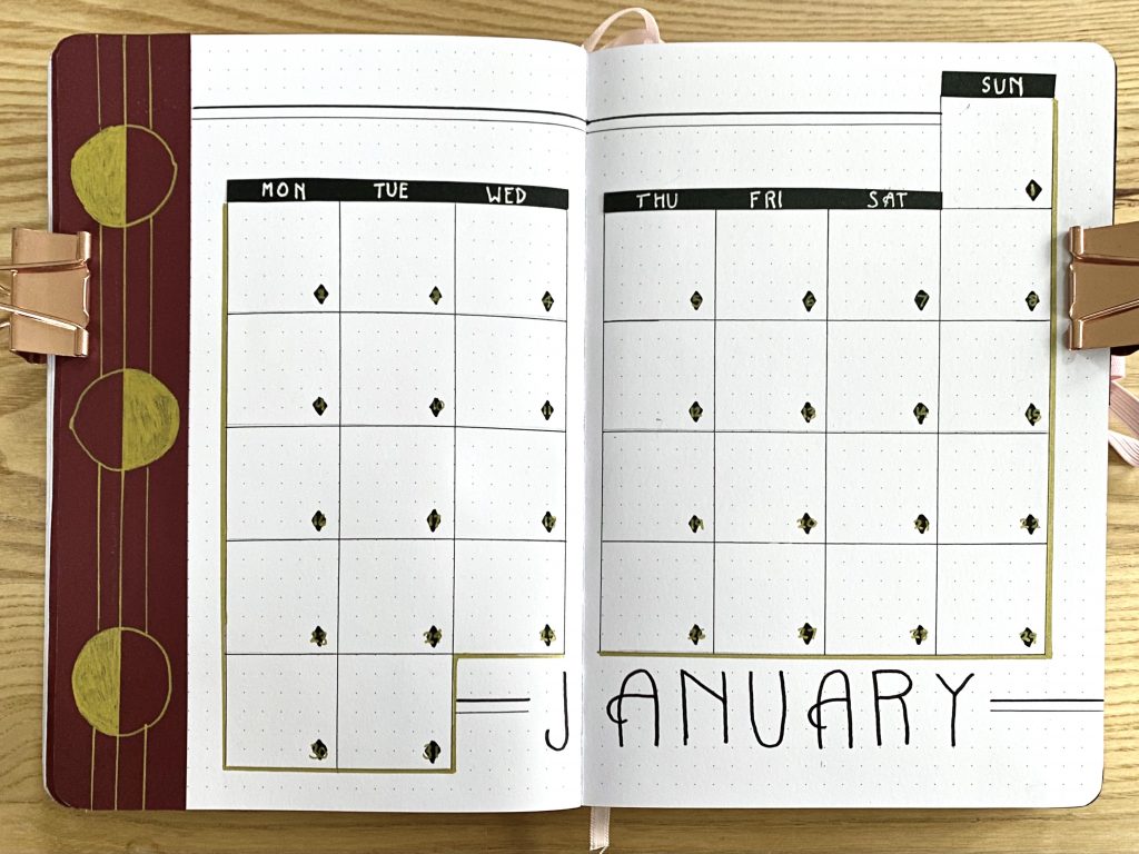
Next up is my monthly calendar. The pattern on the left-hand side of this spread is inspired by the Penguin Hardback Edition of Tender is the Night. I used my Muji 0.38 pen to draw the calendar, outlined it with my gold Uniball and used my white Sakura Gelly Roll to write on black paper strips for the days of the week along the top. For the dates, I drew small diamonds using my Tombow, then wrote the dates on top using my gold Uniball. This was nice in theory, but I found that the gold did not show up particularly well on top of the Tombow. If I were to do this again, I think I would just use the finer end of the Tombow (which I used to write ‘January’ at the bottom of the page) to write the dates in a bolder black, using the same Art Deco-style font. I also used that finer end of the Tombow, along with the Muji 0.38, to draw the uneven parallel lines for decoration.
Weekly Setups
I like to vary my weekly setups, just to keep things more interesting throughout the month. Similarly to my 2023 setup, I love to make use of internal tabs to help make my weeklies accessible and defined. For this month, I used the burgundy paper and my gold Uniball to make the tabs. Because of the way that the days fell this January, I opted to cut down my weeklies and make 4 setups (the first included Sunday 1st to Sunday 8th, while the fourth included Monday 23rd to Tuesday 31st).
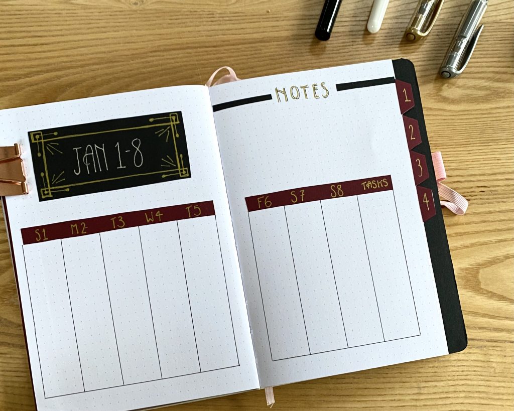
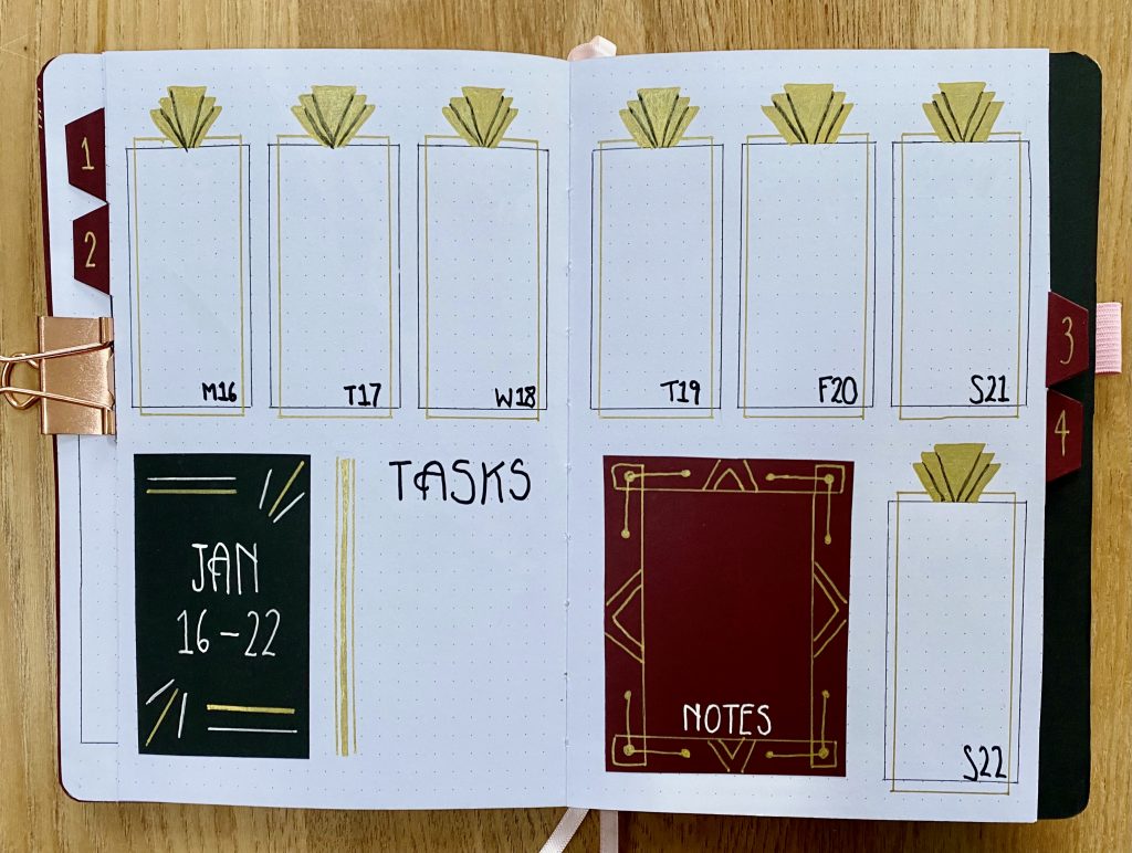
The first weekly was a very simple setup with vertical columns for my daily and master task lists. I like to have a space for ongoing tasks to help me keep track of them without needing to assign them to a particular day. You will notice throughout this setup that I tend not to write out the days of the week in full- honestly, this is because I am too lazy to write them out so many times! No matter, I think the simplicity suits this theme anyway. The main decoration on this first week is the border around the header. I also included a place for notes at the top of the right-hand page, which I like to do when I have the space.
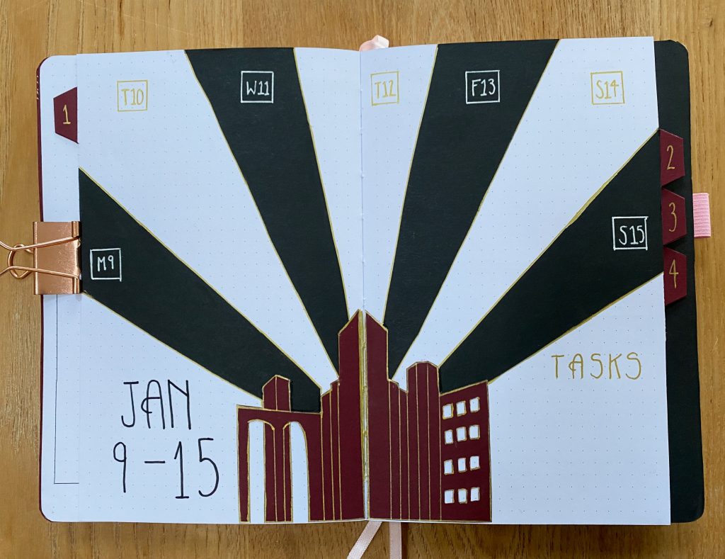
The second weekly set up is my personal favourite. It is inspired by the poster of the 1927 Fritz Lang film Metropolis. I used my craft knife to cut out a similar ‘cityscape’ to that of the poster from burgundy paper, which I cut in half, so that I could easily spread it across the two pages, and outlined in gold. The daily task lists are located within the black and white ‘rays’ emanating from the cityscape, which I also outlined in gold. The master task list is found on the lower right-hand side.
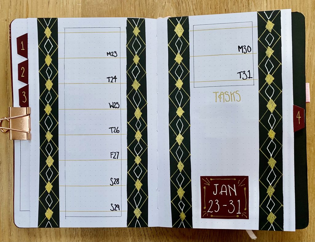
In the third weekly, I wanted to incorporate the triangular ‘capstone’ pattern often found in art deco designs. I created seven vertical boxes for my task lists, with overlapping gold and black lines, each topped with that ‘capstone’ pattern. If I were to draw these ‘capstones’ again, I would draw the black lines between the shapes before colouring them in gold, because I found that it was particularly difficult to ink on top of the gold Uniball. The header, master task list and notes section fit in nicely along the bottom.
The final weekly is probably my least favourite. I wish I had measured the white diamonds on the vertical borders as carefully as I did the gold ones (they were a bit of a last minute addition…). One of the key features of Art Deco design is symmetrical, perfect lines and geometric shapes, so I think it would have fit better with the theme to have all those shapes done more accurately. Ah, well. C’est la vie. For this weekly, I decided to shake it up and use horizontal boxes for my daily task lists.
January Review
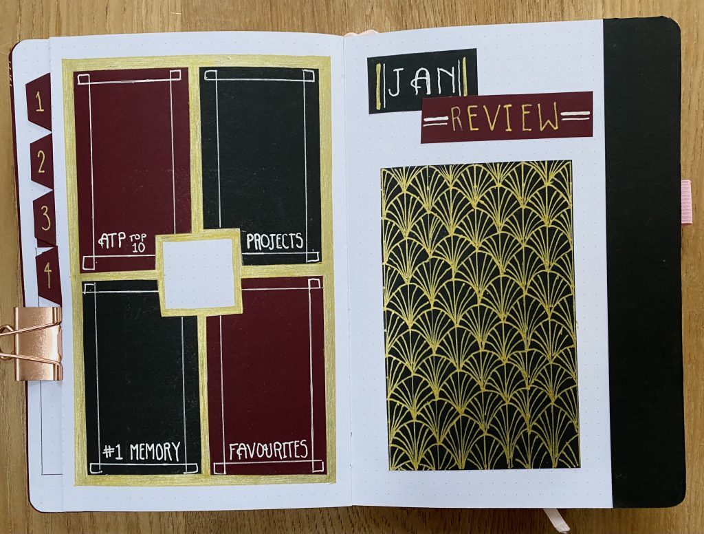
At the end of every month, I like to make a review spread, in which I can record some favourites from the month, my completed projects, a memory and a photo. This month, as an extension of my tennis spread from my 2023 setup, I also included a space to write down the ATP Top 10 players, which I am hoping to use to track the changes throughout the year! All of this information (minus the photo) is located on the left-hand page. I have to admit, I don’t love the setup on this page- it feels less 1920s glam and more … evil jester? I’m not sure. However, I am very excited about the right-hand page. This is where the header and the photo will go. Obviously, because January is not over, I have not put a photo in yet, but the shell/fan patterned piece will serve as the ‘frame’ for the photo, which I will stick on over the top. I use my Instax mini link printer to print out a polaroid-style photo from my phone each month, which I then stick into my journal using double-sided tape. Honestly, I haven’t quite figured out how to get the right brightness on my photos yet, but I’m hoping I just need a little bit more practice with it! The black stripe on the right-hand side is mainly functional (though I think it looks quite nice too!)- it provides a ‘backdrop’ for the tabs of the weekly spreads, so that they look more intentional and less messy. This is similar to what I did in my 2023 setup, where I used the cherry blossom washi tape to offset the brown paper tabs.
And there we have it, my January ‘Great Gatsby with a Strictly Twist’ bullet journal. I hope you like it! I’ll be back in a few days with my February setup, so be on the lookout for that.
Gemma
xxx