

New month, new bullet journal setup! Tale as old as time, right?
For my theme this month, I was inspired by the menus that I designed for my brother’s wedding at the end of April.

I used a similar bow/ribbon motif to the menus throughout my whole setup, and the same two shades of blue coloured pencil for all of the text/lines throughout (I’m not kidding— no pens were harmed in the making of this setup). This was a super simple, super quick and easy setup (which is JUST what I needed after a busy April), though it was also kind of a lesson in not attempting to do cursive lettering with blunt coloured pencils (your girl was STRUGGLING), so, you know, there’s positives and negatives.
Anywhooooo, let’s get into it, shall we?
Table of Contents
Equipment
I only used 5 pieces of equipment to create this setup (I really meant what I said about keeping things simple this month):
- Light blue coloured pencil.
- Mid blue coloured pencil.
- Scissors.
- Corner rounder (this is optional, but I like to minimise my risk of paper cuts as much as possible when I’m trimming down pages).
- Ruler.
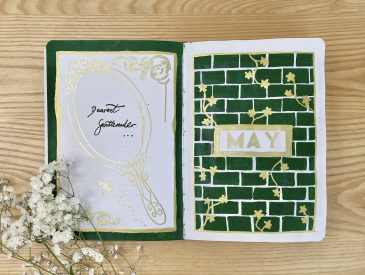
Cover + Quote Page

For both the Cover and the Quote Page, I leaned pretty heavily on the menu inspiration, placing two bow motifs in opposite corners on the page, just like in the original design. For all of the bows throughout this setup, I used a single line of the light blue pencil to sketch out the bow shape, then added a thicker version, using the darker blue pencil, over the top.
For the Cover Page, I wrote ‘may’ in the centre of the page, first in the light blue pencil, then over the top in the darker blue pencil, just like with the bows. I used this same, cursive lettering style throughout the setup (though, as I mentioned in the intro to this post, with varying degrees of success).
For the Quote Page, I experienced my traditional, monthly Quote Panic, where I can’t decide what quote to put in my journal, despite unfailingly allocating a whole A5 page to it. Then, I remembered that my birthday is in May, so I thought a nice quote to commemorate that would fit right in. Admittedly, ‘another year on’ could sound a little morbid/morose, but, I swear, that wasn’t intentional. I actually set this page up last, and, having successfully talked myself out of adding any non-bow decorations to ALL of the other spreads, I finally caved on this one and added some hearts. Naturally, I regret it.
Monthly Calendar

I used my standard format for my Monthly Calendar this month (i.e. a table of 6×6 dot grid size boxes, with one box per day). I drew it out with the two shades of blue coloured pencils and intentionally made my lines a little wavy, to give the whole thing a more ribbon-y feel. I sharpened the darker blue pencil as much as I could without breaking the nib, then used that to write in the dates in the upper left-hand corner of each box. Finally, I added another bow to the top left and another ‘may’ heading (though a slightly less neat one here, that looks more like ‘mayo’ than ‘may’… No worries though, mayo is an important condiment that deserves to be honoured).
Weekly Spreads

For my Weekly Spreads, I’ve gone for the same layout that I’ve been using every month recently, where I trim down the central pages (which house my daily task lists) so that, no matter what day I’m on, I can always see my master task lists (which sit on the far left and right-hand side of the section).

For the daily task lists, I used the same style of line-work that I did for the monthly calendar: just wavy lines in the two shades of blue.

I also added the dates into the top-left corner of the respective boxes with the darker blue shade (again, with the pencil sharpened to within an inch of its life…).

With the remaining space on each Weekly Spread, I added a subheading (just to help me find my place easily throughout the setup). For this, I wrote out ‘may’ in the same lettering style that I’ve used throughout the setup, followed by the dates each page spans, in a simple, sans-serif font, written with the darker blue coloured pencil.

I wanted the master task lists to stand out a little bit more than the daily tasks lists, so I added bows to the top of each box and drew in thicker, more ribbon-like lines with the darker blue pencil over the top of the single line of lighter blue pencil (just like with the bow motifs I’d already drawn). I like the way this ties in the bow theme, while still using up only a small amount of space.
May Review

Finally, we have my May Review page. As always, the content of this one has stayed pretty much the same as my previous iterations: on the left-hand page, I have spaces to note down my 6 favourite songs from the monthy, keep track of the ATP/WTA Top 10s (your girl still can’t shake the tennis bug) and write out my favourite memory. On the right-hand page, I have the ‘May Review’ heading and a space to stick in a polaroid.

In terms of decoration, I used the exact same style for the right-hand page as I did for both my Cover and Quote pages, drawing heavily on the menu inspiration, with the two bows in opposite corners. However, on this page, I moved the heading to the top of the page, so that I would have space to stick in my polaroid. On the left-hand page, I filled most of the space with the boxes, drawn in that similar, ribbon-like style with the two shades of blue. I used the rest of the space for the subheadings, which I wrote in that same, two-toned, cursive style, to add an extra bit of prettiness to this side of the spread too.
Final Thoughts

Overall, I’m actually really happy with how this spread turned out! It’s definitely one of the simplest I’ve done (and the quickest— I think this whole setup only took me about an hour from start to finish, which is SUPER fast by my standards). Sometimes I felt like I absolutely nailed the cursive lettering, sometimes I definitely did NOT, but I guess that’s just the nature of the beast. As I mentioned earlier, I don’t think coloured pencils are quite the best tool for neat lettering, so I guess I fell at the first hurdle anyway…
My favourite thing about this spread is definitely the monochrome blue thing it’s got going on. I was worried it would be too much blue, all in your face, but I actually think it’s really striking, while still being gentle and feminine, so I really like it!
So that’s my bullet journal setup for May 2025! I hope you like it— I’d love to hear your thoughts in the comments below!
Gemma
xxx