I was cutting it a little bit close with my bullet journal setup this month-I only finished my July setup yesterday! No matter though- it’s done now (and with a whole day to spare!). Partly by necessity, then, and partly because I felt like doing another doodle-y setup like my June Drops of Jupiter one, this Wimbledon-themed spread was relatively quick to put together. I say relatively because, even though each of the individual doodles were super quick to create, I ended up including a lot of the doodles on each page. Luckily, that means if you want to recreate this setup, but want something a little simpler, you can easily achieve that by using fewer doodles for decoration- it’s a super adaptable theme.
Anyway, let’s get into it, shall we?
Table of Contents
- Inspiration
- Equipment
- Cover + Quote Page
- Monthly Calendar
- Hub + Daily Sunshine
- Weeklies
- July Review
- Final Thoughts
Inspiration
If you’ve been following the blog for a while now, you’ll know that one of my great loves in this life is tennis (watching it, not playing). It was inevitable, therefore, that a tennis-themed setup would eventually work its way into my bullet journal and I’m thrilled to announce that the time has finally come. With Wimbledon coming up next month, it seemed only right to make my July bullet journal setup Wimbledon-themed.
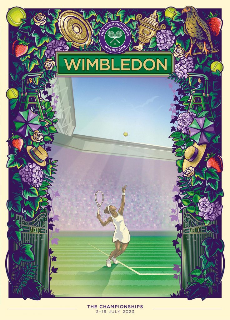
I am IN LOVE with the official poster for Wimbledon 2023. It was created by illustrator Eric van den Boom and, not to be dramatic, but I think it might be one of the most beautiful things I’ve ever seen. I mean, the greenery, the purple highlights, all the little Wimbledon references (though I can’t quite figure out the bird in the top right- any guesses?)- it’s brilliant. I knew I wanted to use this poster as inspiration for my setup, but I also knew that a recreation would be wayyyy past my artistic capabilities. I settled for taking some key elements of the poster (the strawberries, roses, tennis balls, foliage and plaque-style header) and running with that purple/green Wimbledon theme, with a couple of gold touches here and there. The result is a super simplified, much more doodle-y, very distant cousin of the above artwork, but I really love how it turned out. It’s cheery, fun and super summer-y, while still being very Wimbledon.
There’s also a couple of doodles throughout the setup that might seem a bit out of place, but I couldn’t resist dropping in a few tributes to my favourite player. Can you spot them and guess who it is?
Equipment
- Muji 0.38mm pen, black.
- Sakura Gelly Roll, 10 Bold, white.
- Uni-ball Signo Broad, gold.
- Tombow ABT Dual Brush pens: N45 (cool grey 10), N89 (warm grey 1) and 990 (light sand).
- Crayola SuperTips: red, orange, yellow, lime green, sage green, bottle green, khaki, lilac. (The exact shades I use are from a combination of this pastel pack and this assorted pack).
- Ruler
- Pencil
- Scissors
- Eraser
Cover + Quote Page

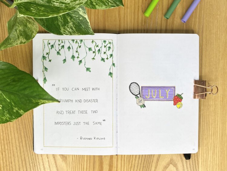
I kept it simple with my Cover Page this month- just a couple of Wimbledon-themed doodles, inspired by the 2023 poster, adorning a purple plaque. The same four doodles are used throughout this setup. All the outlines are done with a Muji 0.38 pen. I coloured the strawberry in with my red & khaki SuperTips, then used with the gold Uni-ball pen for the seeds. For the tennis ball, I used my yellow SuperTip. For the tennis racket, I used my N45 Tombow. Finally, for the rose, I coloured in the petals using my 990 Tombow and used my sage green SuperTip for the leaves. I used the gold Uni-ball pen for the header on the purple plaque. I also added drop shadows to the letters, using my white Sakura gelly roll, to help them stand out.
My quote for this month is lifted directly from the Centre Court Players’ Entrance at Wimbledon and is an excerpt from Rudyard Kipling’s poem, If. I wrote the quote in block capitals using my Muji 0.38 pen, then decorated the page with a gold border and some ivy, again, drawing on the foliage of the 2023 poster. For the ivy, I used my sage green SuperTip, then highlighted each leaf with the bottle green SuperTip.
Monthly Calendar
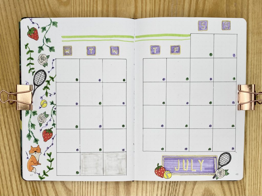
A simple calendar grid this month of 6×6 squares, which I made with my Muji 0.38 pen. I replicated the plaque-style header from my cover page for the July title, then used a slightly simplified version of that purple plaque to list the days of the week along the top.. I also included some more Wimbledon doodles down the left-hand side. For the dates, I alternated between green and purple dots, with the date written on top in my Muji 0.38 pen.
Would it be my bullet journal if I didn’t make a mistake? You can probably see the extra 2 boxes at the end of my calendar grid- I lost track of my lines! I opted to fill them in with my N89 Tombow (which, unfortunately, is running out of ink), to remind myself that there are not, in fact, 33 days in July. Sigh. It was a bit of a comedy of errors, to be honest!
Hub + Daily Sunshine
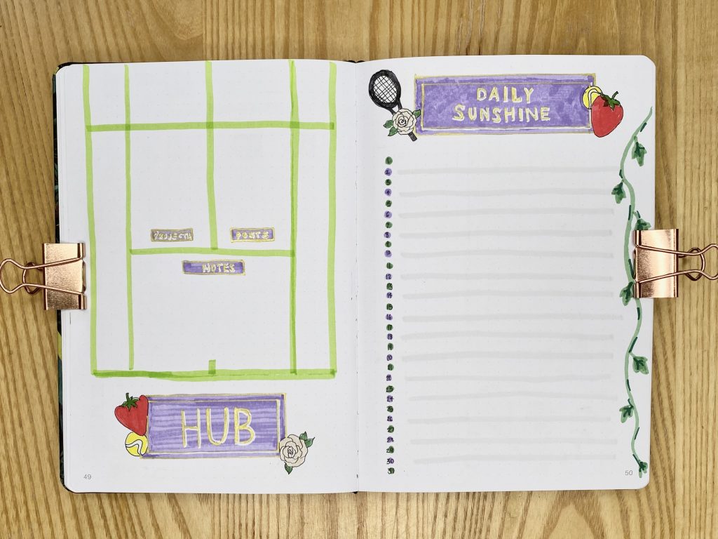
My Hub page is a new spread I am trialling this month. I included my usual Kanban Board in my Mid-Year Setup at the start of this journal, which eliminated the need for the two-page spread every month. However, I do like having a place to list my content/projects for the month, so I created this ‘Hub’. For this spread, I drew a (rough) outline of a tennis court, using my lime green Crayola SuperTip and used 3 of the sections within the court to house 3 categories: Projects, Posts & Notes. The subheadings are a little hard to read, but luckily I know what they are! If I were to make this spread again, I think I would just use my Muji 0.38 pen to write out the headers in block capitals on top of the purple boxes.
My Daily Sunshine spread is a staple in my bullet journal: every day I note down something positive that happened. It’s a great way to end each day, reflecting on the good moments rather than ruminating on the bad. Similarly to my monthly calendar spread, I alternated between green and purple dots for the dates down the right hand side. I also defined every other line with my N89 Tombow, to add a little more dimension.
Weeklies
As always, I’ve used tabs to split up my weekly spreads. I coloured each tab in using my purple and sage green SuperTips, alternating the colours.
Week 1
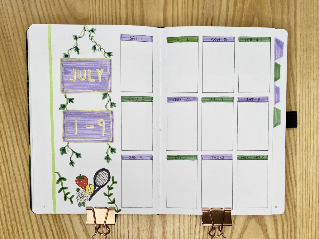
July starts on a Saturday this year, so I decided to merge the first 2 days of July with the 1st full week in my bullet journal. As a result, 9 of the 12 boxes on the right-hand side are taken up by my daily to-do lists. The other 3 boxes are for notes, tasks and events next week.
Week 2
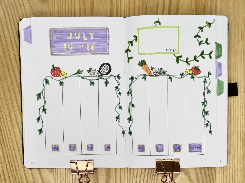
I used 8 vertical boxes for this weekly spread, using the final box for my task list. I also learnt from my earlier mistakes here and used my Muji 0.38 pen to write my smaller subheadings, instead of the Uni-ball gold.
Week 3
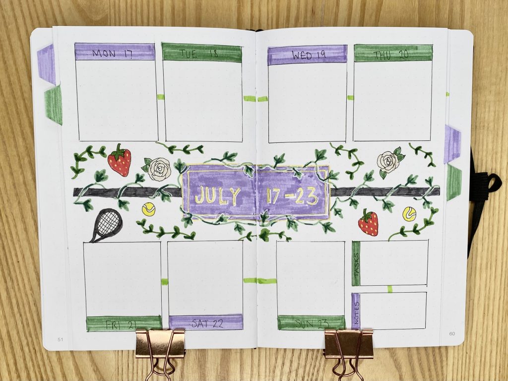
I really ran with the ivy in my third weekly- it’s everywhere! To make it stand out more, I outlined it with white anywhere that it crossed either the purple or dark grey.
Week 4
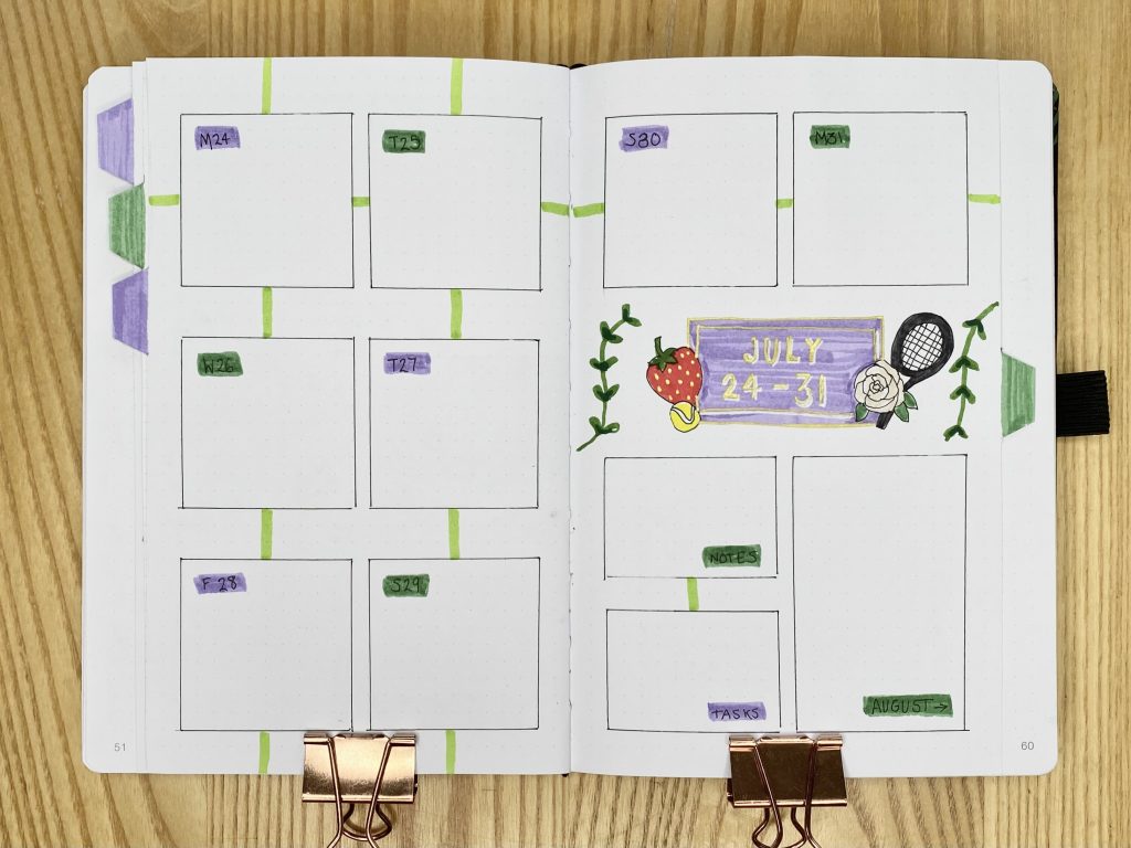
A slightly simpler layout for the final week (+ 1 day) of July. As usual, I’ve left some space for filling in dates coming up in August, just to help myself to look ahead.
July Review
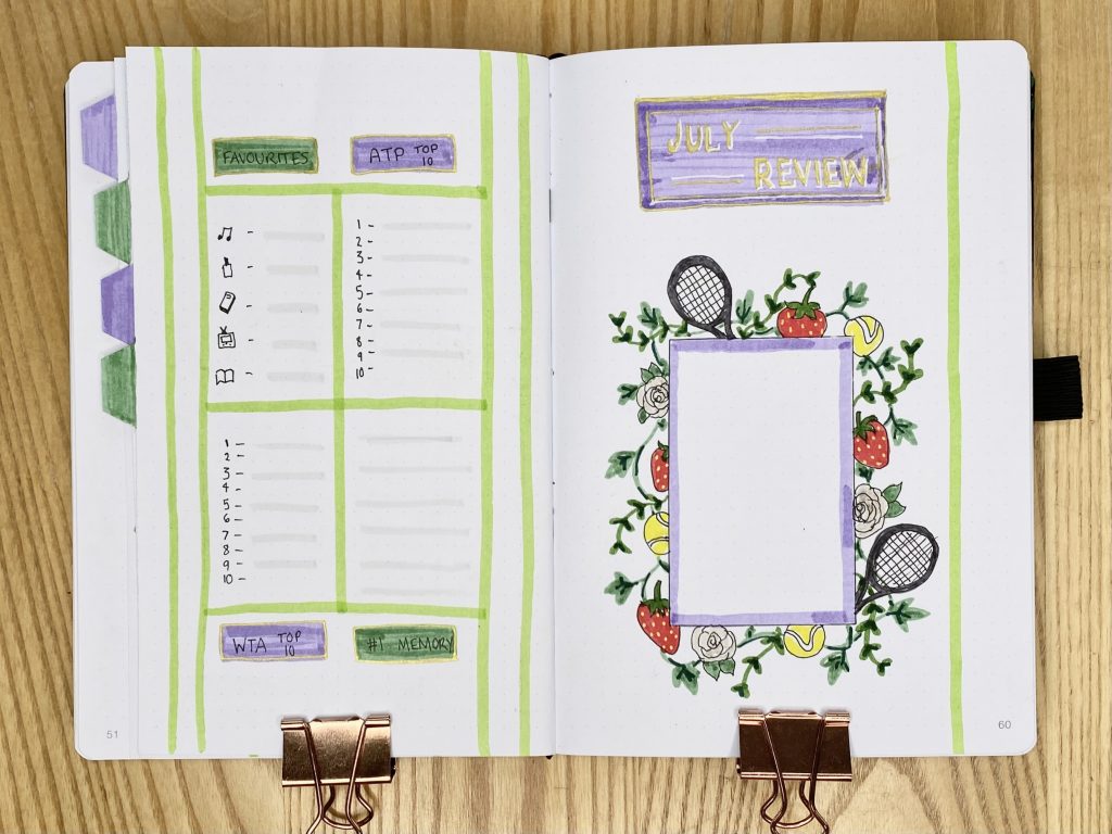
My July Review layout follows the exact same pattern as my other monthly setups: I have space for a polaroid photo on the right-hand page, then 4 sections on the left-hand page for my monthly favourites, the ATP & WTA Top 10 and my #1 memory from the month. Much like my ‘Hub’ page, I used a vague tennis court-shape to divide up the right-hand page. For my polaroid frame, I combined all the decorative elements I have used throughout this setup into a kind of overgrown-looking, intentional mess. I really love how it turned out!
Final Thoughts
As I mentioned at the start, this setup is a strange hybrid of simple and complex: there’s a lot of doodling, but the doodles themselves are pretty simple. I also feel a little like my cover page started out super tasteful and subtle and then the spreads got progressively more decorative and over the top, but I don’t hate that! There are a couple of things I would change/do differently if I were to do this spread again, but, overall, it gives me major fun & summer-y Wimbledon vibes and that’s really all I need!
Let me know what you think! Will you be watching Wimbledon this year? Let me know- we can be tennis friends!
Gemma
xxx
