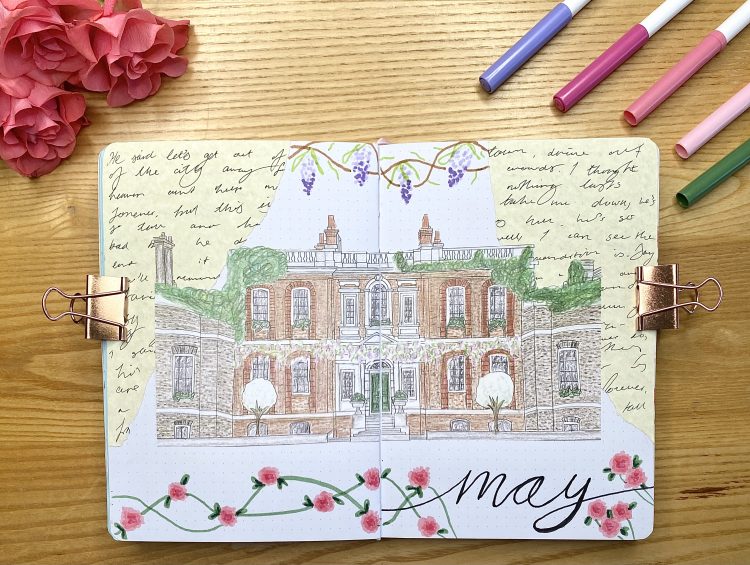
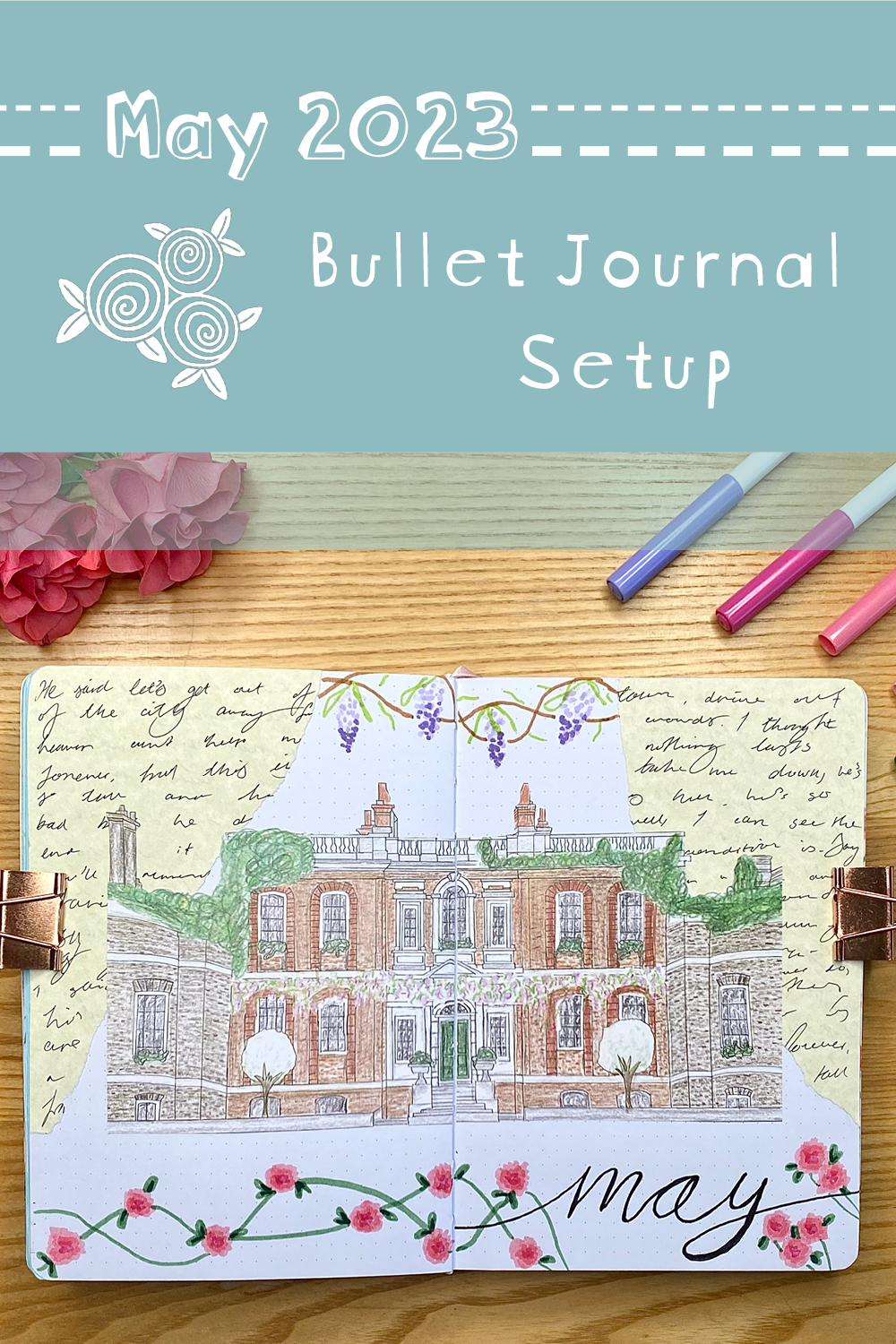
We’re coming to the end of April now, so, you guessed it- it’s time for my May bullet journal setup! My theme this month is one I have been waiting for soooo long to do, so I’m really glad that it’s finally the right time of year for… a Bridgerton themed setup!
I am a big fan of Bridgerton. It’s unsurprising really, given that I was practically raised on Jane Austen and that I like my fictional entertainment to be at least 90% romance. Nonetheless, Bridgerton just speaks to me on a spiritual level- I mean, Julie Andrews as a narrator? Yes, please. Orchestral covers of pop songs? I have a whole playlist of them. Regency fashion with a modern spin? Ooohhh, my heart. One of my favourite things about the series, though, is just the general aesthetic: the wisteria everywhere, the flowers, the stately homes- it is all just so pretty, and so springtime. With the release of the spinoff series Queen Charlotte: A Bridgerton Story set for 4th May, it felt like the perfect time to finally attempt a Bridgerton themed set up in my bullet journal.
One note before we get into it: I was very inspired by Journal Away on YouTube- particularly her May 2022 setup, which also had a regency-inspired theme. I’ll be sure to highlight the particular features of that setup that I drew inspiration from as I go through mine!
Equipment used:
For the setup:
- Parchment coloured paper
- White card
- Muji 0.38 pen, black
- Crayola supertips, pink (light, mid, dark), purple, green (lime, sage, bottle) and brown (from this pastel pack and this 24-pack).
- Tombow dual brush pen, N15 (black), N89 (warm grey), 990 (light sand), 623 (purple sage) and 553 (mist purple). (I got N15 and N89 together, in this pack).
- Uniball signo broad, gold
- Scissors and glue
- Craft knife and cutting board
- Pencil, ruler and eraser
For the Bridgerton House drawing:
- Printer & printer paper
- Tracing paper
- Tape (masking and cellotape)
- Coloured pencils
- Pencil, ruler and eraser
- Sketchbook paper
- Phone/scanning device
Before we get into the page-by-page walkthrough of the setup, let’s talk about a few of the individual elements. This setup looks complicated, but, at its core, it’s really just a series of pretty straightforward elements combined together in different ways. Once you know how to achieve the three main components: the handwritten paper, the wisteria and the roses, it’s just a case of incorporating those elements into basic layouts. Ultimately, you get the extravagance and detail (dare I say, fussiness?) that you want from a Regency-inspired setup, without needing to spend hours and hours on it.
A small caveat to this: while the setup itself didn’t take long, drawing the house for the cover page definitely did. I’ll go through how I created this drawing later on, but if you’re looking for something a bit quicker and easier, you might want to consider using a printed-out image instead!
Anyway, let’s go through each of the main elements. I’ll show you how to create each one, and, once you’ve got them in your arsenal, the setup will feel much more approachable.
Handwritten paper:
The plot of Bridgerton revolves around a mysterious, Gossip Girl-style author named Lady Whistledown, who publishes pamphlets of scandalous gossip about the members of high society. As a result, the written word is a key theme throughout the series- characters write to each other, Lady Whistledown writes her pamphlets and there are quills and ink pots on every desk. I wanted to convey that aspect of the series in my journal, so I included this ‘handwritten paper’ as a decorative element. You can buy both paper and washi tape that come with cursive writing already on printed on them, but I had this parchment-coloured paper already, so I decided to just make my own. I actually watched Journal Away do this in their May setup (albeit on much thinner/more translucent paper), so I felt pretty confident that it would work out. I just used my Muji 0.38 pen to fill an entire page of the parchment-coloured paper with writing, written quickly in cursive (it doesn’t even need to be particularly legible). I actually just wrote out the lyrics to Taylor Swift’s Wildest Dreams (a fun little Easter egg, given that an instrumental version of this song is used in the first season of the show). Once you’ve filled the paper, you can tear it up and use it to decorate your spreads however you would like.
Wisteria doodles:
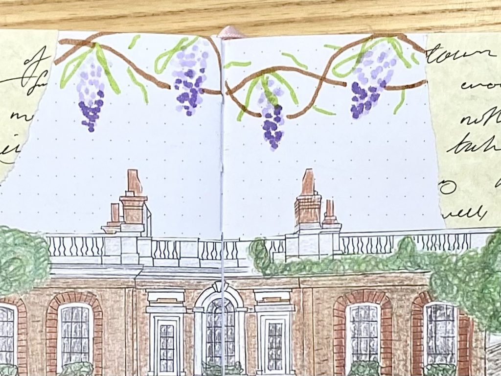
I feel like wisteria and Bridgerton have become pretty synonymous since the show’s release in 2020. In Bridgerton‘s London, there seems to be wisteria everywhere, including, as I mentioned earlier, on the iconic Bridgerton House. As a result, I just had to include lots of wisteria in this setup. I got pretty good at drawing these wisteria doodles- they’re super quick and easy, and it really doesn’t matter if you’re messy! I’ve made a little step-by-step guide to show you how I drew them, which you can see below:
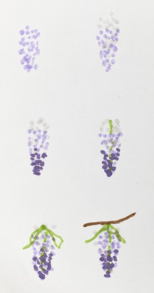
I used two types of pen for these doodles: Crayola Supertips (green, brown and dark purple) and Tombow dual brush pens (N89 warm grey and 623 purple sage), but you can use whichever pens you have to hand.
Rose doodles:
Roses are another flower that features prominently throughout the series- multi-toned pink ones even climb up the gates in front of Bridgerton House. I tried to mimic those specific roses in my setup- again, I’ve made a little step-by-step guide:
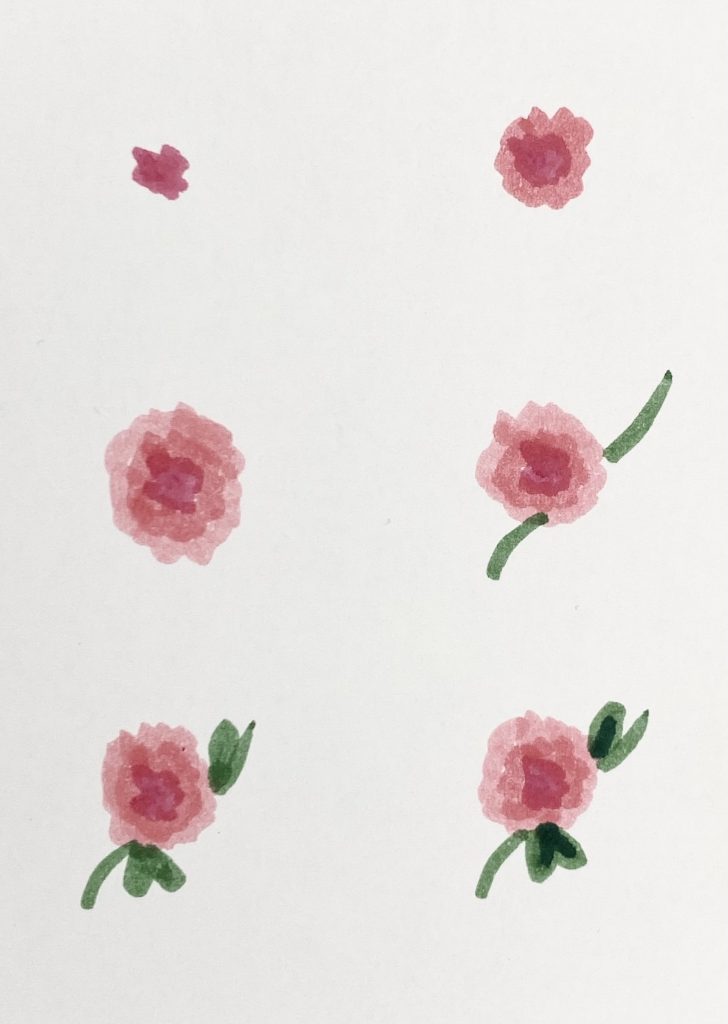
For the roses I only used Crayola Supertips: you’ll need 3 shades of pink and 2 shades of green.
Right then, now that we’ve covered the three main elements, let’s get into a page-by-page rundown of the setup.
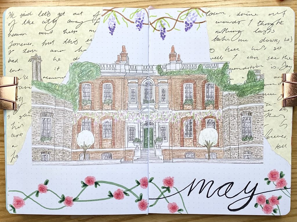
Cover Page:

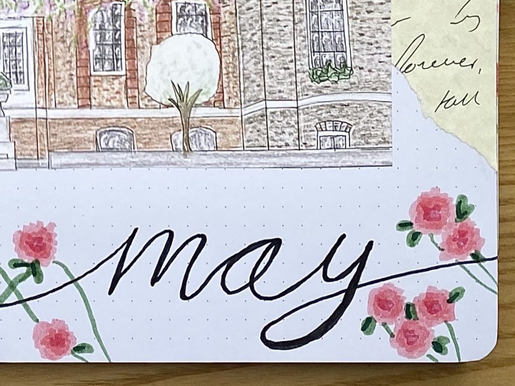
Bridgerton House is one of the most iconic and recognisable elements of the show, with its red brick walls and wisteria. I really wanted the house to feature on my cover page, but I also wanted it to match in with the aesthetic- that is, I didn’t want to print out an image and stick it in (though you absolutely could do this to save yourself some time). I opted instead to produce a pencil crayon drawing of the house, which I could then scan, scale and print out on thinner paper to stick right into my journal. It was a bit of a… process, but I’m really happy with how it turned out in the end.
Full disclosure, I absolutely did trace the outlines of the house for my drawing (know your limits, people). To do that, I printed out a mirror-image of the house (it has to be flipped, otherwise your finished drawing will be flipped!) and stuck it to a flat surface using masking tape. I then stuck a sheet of tracing paper over the top (using cellotape this time, because the masking tape didn’t stick very well to the tracing paper). I then used a ruler and pencil to draw over all of the lines, leaving gaps for the foliage. When I was finished, I untaped everything, then stuck a fresh piece of sketchbook paper on the board, followed by the tracing paper (reversed, so that my pencil marks were touching the paper underneath) on top. I then went over all the lines in pencil, which transferred the original pencil from the other side of the tracing paper onto the sketchbook paper. When that was done, I was left with a pencil outline of the house on the sketchbook paper, ready to be used. Once I had my pencil outline, I went over all the lines with my Muji 0.38 pen, using a ruler to get crisp, straight lines. After that, I got to colouring.
When I was happy with my drawing, I scanned it into my computer, so that I could resize it to fit my journal perfectly (the house is so detailed that it was much more achievable to draw a bigger version and make it smaller than draw a small version from the start). I printed the resized version on standard printer paper, trimmed around the outline and then cut it in half down the centre, so I could stick one half on each side of the journal.
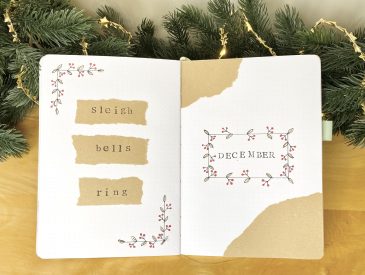
With the house done, the rest of the spread was pretty straightforward. I tore up some of my decorative handwriting paper to put on the top two corners, stuck the house in and decorated the top of the spread with wisteria doodles and the bottom with roses. For the May header, I used my Tombow N15.
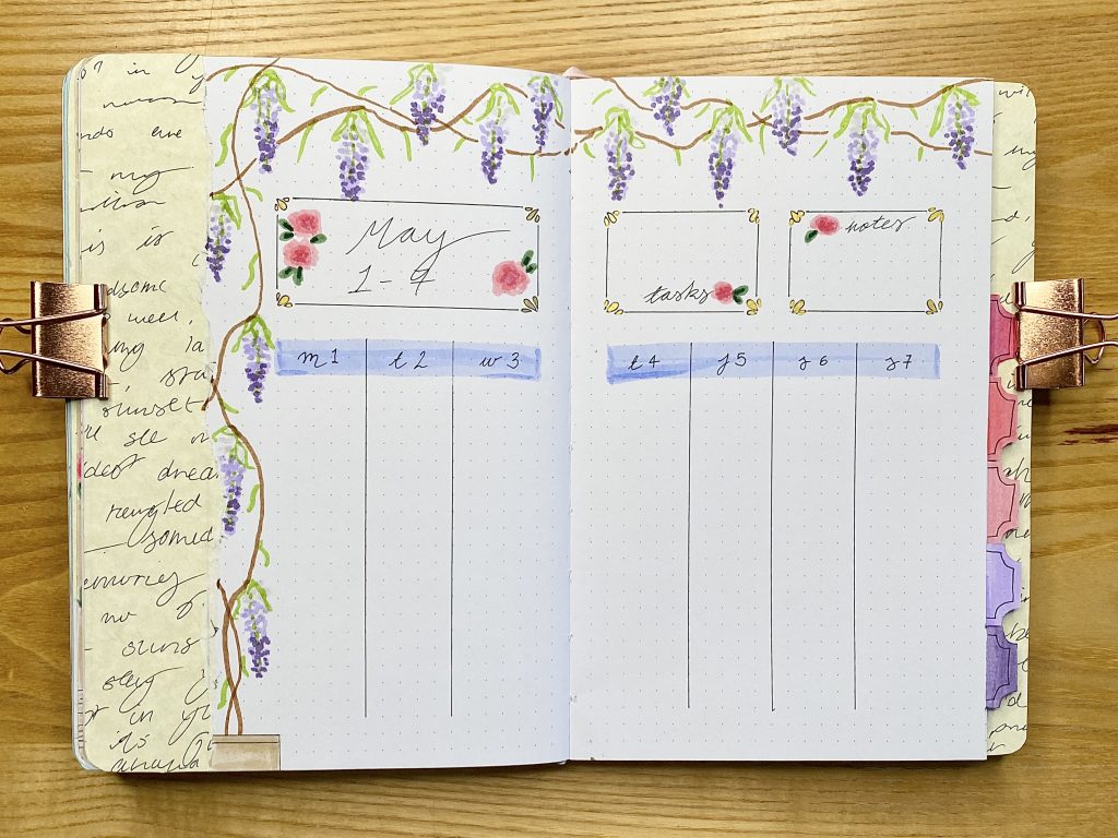
Monthly Calendar:
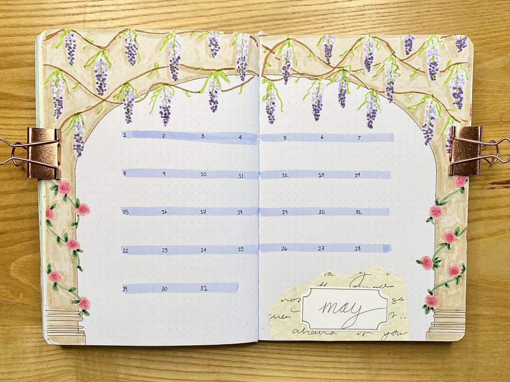
My calendar this month utilises a very simple layout- it’s essentially a grid without any defining vertical lines. I used my Tombow 553 (the closest I could find in my stash to Bridgerton blue!) to create the horizontal lines, then wrote the dates in the top left corner of each ‘box’ with my Muji 0.38 pen.
I wanted to incorporate some sort of archway into this setup and I thought it would be perfect for this calendar spread. I sketched out a basic shape in pencil first, then doodled the wisteria along the top and the roses climbing up the columns. After that, I went over my sketch with my Muji 0.38 pen, then coloured in the archway itself with my Tombow 990. I think, if I were to do this spread again, I would use my Tombow N89 instead of this light sand colour, just because I feel that the tone of the pen clashes a bit with the colour of the decorative parchment paper I used throughout the setup.
For the header on this page I used another torn piece of my decorative paper, which I layered underneath a white card rectangle with inverted rounded corners. I typically prefer to use thinner paper in my journal, to prevent it from becoming too bulky, but the card was necessary here to ensure that the decorative paper did not show through. I drew a slightly inset border on the card, following the shape, with my Muji 0.38 pen and wrote the header ‘May’ in cursive.
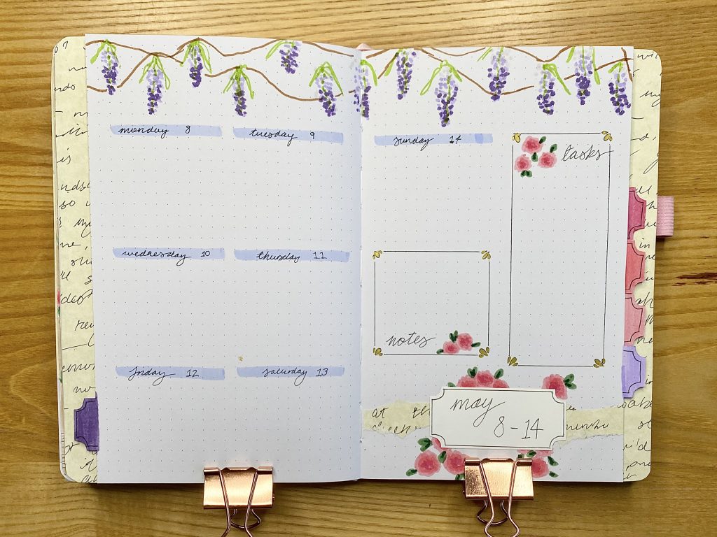
May Reset and Daily Sunshine:
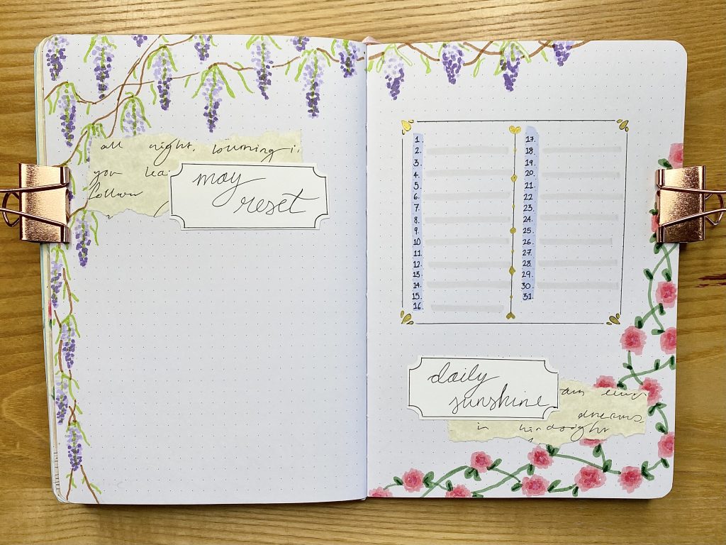
I have been feeling a little all over the place recently, so I decided to dedicate a page in this month’s setup to getting myself back together a little bit. I’ve called it my ‘May Reset’ and the aim is to use it as a place for notes/plans for getting back on track. I decorated this page with wisteria, which I placed along the left-hand side and the top of the page.
The Daily Sunshine spread is also new to my bullet journal this month (since I started blogging, at least). At the start of this year, I decided to cut down on the number of spreads that I included in each monthly setup to make both creating and using my bullet journal seem more approachable. For the most part, this has worked, but I have found myself particularly missing this spread. It works very much like a gratitude log or positive memory list- everyday I write down one good thing that happened, whether that is something that I am grateful for, or just something that made me happy: a little bit of sunshine every day. I find that I tend to focus on the negative things that happen, so it is nice to finish every day by forcing myself to remember something good instead! To decorate this page, I continued the wisteria from the previous page on along the top, and added some roses along the bottom and right-hand side of the page. I used more decorative paper and another card header for the title. The frame around the lines for writing out my daily sunshine lines was another element inspired by Journal Away’s May setup– I think the decorative corners really add a sense of extravagance that feels very regency. I filled mine in with my gold Uniball to add even more fanciness. I used my Tombow 553 to highlight the vertical space for the dates, and my N89 to highlight every other line, just to add a bit of definition.
While the Daily Sunshine page is mainly decorated with roses and the May Reset page is only decorated with wisteria, you see both of these elements together when you look at the double-page spread as a whole. I think this works really well, because it gives a sense of distinction between the two separate spreads, but also brings the whole double-page spread in line with the rest of theme.
Projects:
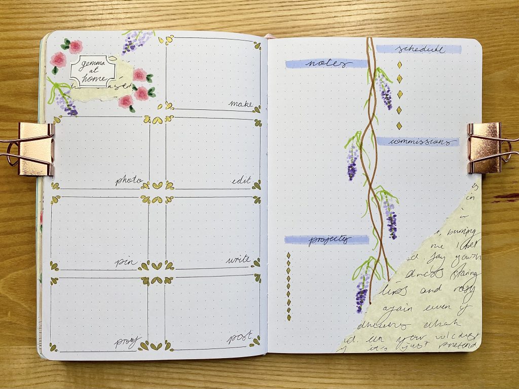
Last month, I tried out a new spread in my journal for keeping track of my projects. Within it, I had a kanban board, a space to list out projects and a space for notes (you can read more about this spread here). I found that spread really useful, so I have included one in my May setup as well. However, I have slightly adapted it to make it more functional: I’ve changed up the stages in my kanban board, I’ve included a section for my blog post schedule and I’ve also added a section for commissions (I have a couple of projects for friends/family to do in May). I’m hoping these changes will make the spread even more useful for me. As with my other spreads in this setup, these pages are decorated with the decorative paper, roses, wisteria, my ‘Bridgerton blue’ Tombow for headers and the decorative frames, inspired by Journal Away. The only new element here is that for the bullet points I opted to use little gold diamonds, as an ode to the phrase ‘Diamond of the Season’, which is used frequently throughout the series.
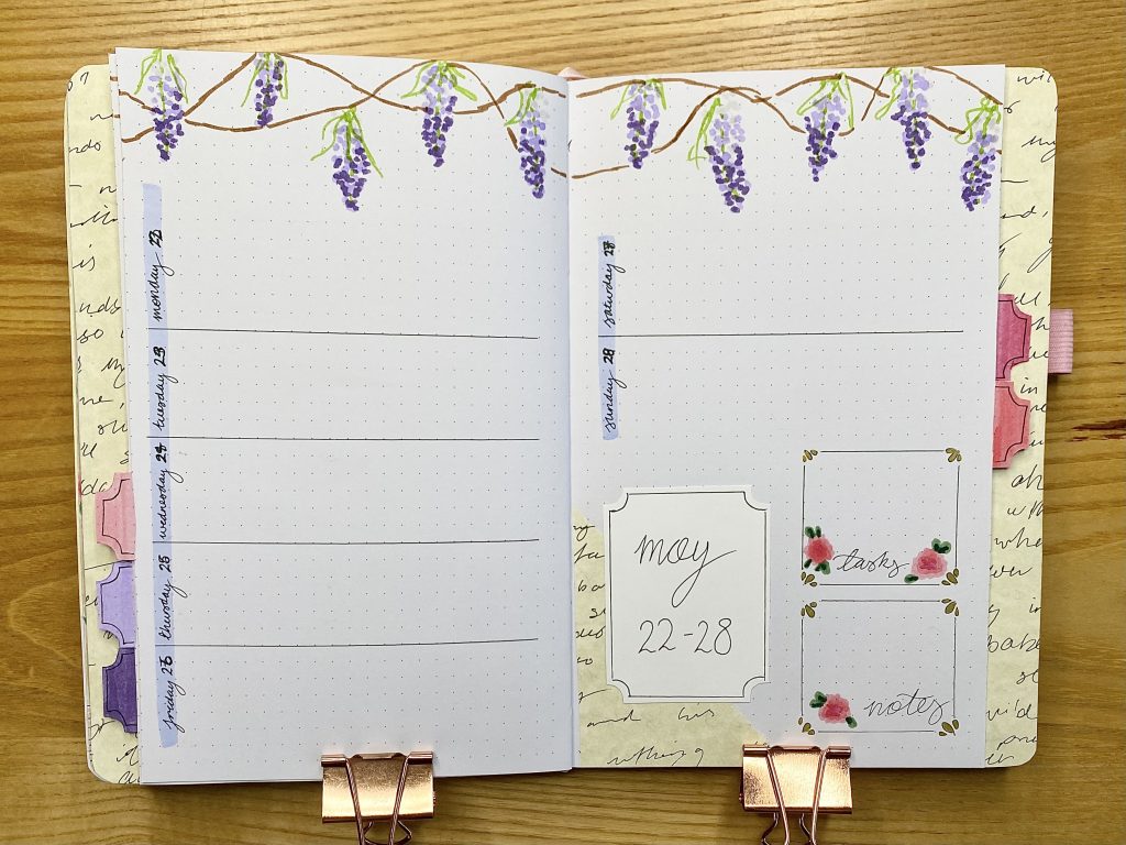
Weeklies:
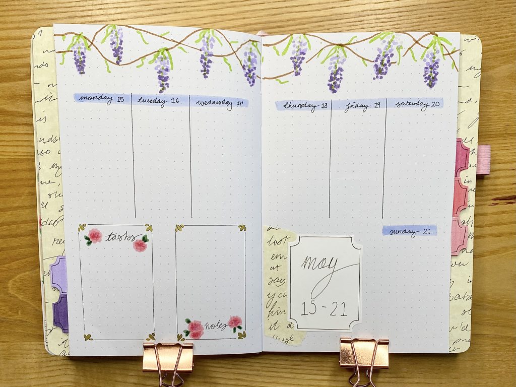
Now we’re onto my weekly setups for May. As always, I like to use tabs to separate my weeklies and this month I chose to make my tabs rectangular with inverted rounded corners (much like the header frames used throughout the setup). Instead of covering them with coloured paper, as I usually do, I just used the pink and purple pens I used to draw the wisteria and rose doodles throughout the setup to colour each one, then added an inset border using my Muji 03.8 pen. As a backdrop for the tabs, I used more of my decorative paper.
I tried to keep my weeklies pretty consistent, so the only thing that changes really over all of the five is the layout of the boxes. Otherwise, each weekly has wisteria along the top (growing from ‘planter boxes’ the bottom left on the first weekly spread and the bottom right on my review page), daily task lists with ‘Bridgerton blue’ header bands and notes/task lists with the gold-cornered frames and rose doodles.
For my first weekly, I opted for a vertical layout for my daily task lists.
For the second weekly, I divided each page into 6, then used 7 sections for my daily task lists, 1 for my notes, 2 for my task box and the final 2 sections at the bottom for the title.
For the third weekly, I divided the page in half horizontally and used half-height vertical boxes for my daily task lists.
For the fourth weekly, I used horizontal boxes (which are still, admittedly, not my favourite for daily task lists, but I like to vary my layouts, and there are only so many different arrangements!).
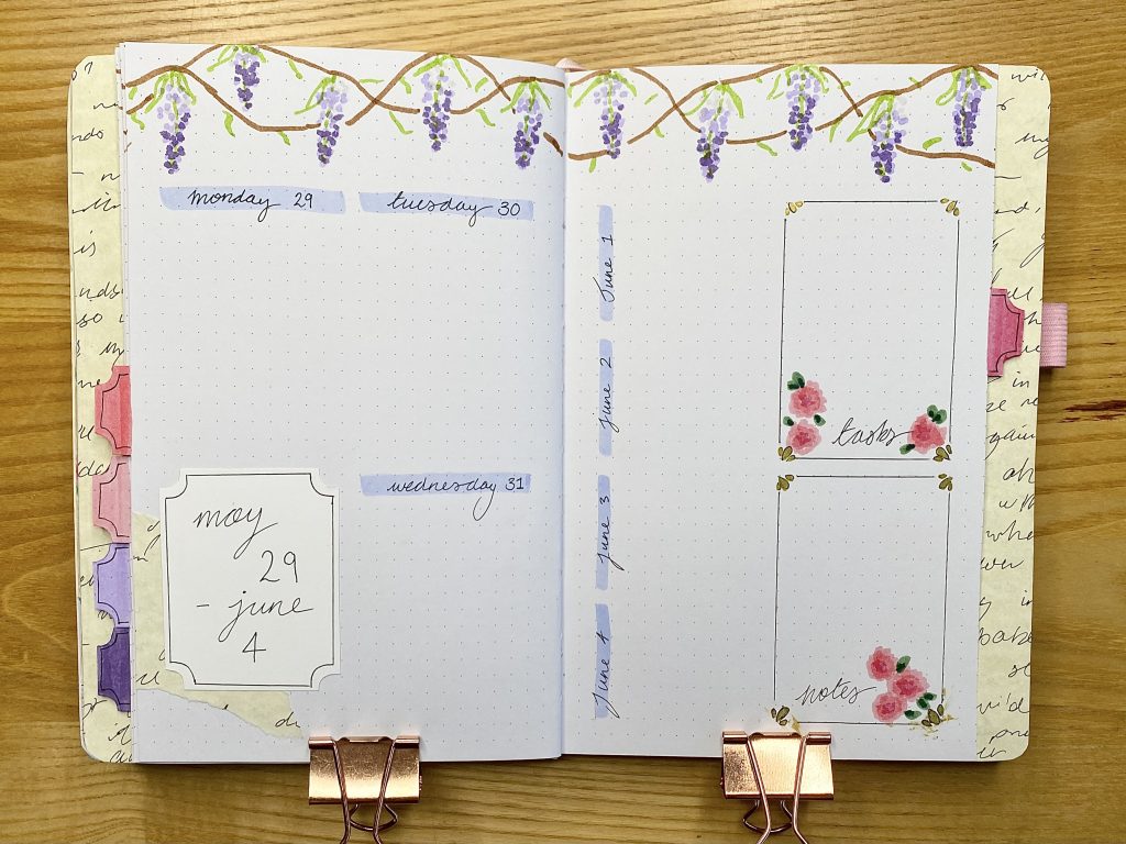
For the final weekly, I divided the left-hand page into quarters and used 3 of them for the final 3 days of May. I then used the left-hand side of the right-hand page for the first 4 days of June.
May Review:
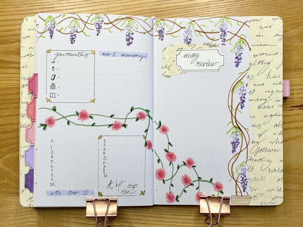
Finally, we come to my May Review, which follows the same formula as my other review pages. On the left-hand page, I have spaces for my monthly favourites, my #1 memory of the month and the ATP/WTA top 10. For these, I alternated between the decorative frames and the simple ‘Bridgerton blue’ headers. On the right-hand page, I have my title and a space for a polaroid. The wisteria from across the tops of all the weekly pages ends in another planter box in the bottom right-hand corner and I also included some rose doodles that climb across the setup.
I hope you enjoyed reading about my Bridgerton-inspired bullet journal setup. If you’re a Bridgerton fan, I’d love to hear your thoughts on the upcoming season/the Queen Charlotte spinoff in the comments!
Gemma
xxx