 Gemma
Gemma 
Welcome to another WIP Wednesday!
Last week, I talked you through all of my plans for my current project: a Porcelain Sweater made with the 2025 Bridgerton Advent mini skeins from Castle View Yarns. This week, the knitting begins!
I actually have to confess something: I’m already a couple of weeks into knitting this sweater! By the time I got around to sharing my first WIP Wednesday last week, I had already been sitting on the post for a little while and got myself all in a pickle with the timeline… I figured the best thing to do was just to let you know, continue writing these weekly updates as I go and share them every Wednesday, so you’ll still see my weekly progress, just a couple of weeks after the actual knitting has taken place! Hopefully, after this project, I can bring my WIP Wednesday posts a little closer to real-time, so I feel less fraudulent…
Anyway, let’s roll back a couple of weeks and talk about the first 7 days of knitting my Porcelain Sweater!
Progress
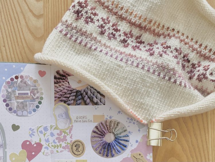
Here’s what I knitted in my first week:
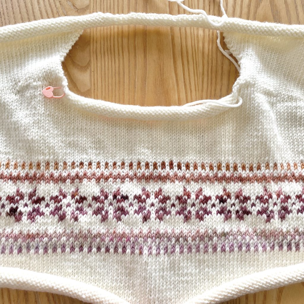
- Top of the back
- Left shoulder
- Right shoulder
- First few rows of the front, with the shoulders joined together
Not too bad, right?! So far there’s been a bit of shaping, a bit of colourwork-ing and a bit of good old fashioned stockinette stitch. Something for everyone!
Mid-Knit Thoughts & Musings
I have been really enjoying knitting this project— it feels like perfect balance of simple and challenging to keep me interested, but not overwhelmed.
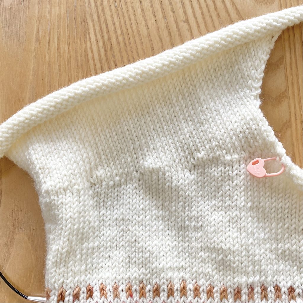
From a technical side, so far, I’ve been able to practise the backwards loop cast on and German short rows, as well as my colourwork technique. Everything so far has been knit flat, so the colourwork has been a little bit of a learning curve— I feel like I’ve really nailed down my colourwork technique when knitting, but not quite so much when purling, so I’ve had to adjust to that.
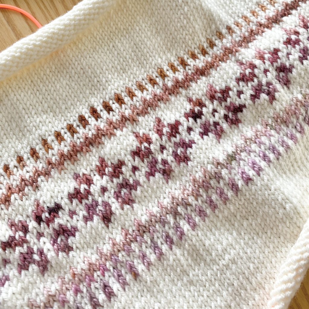
I have found that I need to knit a few extra rows here and there in the cream stockinette sections, just because my row gauge is slightly tighter than the pattern calls for. I’m making a Size L and purchased 12 balls of DROPS Merino Extra Fine as my main colour, but I think there’s a relatively strong chance that I’ll run out (mainly because of those extra rows)… I’ll be keeping my fingers crossed that I have enough!
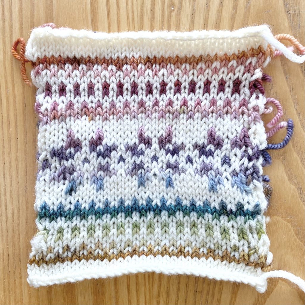
After making my colourwork swatch, I decided to reverse the order of the contrast colours on the sweater, so that the warmer, pink shades are closest to my face. I’m very pale (sometimes bordering on a slightly… ghostly grey, depending on how unwell I’m feeling) but I do have brown eyes, so I think these will be the most flattering shades for me, hence the decision to position them closer to my face. I didn’t think of the placement at all until I made the swatch, at which point I realised I preferred the gradient upside down (as pictured) than right way up!
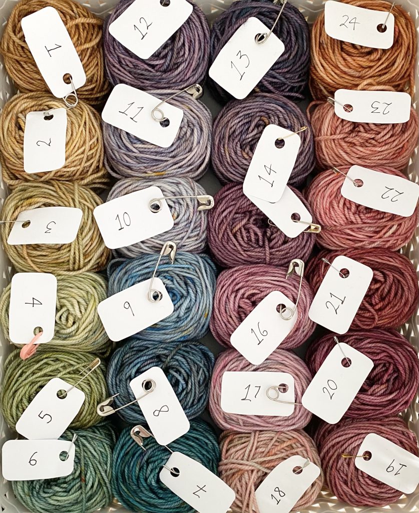
As a result, for my colourwork sections, I’m working from the Day 24 shade through to Day 1, not from Day 1 to Day 24. I spent a while deciding how best to split up the rows between the colours, and with a little counting and (light maths), I worked out that I could do 2 rows of each shade, plus an extra row of 7 of them, because I have 24 shades and there are 55 rows worked with the contrast colour. I tried to stagger the 3-row bands of colour pretty evenly throughout the jumper, so that the difference wasn’t too noticeable. I think it’s working really well so far!
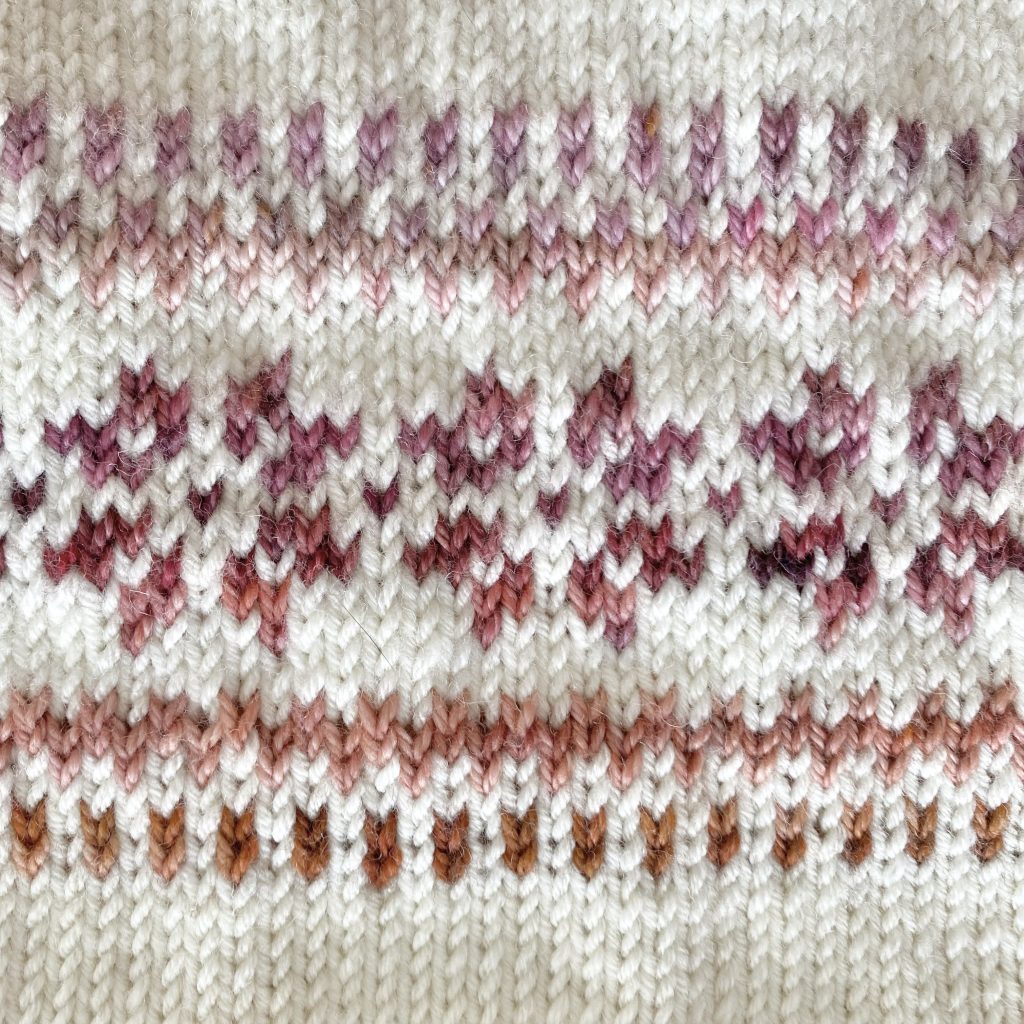
I opted to recreate the colourwork chart from the pattern on Numbers (Apple’s slightly less heavy-duty answer to Microsoft’s Excel). I did this mainly so that I could use my own colours within the chart, because I realised things might get pretty confusing pretty quickly with so many colour changes. This also allowed me to get an idea of how the patterned band would look, which was very helpful.
I was a little confused by the chart for this band at first, because the middle section of stitches is labelled separately as the ‘repeat’. However, I followed my general policy of knitting-exactly-what-you-see (it has stood me in good stead so far!) and soon realised that, because this section is knit flat, the chart does not need to be (and is not) cyclical in its entirety, so it all made sense in the end.
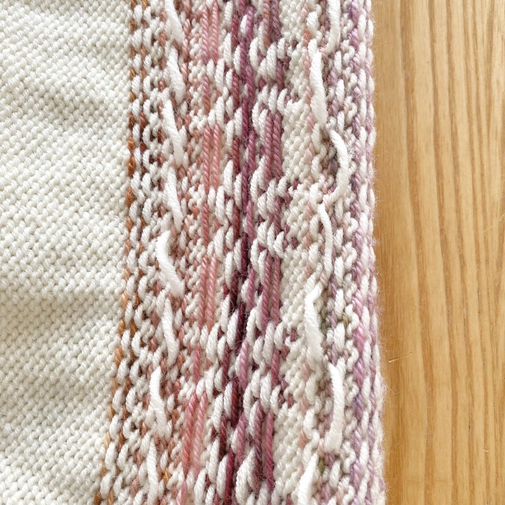
In this colourwork band, there are four plain rows where you need to either carry the non-working yarn across the back of the work or cut the yarn and reattach it at the end of the row, so that you can work the pattern in the following row. I totally forgot that this would be the case, because I’m so used to knitting colourwork in the round, but it is often a necessary evil when working colourwork flat, like this. I managed to avoid one of these instances, because my contrast colour change fell in exactly the right place (which was unplanned, but absolutely delicious)! Towards the bottom of the band, I did have a scenario where I should have carried the contrast yarn behind the main colour, but I couldn’t quite bring myself to use more of my special, Advent yarns than necessary, so I cut that yarn and reattached it at the end of the row. I was a little reluctant to do that, because I’m already a bit worried about finding places for all of these yarn ends without bulking up the sweater too much, so for the other two instances, where it was the cream shade that needed to be carried, I did, just to reduce the number of ends (though I know this will not help my potentially-running-out-of-yarn problem…).
As it turns out, carrying yarns all the way across a piece of work is not one of my fortes: ironically, because patterns always warn you not to make your floats too tight, I always leave mine too loose! My current way of dealing with this is to knit the whole row, then go back afterwards and adjust the floats to make them the perfect tension, which isn’t the most efficient method, but has been working for me so far.
Also, before I forget, I’ve been very diligent about keeping my yarn dominance the same throughout this project, because I want to make sure everything looks really even. I’m keeping my contrast colour(s) as the dominant yarn, so, whenever I work the colourwork sections, I’m always double-checking that the main colour floats are going over the contrast colour floats (i.e. the contrast colour is sitting closer to the back of the fabric).
Castle View Yarns 2025 Bridgerton Advent: Shades 24-17
For the first band of colourwork, I used shades 24-17 of the 2025 Bridgerton Advent from Castle View Yarns. There’s only one row of Shade 17 at the end of this band, but I’ll be using it again at the start of the second band too, to help the gradient flow through the design. I thought it would be fun to share the yarn shades that I’ve used so far here, along with their names and (my best guesses at) their inspirations from Bridgerton!
24: ‘Souls That Dance’
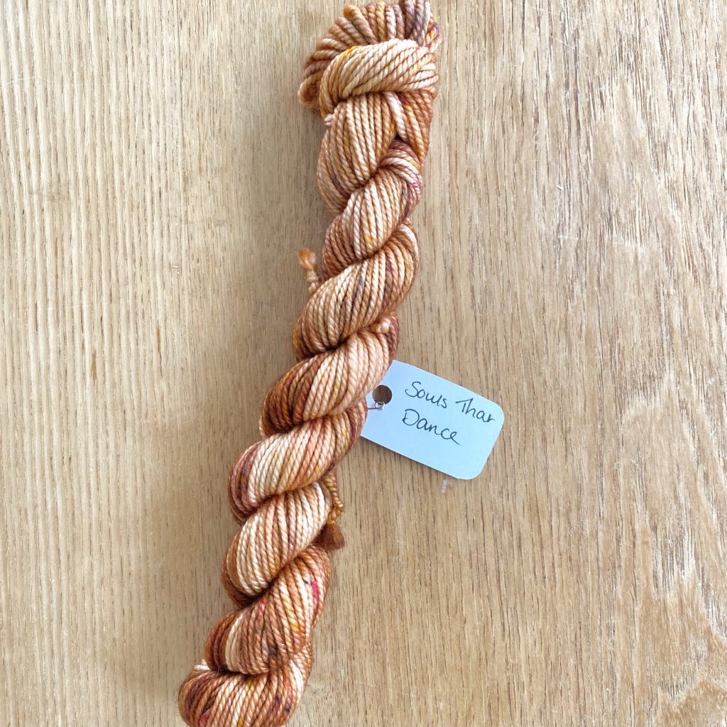
This golden orange shade is named after a quote from Season 2, said by Kate Sharma during her sister Edwina’s Haldi Ceremony. I’ve always loved the colours in this scene, so I was very excited to see it represented in this Advent!
23: ‘You Occupy My Every Thought’
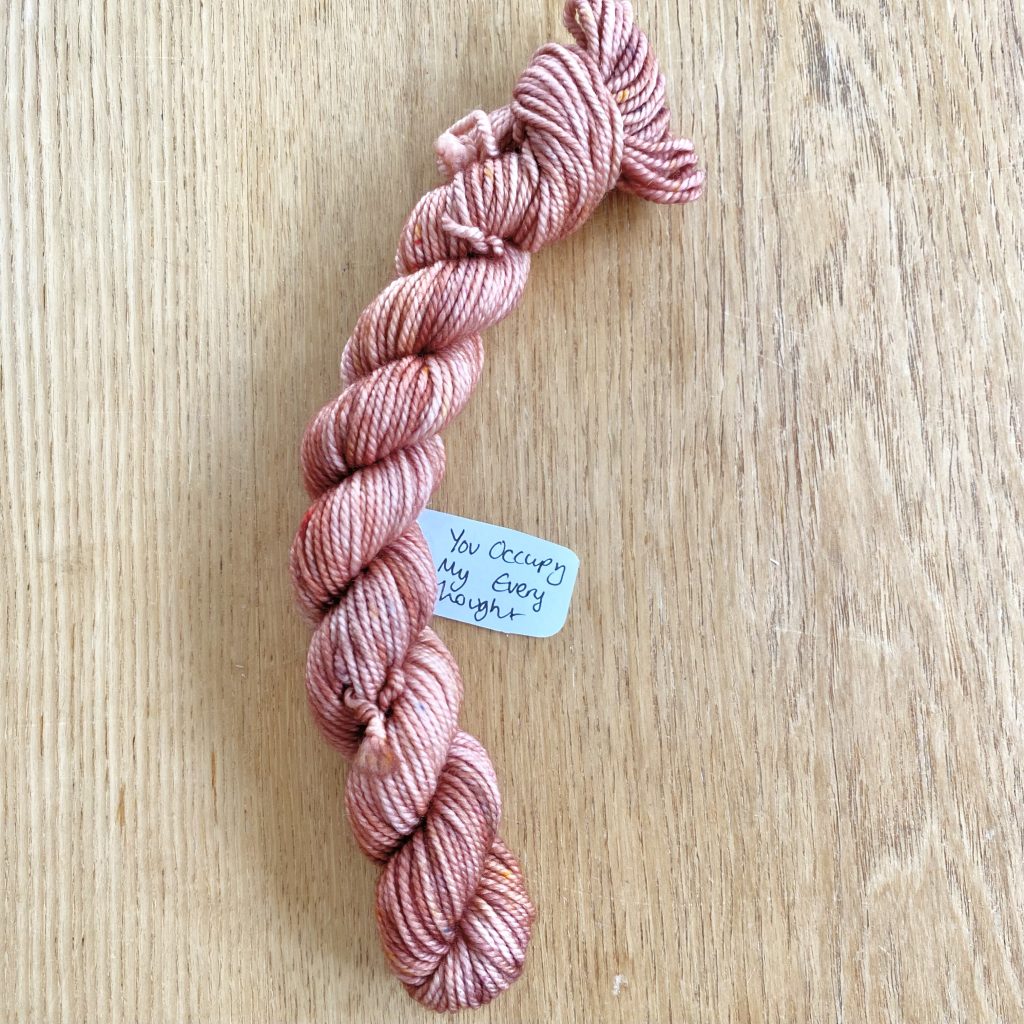
This coppery-pink shade is named after a quote from Season 3, said by Penelope Featherington during Colin Bridgerton’s dream sequence. The scene takes place at night and is very romantic and misty, with firelight flickering across the stone walls and the actors’ skin, infusing everything with a subtle, pink glow. I think that rosy glow must have inspired this yarn!
22: ‘I Would Not Need Flowers’
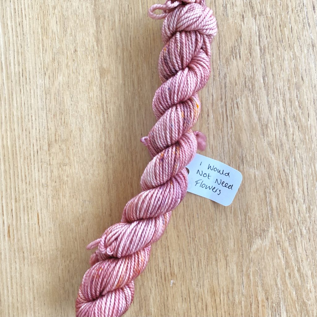
This pink shade, flecked through with orange, is named after a quote from Season 1, said by the Duke of Hastings to Daphne Bridgerton. I think this shade really suits its name, but, try as I might, I can’t quite figure out the inspiration behind it! The pink shade does show up, albeit very subtly, in the scene, on the cravat of a passerby and (perhaps?) on the pattern of the Duke’s waistcoat, though I’m most inclined to take it as a reference to blushing, because the Duke was being… a little bit risqué here. Daphne’s hair also has quite a gingery undertone in this scene, so perhaps that’s where the orange flecks come in? Either way, I really love the combination of pink and orange, particularly in flowers, so I really, really love this shade.
21: ‘My Wit & My Wardrobe’
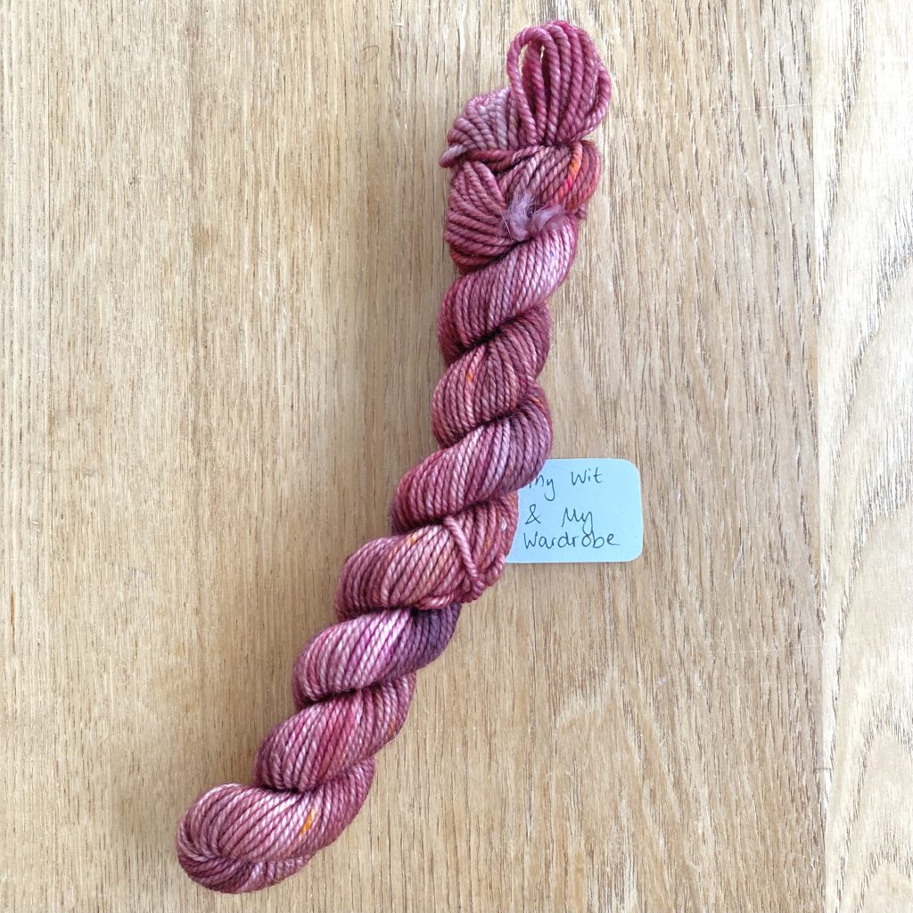
This berry shade is named after a quote from Season 1, said by the iconic Lady Danbury. This colour so perfectly encapsulates the character, who typically wears darker, more dramatic jewel tones— I love it!
20: ‘Scandal’
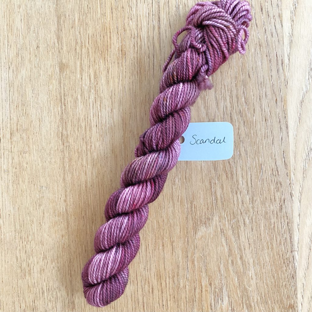
This blackberry shade has more of a general, thematic name, rather than taking inspiration from a direct quote in the series (scandal is, after all, a recurring element in the show, throughout all of the seasons!). This colourway has a similar intensity to ‘My Wit & My Wardrobe’, but is slightly more cool-toned, marking a shift towards the lighter pinks and lilacs in the gradient.
19: ‘Cressida’s Corsage’
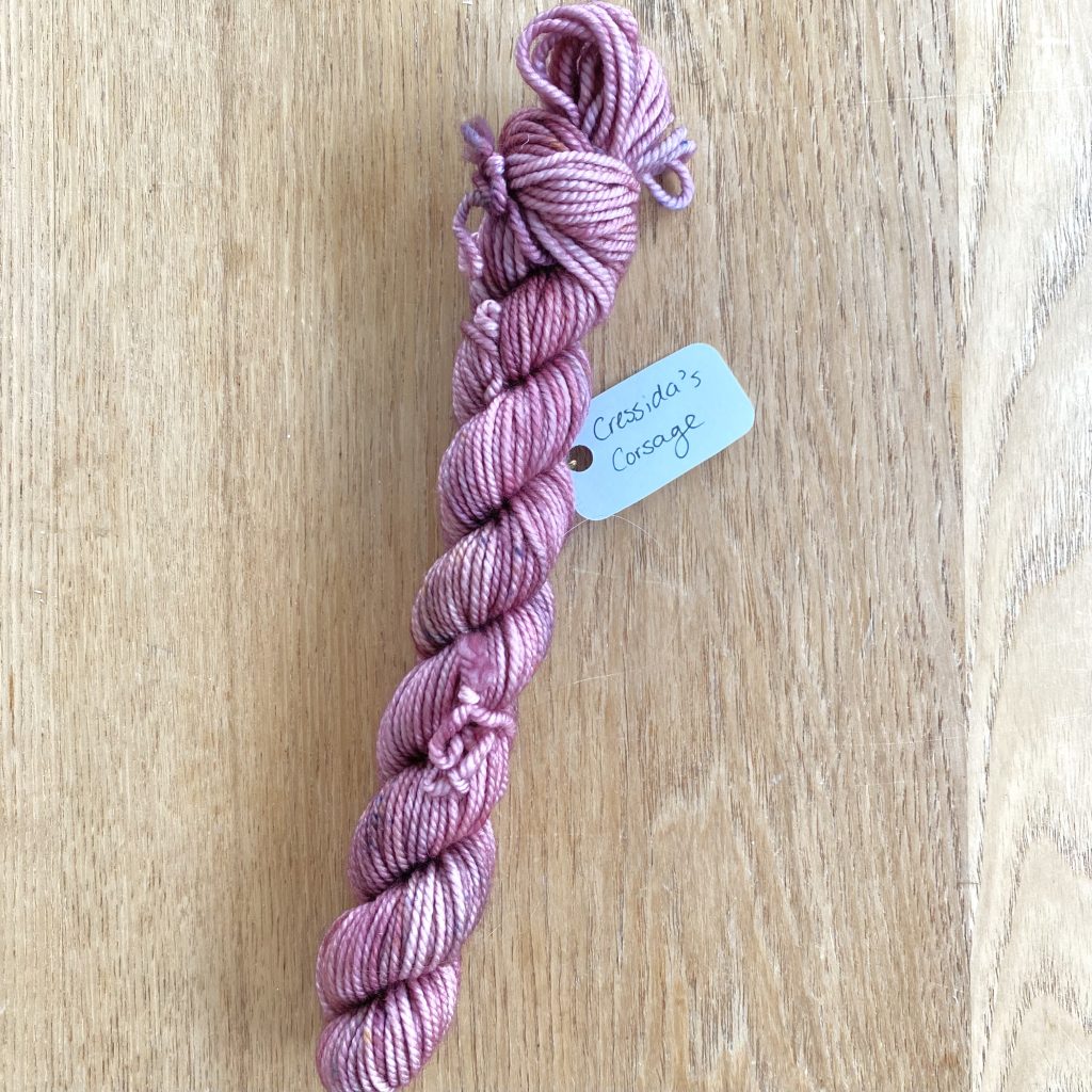
This pink shade is (I believe!) another more general name: throughout all of the seasons of the show, Cressida Cowper’s dedication to the colour pink is unwavering, so this feels like a fitting tribute.
18: ‘Love Match’
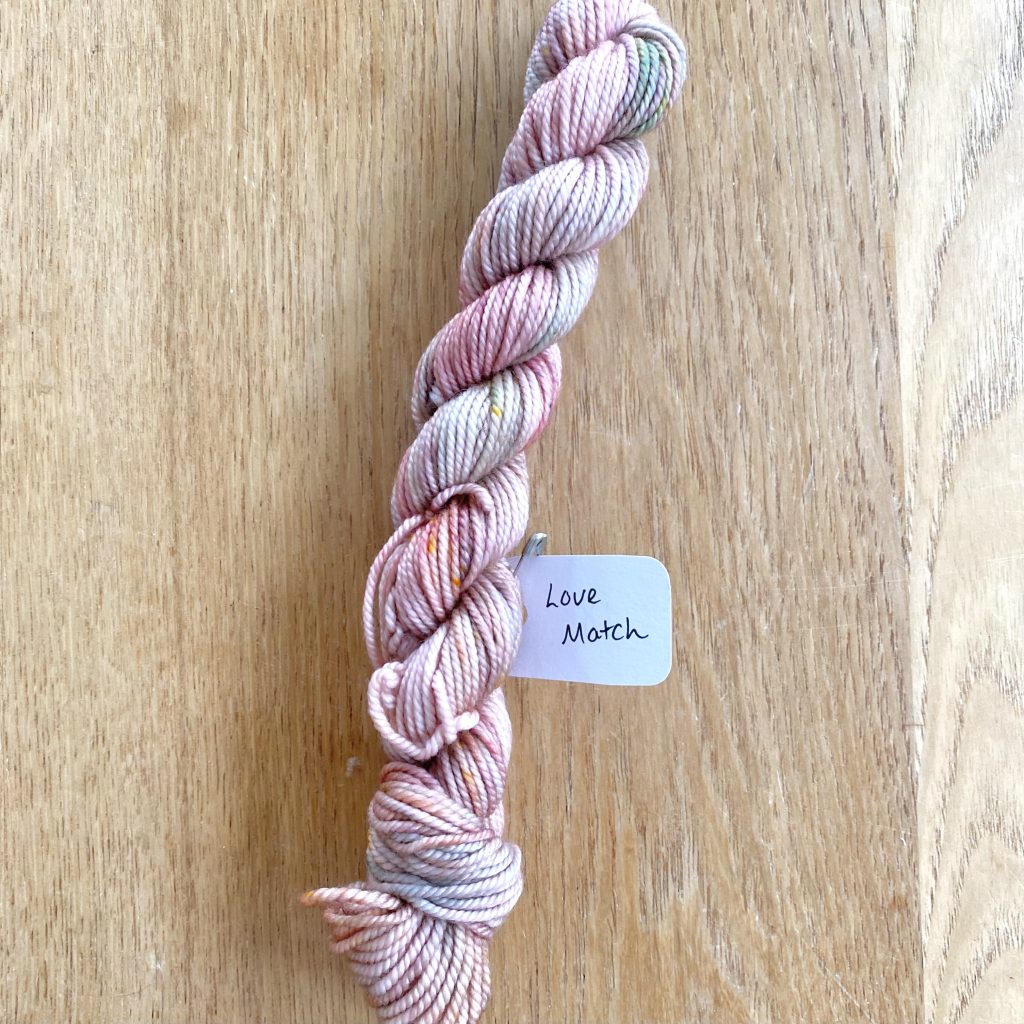
This pale pink shade is shot through with hints of orange, blue and lilac. The concept of a ‘love match’ is a recurring theme in the show and I think this shade encapsulates it perfectly: to me, the pink creates a backdrop of love and affection, while the orange flecks infuse it with a little bit of fiery passion, the blue the more painful parts of real, human love and the lilac the peace that comes with finding a true connection. I think this one is particularly clever, even if I’m more drawn to some of the deeper shades.
17. ‘First Spark Of Affection’
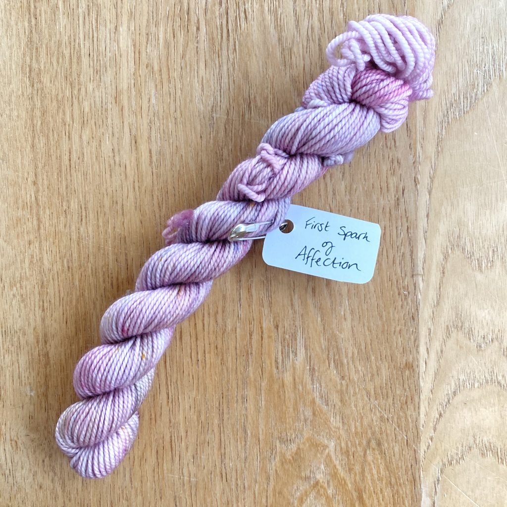
We’re shifting into the purples now with this lilac shade. At first, I thought that this shade was inspired by Francesca Bridgerton, because I knew the title was from a quote in the scene in Season 3 where she is being introduced to the Queen’s suitor for her. However, upon further research, I actually think it’s inspired more directly by Violet Bridgerton (the speaker of the quote itself) and the outfit she’s wearing in the scene: a lavender jacket and a dusky, pinky-plum dress. I think this is a lovely tribute, especially given that Season 3 is when Violet finds her own ‘first spark of affection’ since her husband’s passing.
And those are the yarns from the 2025 Bridgerton Advent that I used for the first band of colourwork on my Porcelain Sweater! I worked 2 rows with each shade, except for ‘You Occupy My Every Thought’ and ‘Scandal’, which I worked 3 rows each of, and ‘First Spark of Affection’, which I worked 1 row of (and will continue on with at the start of the next colourwork band, to help the gradient flow).
Final Thoughts
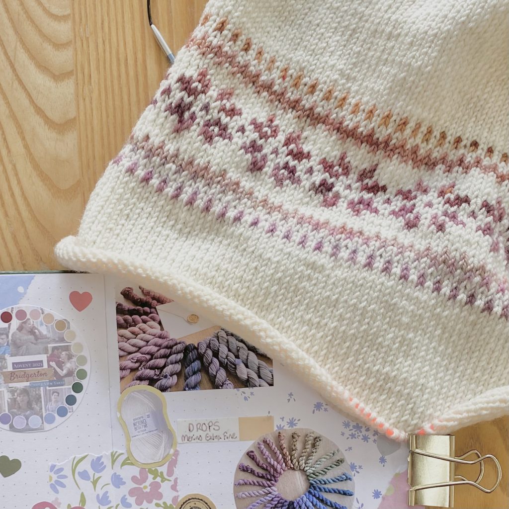
And that is how the first week of making my Porcelain Sweater x Bridgerton Advent project went! I really am loving this process— I feel like I lost my spark a little with knitting, but it’s definitely back now. I think the fact that I’m just following the pattern, so it feels fairly simple, but doing something a little creative with the colours, so it also feels exciting and special, is working really well for me and I’m absolutely loving watching the pattern and the gradient appear as I knit.
If you're interested...

You can purchase the Porcelain Sweater pattern by LE KNIT by Lene Holme Samsøe on Ravelry here.

You can find the Ravelry project page for my Porcelain Sweater here.

You can check out Castle View Yarns here.
Gemma
xxx