 Gemma
Gemma 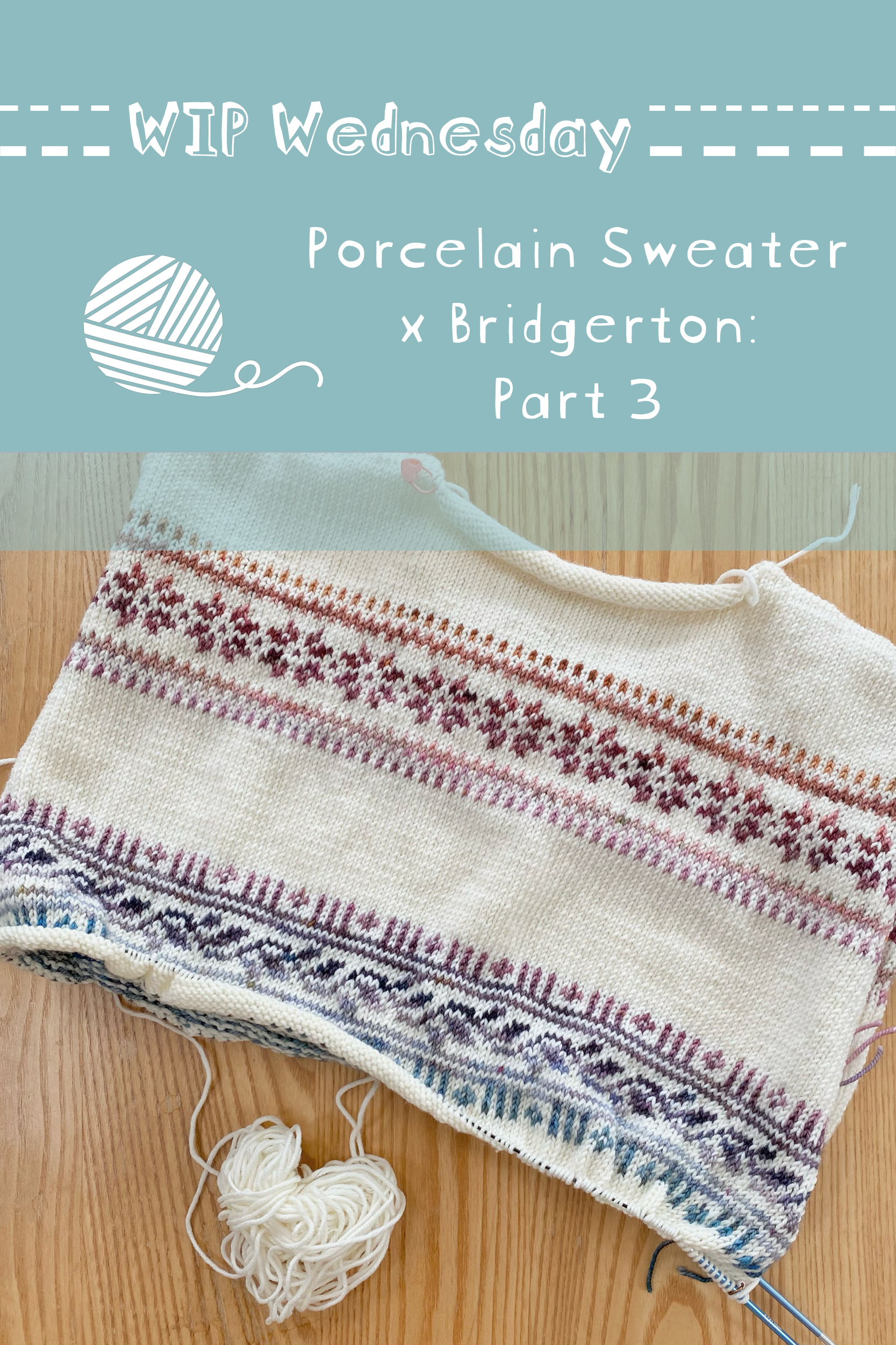
Happy WIP Wednesday!
I’m still working on my Porcelain Sweater (pattern by LE KNIT by Lene Holme Samsøe), with the 2025 Bridgerton Advent from Castle View Yarns as the contrast colour(s).
I’m not a super speedy knitter (your girl has cakes to bake), but I felt like I got quite a lot of knitting done in the first week of making this project! The second week involved less shaping than the first, but just as much colourwork (in the round, this time, thank goodness) and I think I got a pretty good chunk of knitting done!
Progress
After the first week of knitting, I had worked the top of the back section (including the first band of colourwork), as well as both shoulders. I’d also knitted the first handful of rows after joining the right and left shoulders across the front.
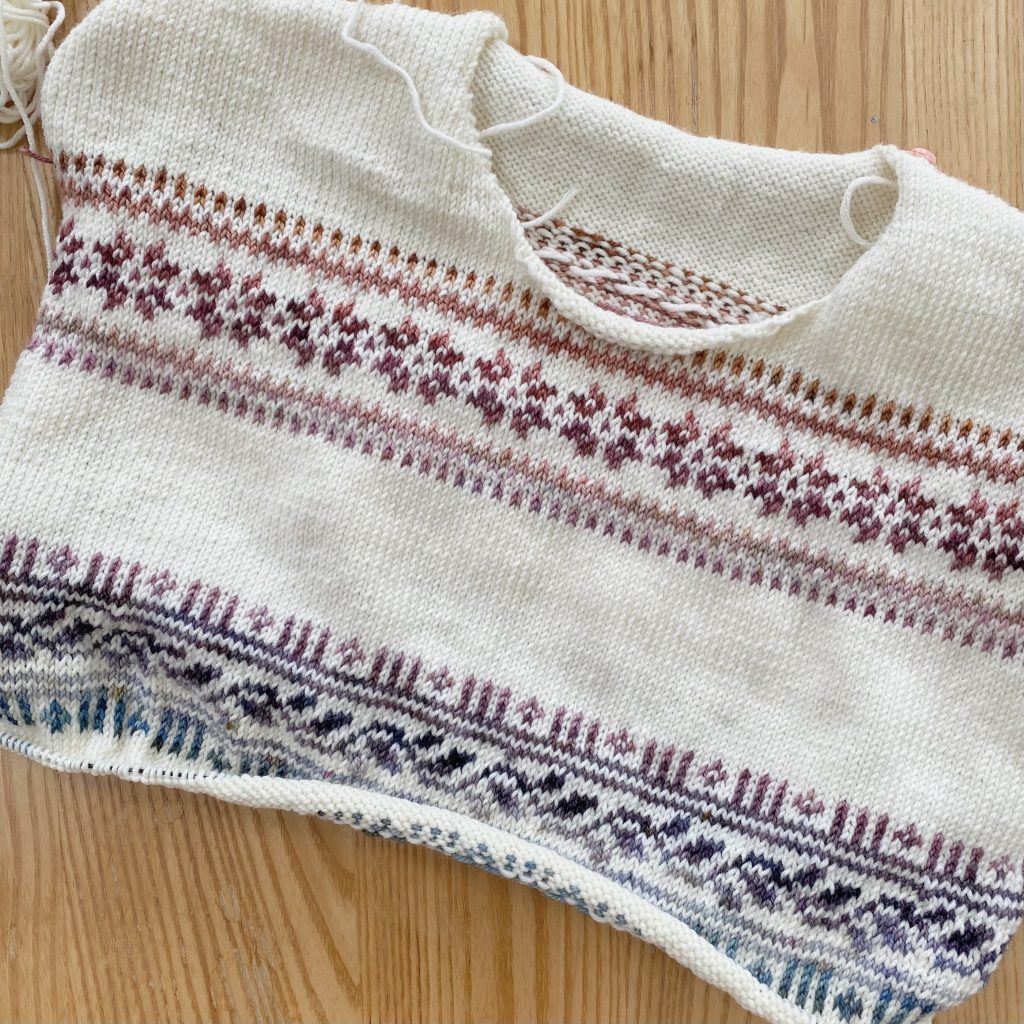
In the second week of knitting, I finished…
- The top part of the front section (including the other half of the first colourwork band)
- Lots of plain stockinette rows in the DROPS yarn
- Joining the front and back together to start working the body in the round
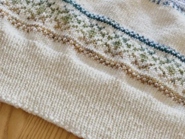
- The second band of colourwork
So, a lot of colourwork this week, paired with a big stretch of stockinette!
Mid-Knit Thoughts & Musings
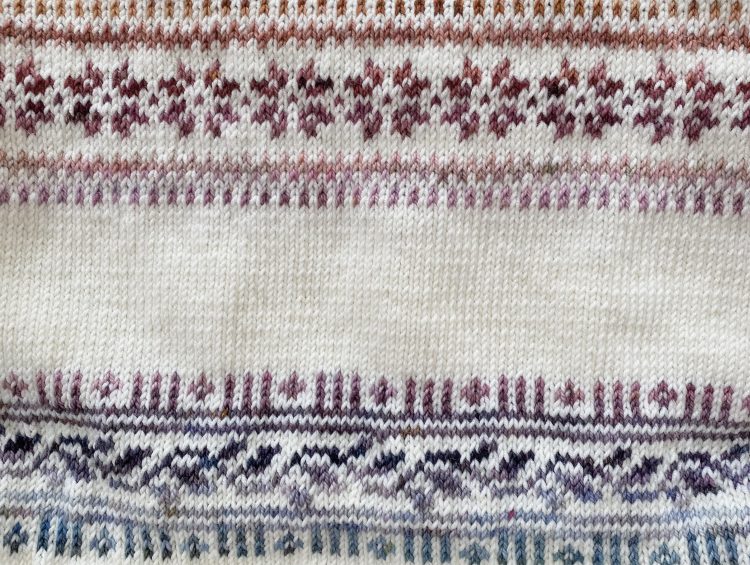
I am so relieved to be working in the round now— I’m a super slow purl-er and… knitting colourwork flat? It’s not for the weak. I’ve continued my gradient of the 2025 Bridgerton Advent colours into the second band of the sweater, so I’ve gone through the purples and dipped into the blues towards the end.
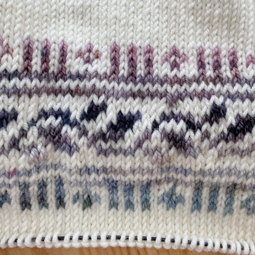
The second band of colourwork is definitely more complex than the first: not only is the repeat larger (and a little less intuitive to follow), you also need to increase and decrease the stitch count around the middle leaf design to make it work.
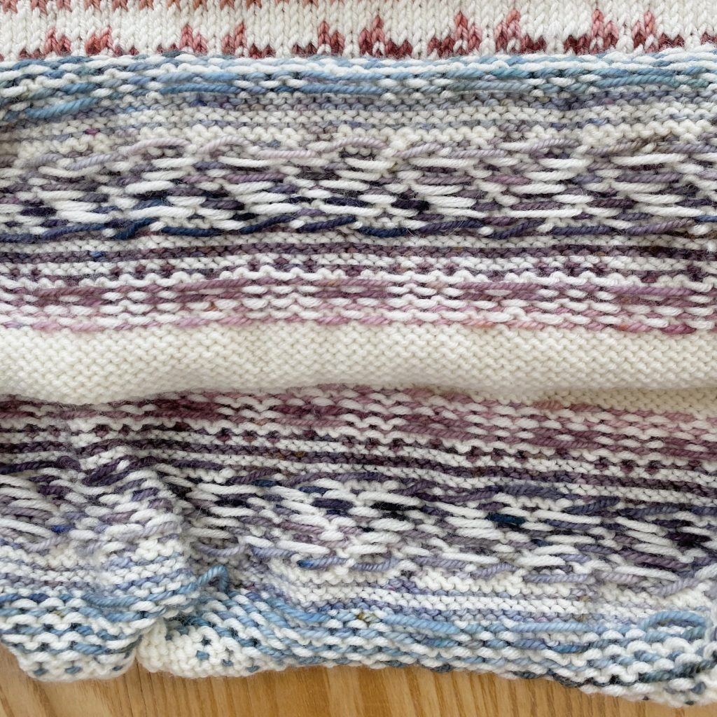
On some of the rows of the leaf design, I did need to carry the floats by twisting the yarns at the back of the fabric, which was a bummer, because I thought I had moved past all that float-carrying business once I switched to working in the round, but alas, the distance between the contrast stitches on some rows was just too great.
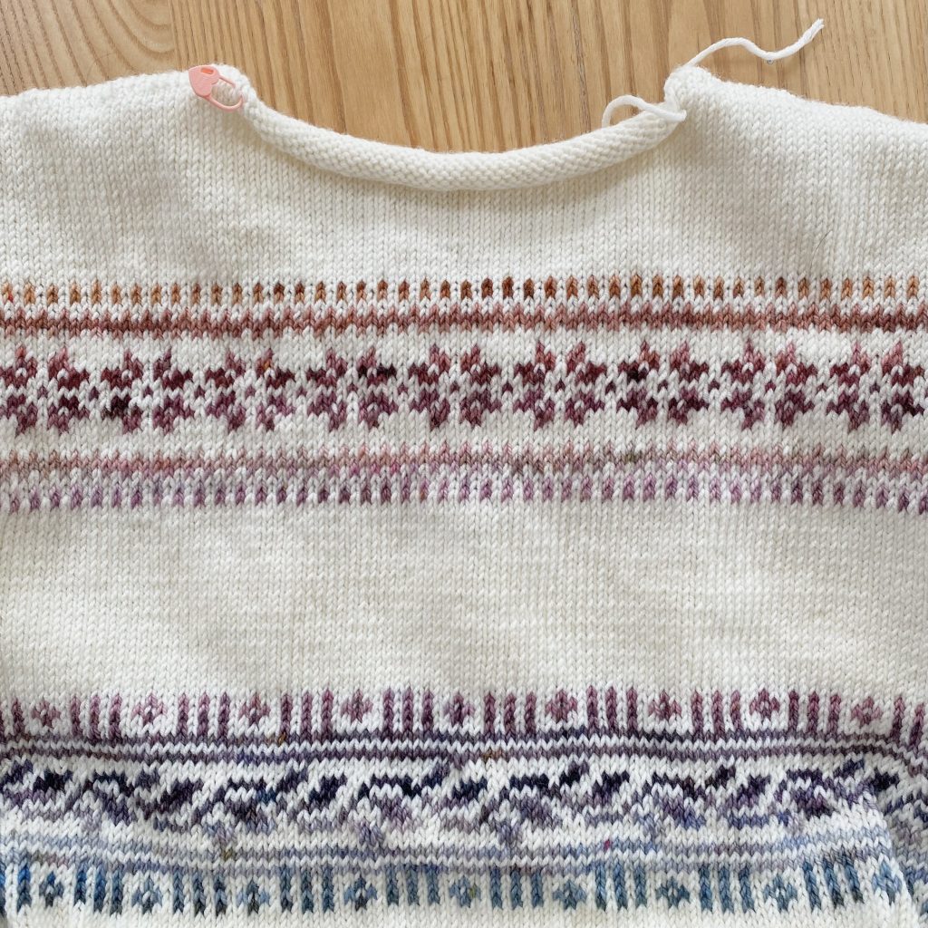
I think the aforementioned float-carrying and relative complexity of this band definitely meant that my work isn’t quite as neat as the first band, but I’m hoping that it will kind of… smooth itself out once I block it? Fingers crossed!
I did make one slight adaptation when it came to increasing the stitch count for the leaf motif. For my size, I needed to increase my stitch count by 6 stitches, so I placed 6 stitch markers around my work, evenly spaced, so I would know where to work them. I was supposed to increase on Row 8, but I ended up working my increase row on Row 9, instead.
I wanted my increases to be as invisible as possible, so I tried a few different types of increase (k2tog, M1L, LLI etc.) and I found that the k2tog made a visible ‘purl’ bump, so I opted to use a lifted increase. However that meant that if the stitch being lifted was a different colour (i.e. if I was lifting a stitch from the contrast colour row), the increase not only stood out more, but it also threw off the seamlessness of the colourwork. Shifting the increases to the Row 9 meant I could work M1Ls pretty seamlessly, knitting cream stitches on top of cream stitches, without distorting any of the colourwork (LLI lifts the stitch from two rows below, so I couldn’t use that one!). I suppose I could have done M1R, but I do not particularly enjoy working M1Rs so… M1L it is!
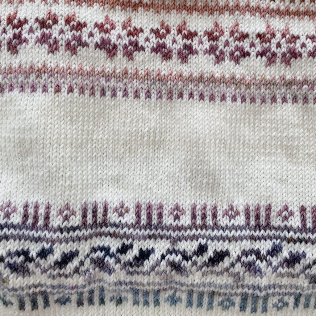
I worked my increases and decreases as close to my original 6 stitch markers as possible, but I prioritised making sure that they were well within the chunks of cream stitches (i.e. not too close to any of the contrast colour stitches), to minimise any distortion of the colourwork. I know this all sounds a bit… over the top, but I think it makes a big difference and I’m really pleased I took the extra time to think about it— it made me feel very professional!
Castle View Yarns 2025 Bridgerton Advent: Shades 16-9
I’m working through the 2025 Bridgerton Advent gradient from Castle View Yarns (in reverse) as my contrast colour(s), within the colourwork bands of this sweater. In the first band, I used the Shades 24-17 (which I talked about in detail in last week’s post!).
In this second band of colourwork, I used the shades 17-9. I mentioned last week that I only worked one row at the end of the first band in shade 17, so I continued on with it at the start of the second band to help the gradient flow through the sweater. However, because I did my deep-dive into that shade last week, I’ve skipped it in this post!
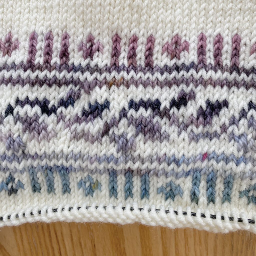
Just like last time, here are the shades, their names and my ✨educated guesses✨ of their inspirations from the show!
16: ‘The Modiste’s Thread’
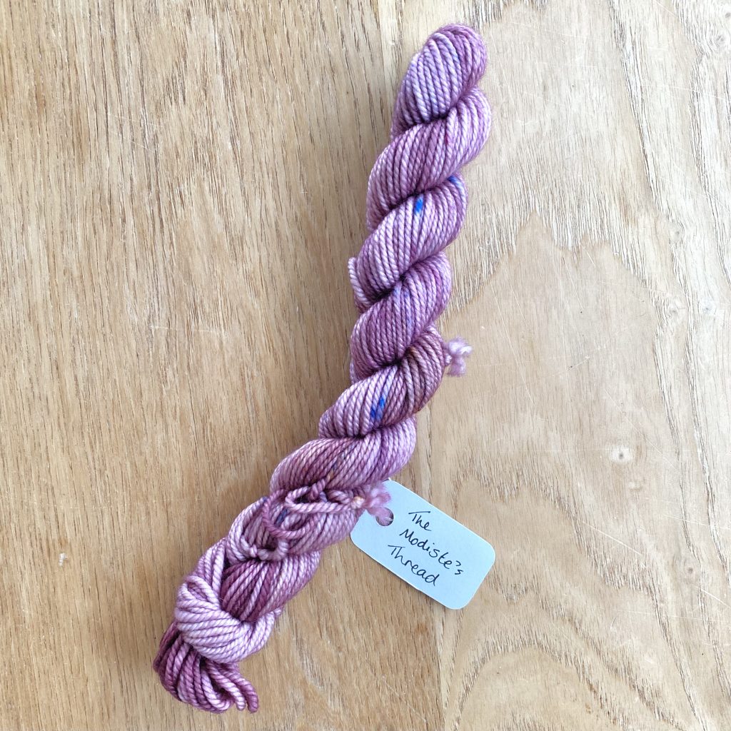
This pinky-purple shade is obviously inspired by Madame Delacroix, the ton’s modiste in the show. In general, Madame Delacroix wears darker colours than this (think navys, blacks and dark purples!), so I don’t think it is directly inspired by her character, but, as the name suggests, by the fabrics and materials that she uses in her dress-making business! In fact, there’s a scene in Season 3 where she’s suggesting fabrics to Penelope Featherington and holds up a lilac material that does remind me a little of this yarn!
15: ‘Den Of Iniquity‘
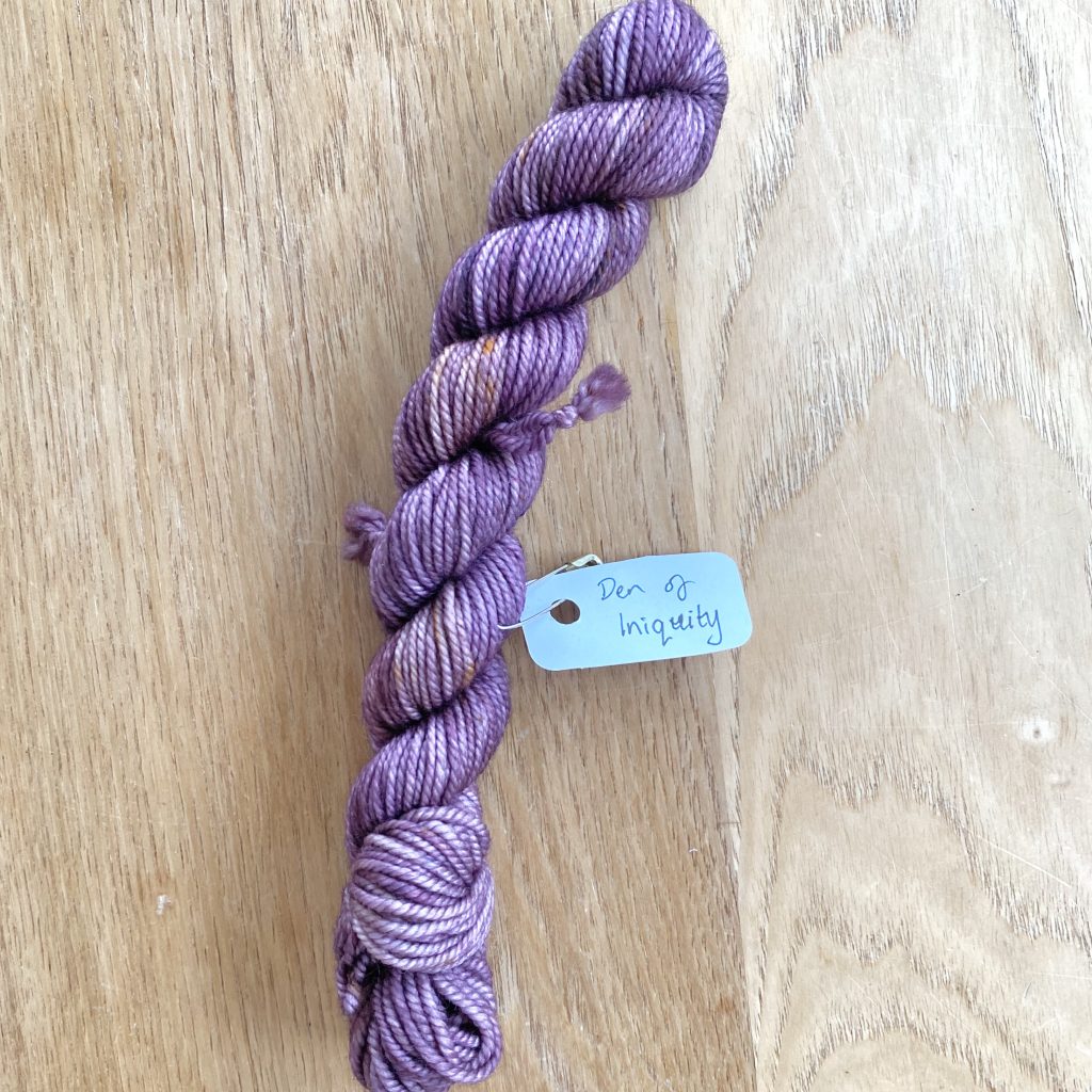
This grape shade is named after Lady Danbury’s exclusive soirée for the married women of the ton, which Daphne Bridgerton is invited to in Season 1. Daphne wears purple to attend the event, a colour she shifts into wearing after her marriage. However, the Danbury colours are typically deeper, more jewel-toned shades, which I think is where the darker tone of this yarn comes into play.
14: ‘Bane Of My Existence’
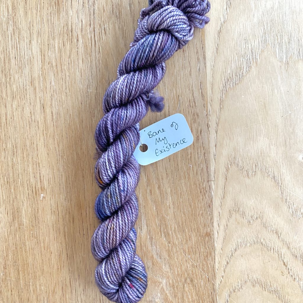
This purple shade is named after one of the most iconic quotes from Season 2, said by Anthony Bridgerton to Kate Sharma. Kate is often shown wearing deeper shades (lots of teal and purple!) than her debutante sister, Edwina, and this moody purple feels very evocative of her relationship with the Viscount.
13: ‘Mallet Of Death’
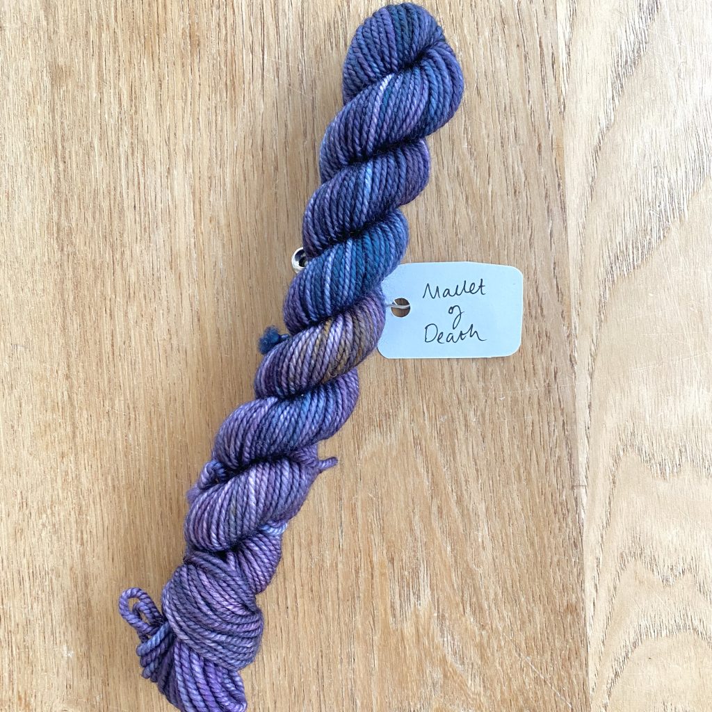
The so-called ‘Mallet of Death’ in the Bridgerton family’s Pall Mall kit may be black, but Kate Sharma wields it twice throughout Season 2 and both times she is wearing a purple dress, so this deep, aubergine shade feels like a perfect fit!
12: ‘Love Is Not Finite
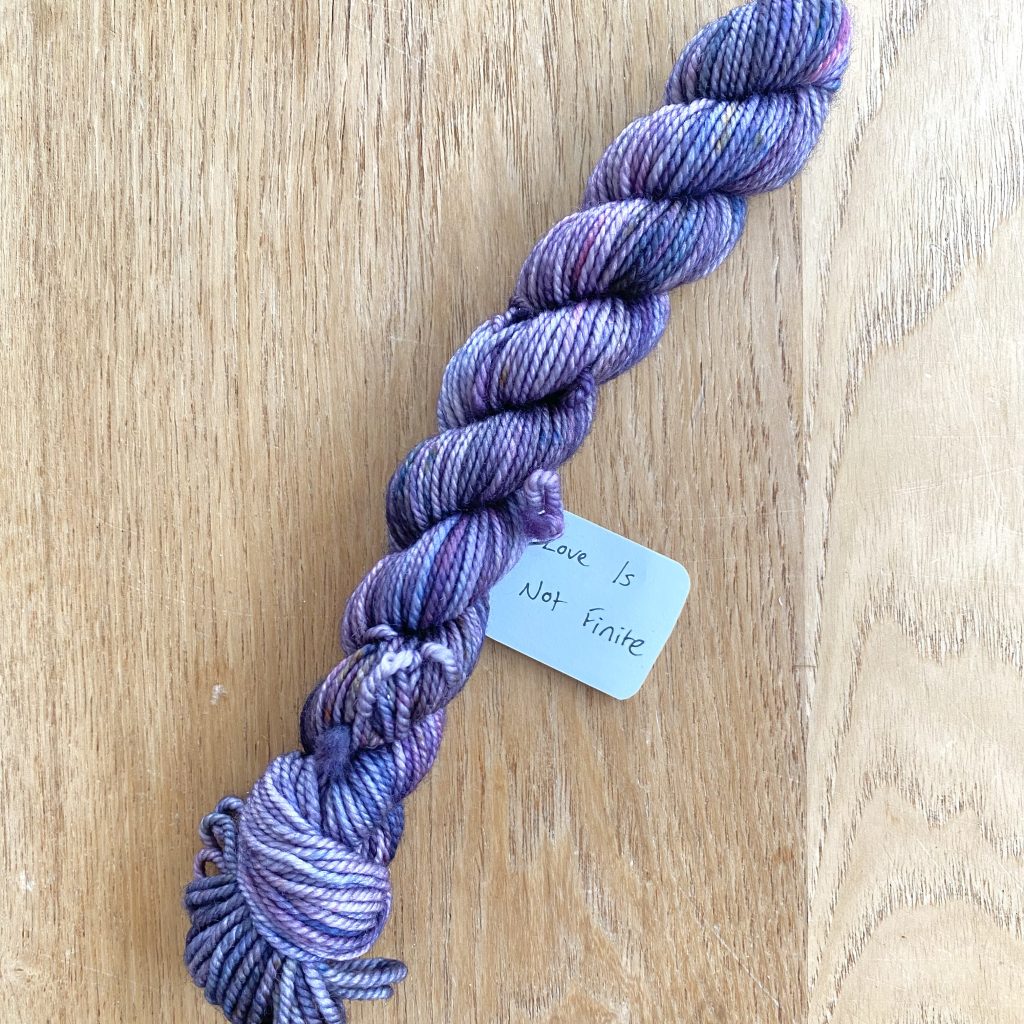
This shade is very similar to ‘Bane of My Existence’: a ‘true’ purple, albeit slightly deeper and more blue-toned. The name ‘Love Is Not Finite’ comes from the scene in Season 3, where Benedict offers his sister, Eloise, advice. If I’m being honest, I was sure that Violet Bridgerton said this line to Anthony in Season 2 (hence the purple), but I was completely wrong! While neither Benedict nor Eloise wear purple in the Season 3 scene, Benedict’s love interest Sophie does wear this colour when she works as a maid at Bridgerton House in Season 4 and, while I know these colours were designed long before the release of Season 4, I still think it’s a fun twist of fate!
11: ‘We Chose To Love
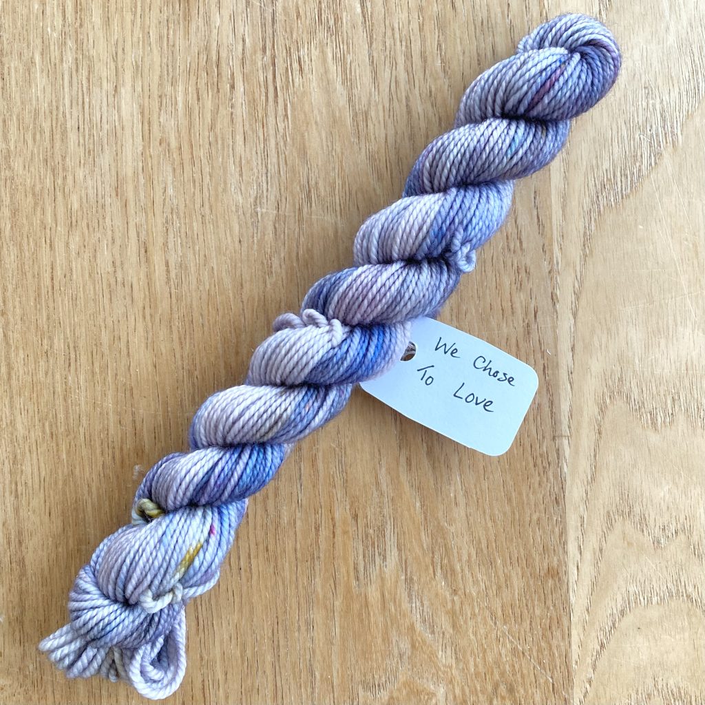
This lavender shade is named after a quote that is definitely said by Violet Bridgerton! She says this while imparting some advice to her daughter, Daphne, towards the end of Season 1. This colour ties in so nicely with Violet’s character, both with the purple reference in her name and the little specks of ‘Bridgerton Blue’.
10: ‘The Queen’s Sparkler’
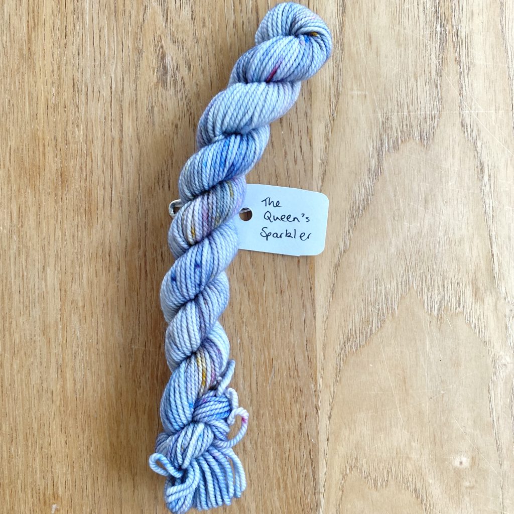
This shade must be a reference to Francesca Bridgerton in Season 3, who makes her debut and eventually becomes the Queen’s so-called ‘Sparkler‘. This is a delicate, soft blue shade, shot through with hints of purple, pink and gold.
9: ‘What If I Want To Fly?’
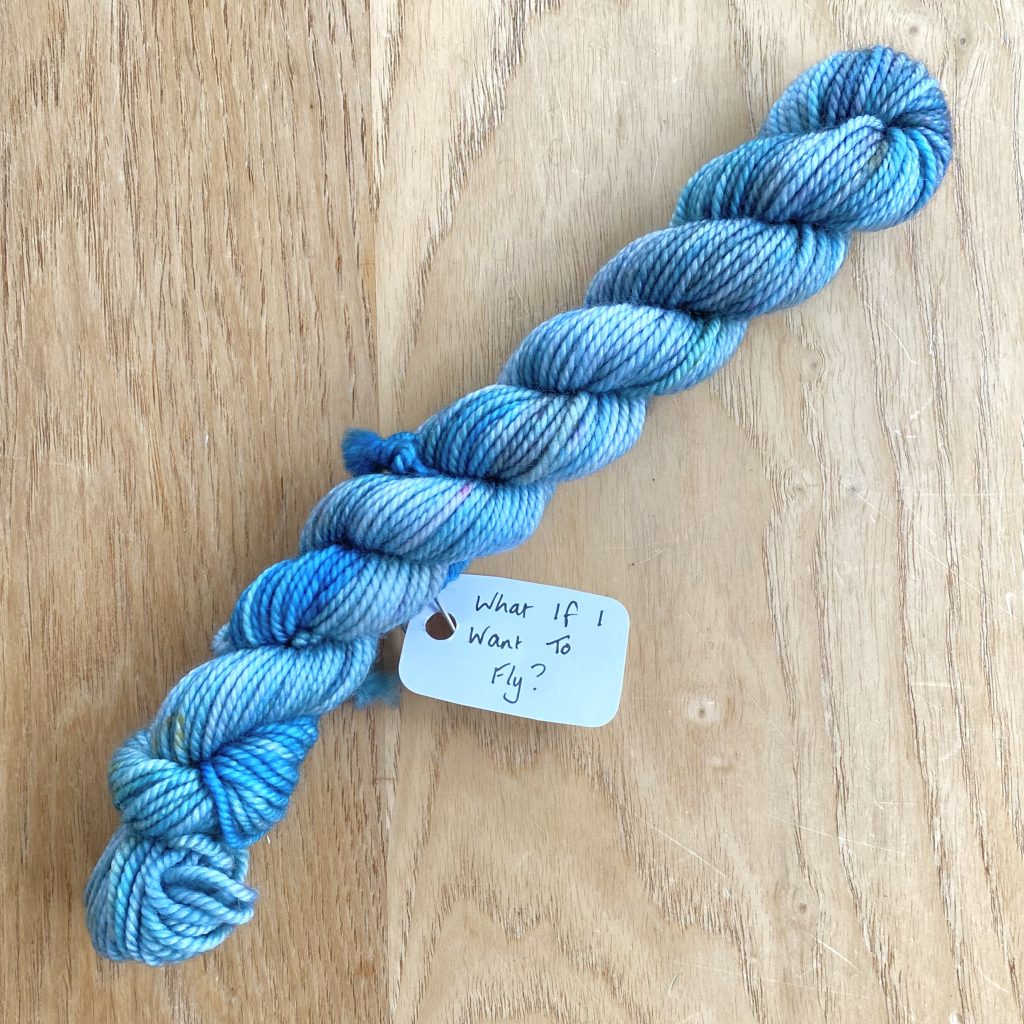
This shade marks a clear shift into the blues of the gradient, and is named after a quote spoken by Eloise Bridgerton. Within the blue, this yarn contains hints of the green of Eloise’s dress in this scene, as well as a stronger, more vibrant blue shade that I think reflects the character’s bold attitude (and general recalcitrance) well.
Final Thoughts
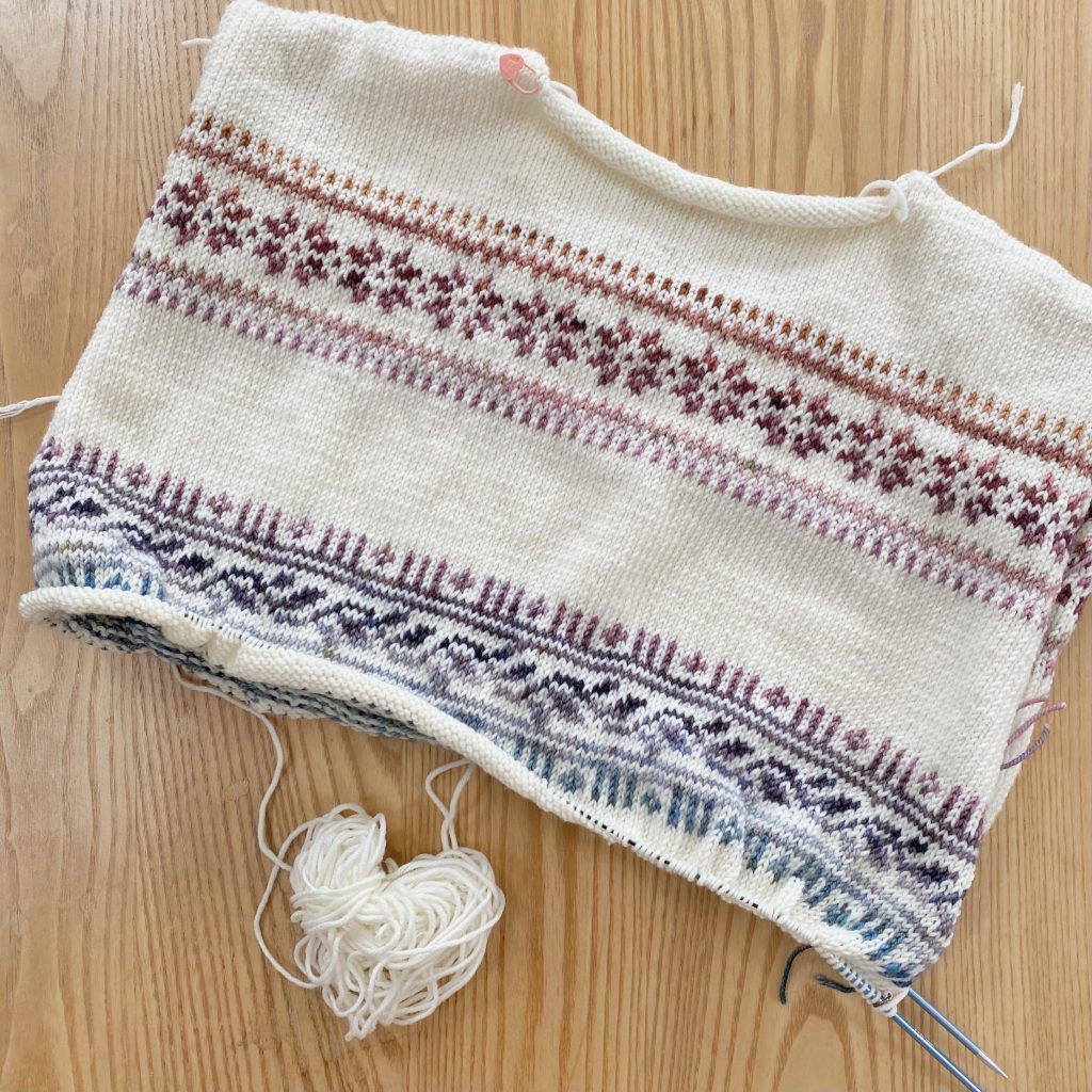
And that is how Week 2 of working on my Porcelain Sweater x Bridgerton Advent project went! I’m still really enjoying this process, even though I found that leaf section in the second colourwork band… a little less enjoyable than the other sections! It’s been so satisfying watching the gradient form alongside the varying patterns and it has been very nice to fall back into the swing of knitting in the round again!
If you're interested...

You can purchase the Porcelain Sweater pattern by LE KNIT by Lene Holme Samsøe on Ravelry here.

You can find the Ravelry project page for my Porcelain Sweater here.

You can check out Castle View Yarns here.
Gemma
xxx